A sense of identity and place at Design Indaba
You’re probably familiar with the idiom, ‘It’s not about where you’re from, it’s about where your going’. Well forget that, and whoever said it. This year, partly by accident, partly deliberately, Cape Town’s Design Indaba conference seems to reverse the mantra and instead makes us think about where we’re from.

The three-day conference celebrates its 20th anniversary this year and has chosen to present itself with a visual language that references its host city. There was a vibrant 3D backdrop set design on stage featuring buildings from the around Cape Town, which was picked up on screen and across other touchpoints.
Coincidentally, we find out while in Cape Town that the city itself is rebranding, and creating a visual language based around its own backdrop, Table Mountain.
Indaba has a truly international outlook; a feeling that is catalaysed by the global delegation of speakers, an audience who have jetted in from all over the world, and the presence of international media.
Perhaps it’s this that makes many speakers want to talk about who they are and where they’re from, how that’s made them the designer they are today, and how their identity shapes their work. This might sound a bit reductive, but it’s a conceit which works perfectly in context, as there’s plenty to be learned about projects, insight and methodology too. It’s the ultimate show and tell.
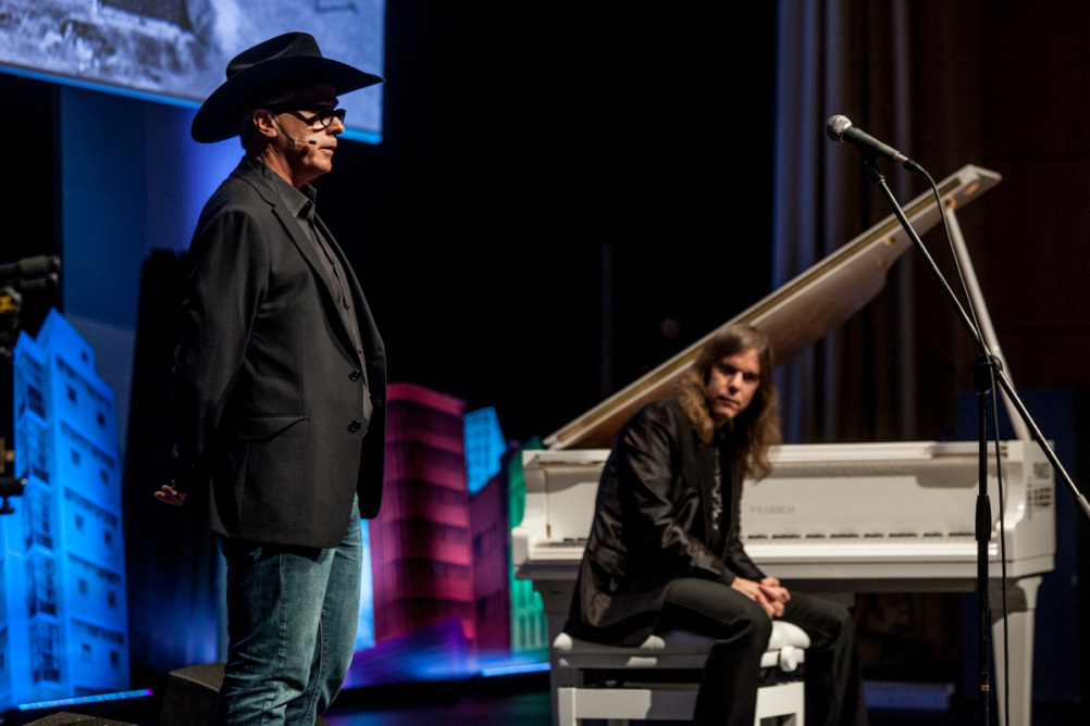
DJ Stout, partner at Pentagram, gave the most direct and deliberate presentation on where he’s from – in his case Texas. He’s worked with clients including Microsoft Windows, Southwest Airlines, and Northwestern University, but he was here to tell us about his Cowboy Poets project.
Published in Pentagrams Papers series, it first came across Design Week’s desk in book form in 2012 and pictures cowboys alongside the poems they have written.
At Indaba, Stout took to the stage dressed in cowboy boots and a ten-gallon hat, before giving a surprisingly moving presentation on how five generations of cowboys in his family had made him who he is as a graphic designer.
He presented the poems on screen, narrated by the cowboys, while a Texan musician and film score composer played an accompanying sound track, live, on a piano – complete with the sound of galloping hooves.
‘It’s very important as a graphic designer to know where you’re from’ said Stout who also introduced work he had done as the art director of Texas Monthly.
His work, he said, is imbued with a sense of confidence and pride, as distilled by the ‘Texas brag’ spirit of his home state, but he showed how it is often delivered with a sense of good-humoured knowingness or irony – as illustrated with a map of North America he designed by shoe-horning every state into the outline of the shape of Texas.
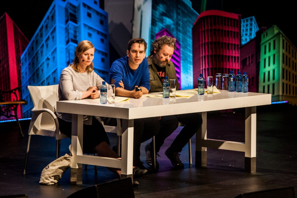
Dutch branding and graphic designers Experimental Jetset are made up of partners Marieke Stolk, Erwin Brinkers, and Danny Van Dungen. They actually shut-up shop for the first time so that all three of them could present at Indaba.
Amsterdam-based, the trio announce themselves as ‘children of the 70s,’ and reveal they are named after the Sonic Youth song, Experimental Jetset – having been unable to name themselves after The Specials’ International Jet Set song.
They make it clear that they’re from an era, and that music – in particular post-punk and no wave – has a massive influence on their work.
It’s interesting to see how the no wave movement affected the studio’s own take on Modernism, ideas which crystalise in their ‘responsive W’ identity for the Whitney Museum of American Art.
And for the record Van Den Dungen says ‘We hate Helvetica’ – which he sees as just another tool – a clarification he makes by joking, ‘We signed our own death sentence by appearing in the Helvetica film.’
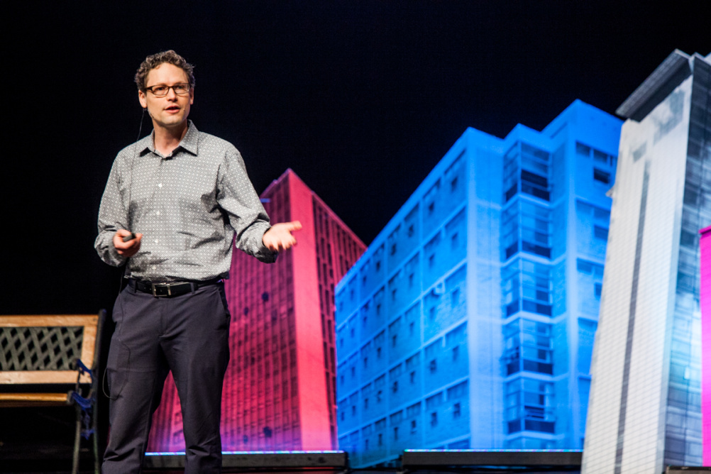
Jake Barton, principal of Local Projects, brings interactive design solutions to art, and to cities – within art institutions and within public spaces – to help tell stories.
In his work, New York-based Barton poses himself the question ‘How do you build structure for creativity?’ The answers differ greatly project-to-project as he seeks solutions that often revolve around gesture, interface and deep level engagement.
In the field of image recognition Barton says he has worked with the Cleveland Museum of Art ‘to literally design behaviours’.
The Cleveland project saw visitors engage with a game that uses facial recognition software to scan their faces and match them up with the faces of exhibits, often unflatteringly.
https://player.vimeo.com/video/64583735
Most impressive, in the same institution is the CMA Collection Wall, which allows users to curate museum content, share their interpretations and find out more about exhibits.
Place and identity comes up again in Local Projects’ work for the 9/11 Memorial and Museum site. The museum takes a global and local perspective with immersive recordings from visitors, survivors, and people around the world remembering where they were as events unfolded.
Most poignant though is the human-centred approach Local Projects took to helping people navigate the placement of names listed on the memorial.
The consultancy created a software system that placed together groups of family, friends, colleagues, and even people who met that day and died helping each other. A website in multiple languages explains these orientations.
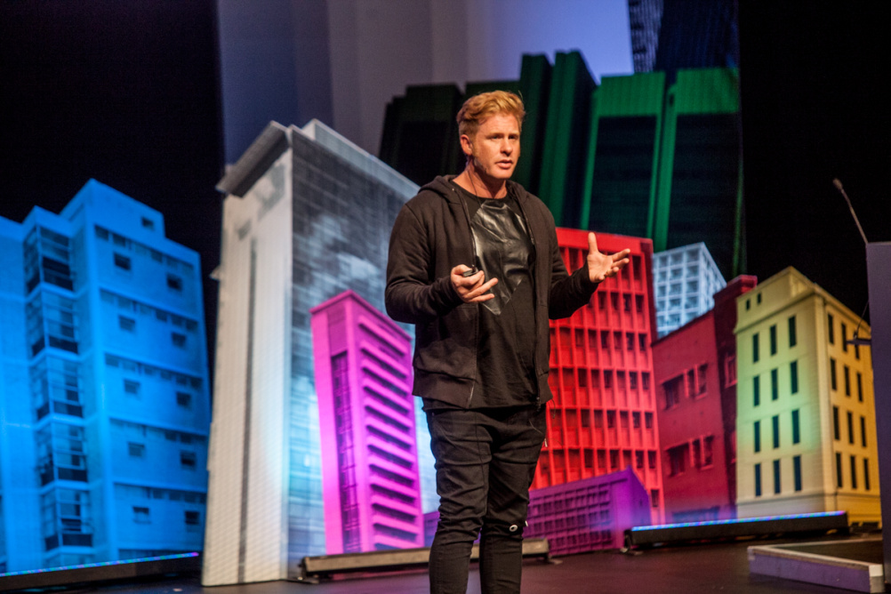
Founder and creative director of Alt Group Dean Poole won the crowd over with his hugely entertaining talk, which showed his forensic obsession with the alphabet and language.
He began by renaming each letter of the alphabet based on the way it looks, before showing how poetry and holes, yes holes, influence his work.
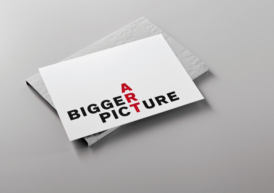
Poole introduced several projects, including branding for Auckland Art Gallery Toi o Tamaki, which makes an identity of the word art, in a playful and surprisingly unpretentious way – when you consider what he’s actually done.
Letters that form the word art are extrapolated and placed into other words to convey messaging.
It distills perfectly the ideas introduced earlier in the talk such as irregular poetic forms like the cirku, which give words a form.
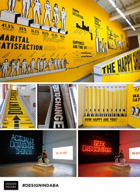
There was a standing ovation for Stefan Sagmeister who delivered his rip-roaring set on happiness, drawing on The Happy Show, a touring exhibition which levels on the science of and pursuit of happiness in a cheeky, playful and interactive way.
His talk ended with the auditorium on its feet singing a karaoke style song about designer and client politics – which brought the crowd great joy…
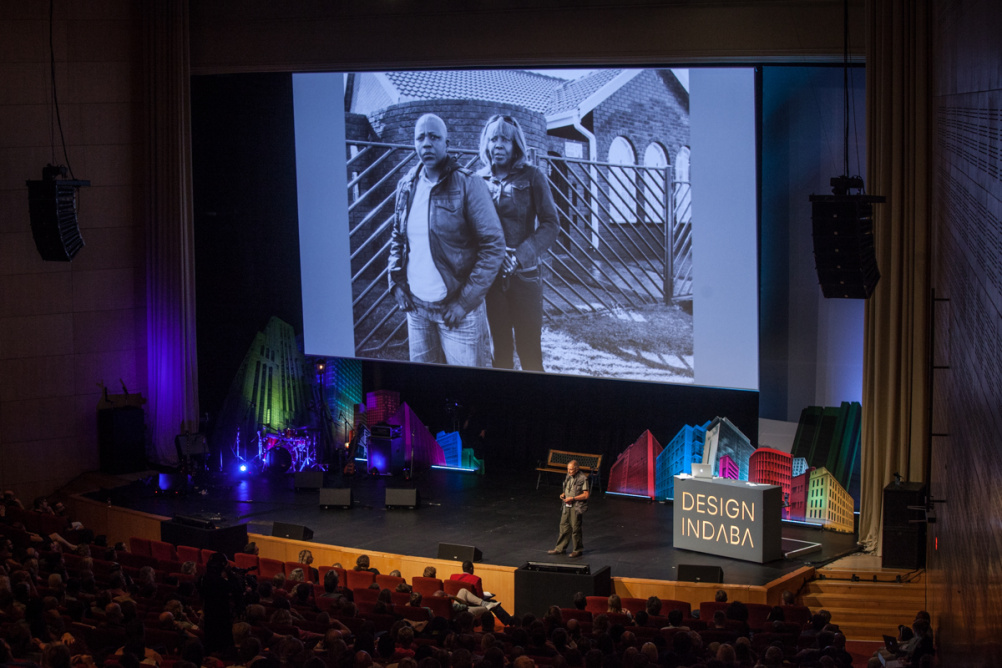
There was another ovation for photographer David Goldblatt who started photographing in 1948 and has since documented apartheid and South Africa’s post-apartheid development and recovery.
He told deeply moving stories and humanised the people in his pictures with accounts of brutality, institutional racism, survival, and gay rights.
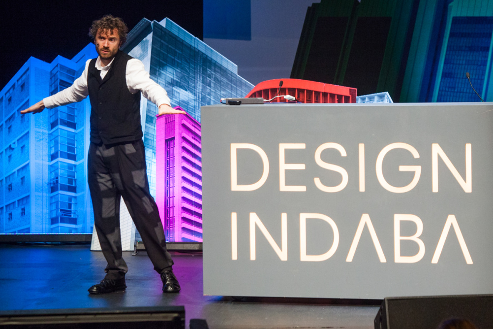
It’s important to not loose sight of what Indaba is all about, which is using design to make positive change in the world, and there were plenty of examples of that. This year we were privy to a big announcement from Thomas Heatherwick who has designed what he says will be ‘Africa’s first major institution for contemporary art.’ He also told Design Week how redesigning the tube would be ‘an amazing project to work on.’
And we spoke to IDEO creative director Tom Hume who has just launched a set of collaborative international design challenges and got some great insights into workplace design from Clive Wilkinson, the architect and strategist behind Google’s office designs. We’ll be sharing his thoughts soon.
-
Post a comment


