AKA designs Museum of London’s Sherlock Holmes campaign
AKA has designed a campaign for the Museum of London’s forthcoming exhibition Sherlock Holmes: The Man Who Never Lived and Will Never Die.
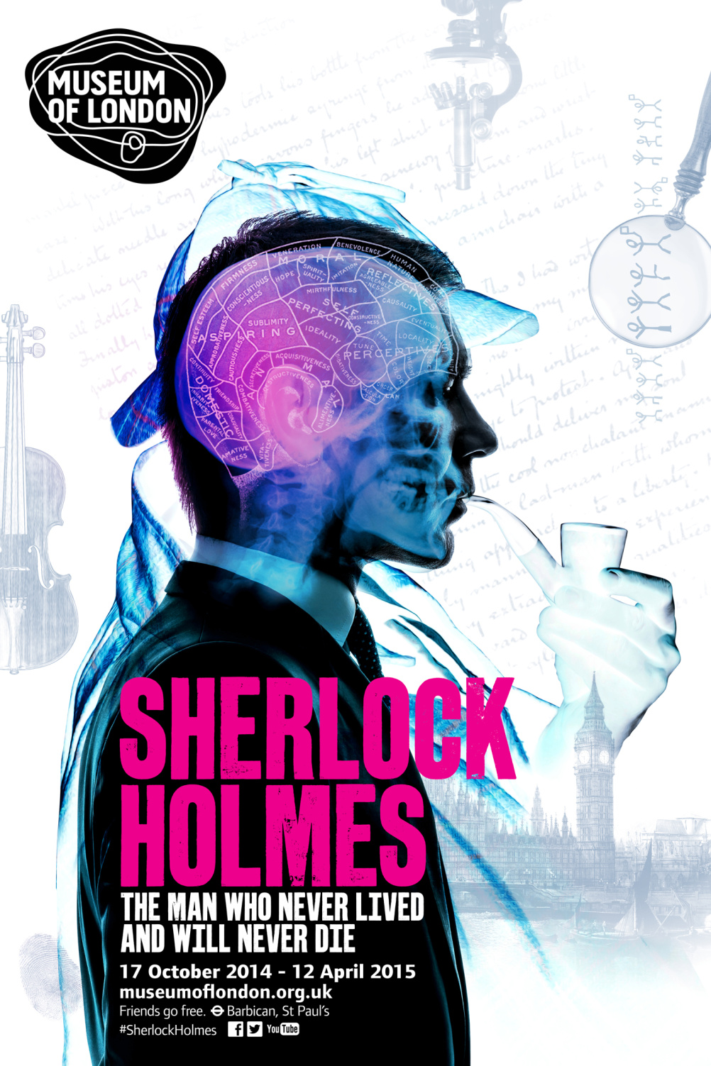
The consultancy worked with A+B studios on the title graphics and has created a composite X-ray style image depicting the fictional detective.
The Ironfoot typeface has been sourced from old presses and has been hand printed and scanned.
Benji Wiedemann, director at A+B Studio, says, ‘Utilising the printing techniques and typographic style of the late nineteenth century, Ironfoot has historical authenticity.
‘This bold, solid typography speaks to the fictional existence of Sherlock Holmes, who was born on the printed page.’
AKA says it has responded to a brief to connect with ‘cultural connoisseurs who love London’s culture, self developers who seek a personal learning experience and intellectual tourists from the English-speaking world as well as north Europe, China and Japan.’
The campaign has been designed in the context of the museum’s strategic objective to increase footfall, its commercial objective of generating income through ticket sales, and its communications objective of increasing brand awareness.
Marc Evanson-Bailey, Creative Services Director at AKA says, ‘In order to assist the Museum of London in achieving its goals, our creative campaign needed to hit the perfect balance between instantly familiar Sherlock iconography and a fresh, contemporary perspective. The resulting concept design invites audiences to explore the mind of Sherlock Holmes, underlines his huge significance within the London landscape and gives an insight into the exhibition’s unique and exciting proposition.’
The campaign will go live across print, outdoor and digital ahead of 17 October when the exhibition – which is expected to attract 100,000 visitors – opens.
Read this next

-
Post a comment


