Brand Union and PriestmanGoode overhaul South African Airways
Brand Union and PriestmanGoode have collaborated on overhauling the South African Airways brand and designing new cabin interiors for the airline.

PriestmanGoode says the essence of the project ‘is about condensing the visual identity of an entire continent into a clear and concise design language to represent this national carrier.’
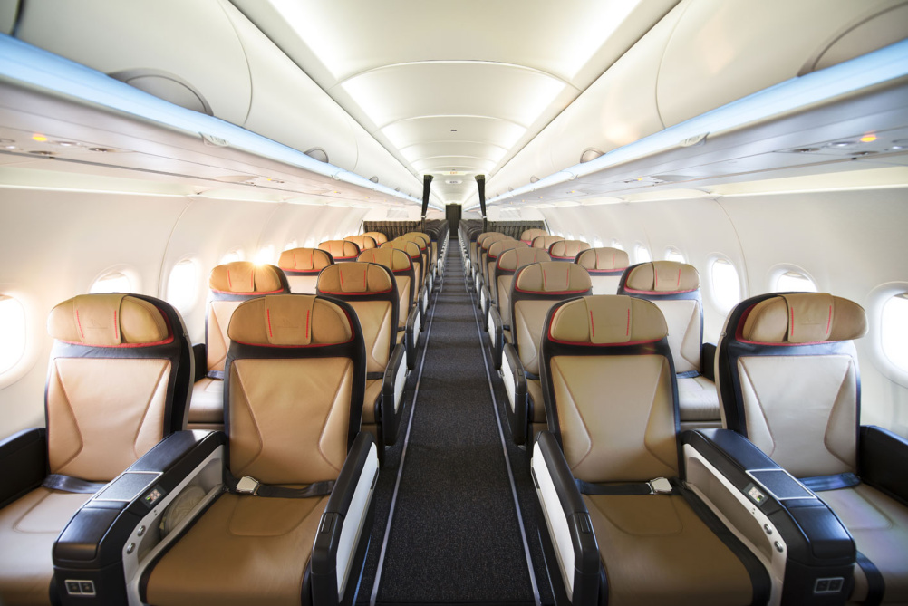
The new look marks the launch of a new fleet of A320 aircraft, which feature a cabin interior concept that dovetails with a new visual language for SAA across all passenger touchpoints. It will roll out across other aircraft interiors and be extended to ground services in due course.
Brand Union says, ‘We refreshed their visual identity, re-contextualised their existing brand assets and added a more luxurious colour pallete and photographic style.’
PriestmanGoode says its brief was to create an interior language representative of South African Airways as a national carrier and representative of the continent of Africa.
This meant that 80 per cent of the look needed to be inspired by contemporary South African culture and 20 per cent from the African continent.
The two consultancies began the project with a research visit and developed a ‘visual story’ by thinking about colours, materials, local fashion, traditional crafts and interior design.
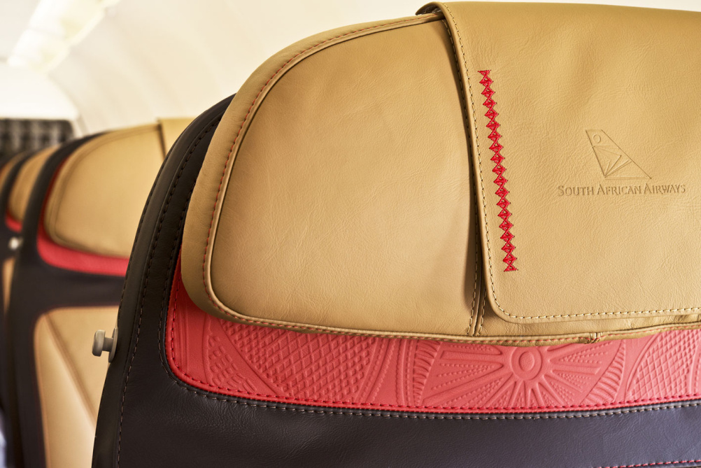
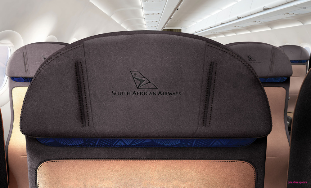
The resulting palette concentrated on ‘expressive pattern’, warm tones, textured surfaces, and the colours gold and anthracite.
Dark anthracite colours represent contemporary South African architecture and gold tones represent winter sun and earthen landscapes. They are offset with highlight colours of burnt red and blues.
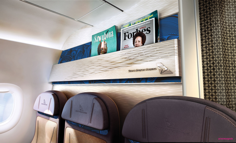
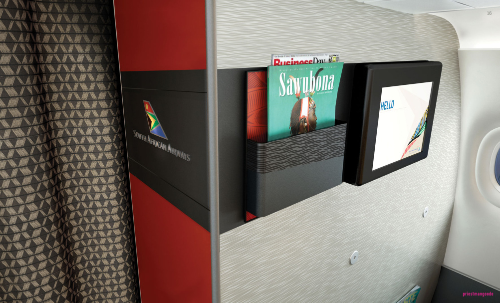
In the cabin the colours are picked up in details like brand panels and stitching and there’s a strong use of patterns – geometric woven diamond, geometric linear weaves and ribbed herringbone – which were developed by both consultancies.
Gary Bryant, managing director of Brand Union Africa says, ‘The on-board experience is one of the most important and the collaboration with PriestmanGoode enabled us to orchestrate the correct tone for the brand onboard the aircraft and ensure that it matched all other passenger touchpoints.’
Priestmangoode director Luke Hawes says, ‘Until now, SAA has had minimal brand continuity throughout its interior products. The purchase of new narrow body aircraft gave SAA an opportunity to build a brand platform with a distinct look and feel.’
Hawes says the new look interior ‘is one of sophisticated elegance’ which draws on new colour, pattern, and material designs to reflect the nation while offering global appeal.


Looks like Southwest Airlines in 1990