Designs of the Year – and defining what ‘design’ really is
As with every year’s Designs of the Year show at the Design Museum, the breadth of work on show proves how joyfully tricky it is to define what ‘design’ really is, what it should do, and what it looks like.
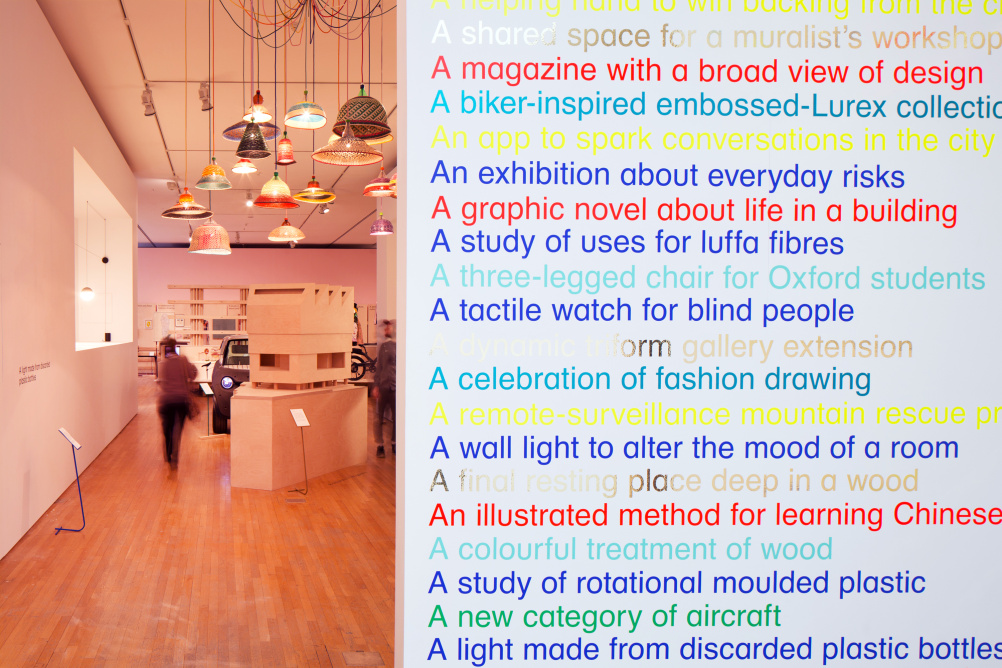
With work ranging from huge architectural projects to neat identity design to edgy fashion creations and fun digital apps, the 76 nominations for this year’s prize collectively articulate how messy, sprawling and all-encompassing design, as a wildly broad discipline, truly is.
This year, the exhibition is displayed according to a new set of ‘themes’: Connect, Care, Thought, Situation And Delight. A set of neat ‘headlines’ above each project gives a quick description of it (eg ‘a tactile watch for blind people’; ‘a graphic novel about life in a building’). But still, the work refuses to be neatly siloed into category for judgment. Surely all design, in some way, should delight? And by its very nature, connect?
And the sheer weight of projects on display means there’s something of a self-conscious jolt to move from, for example an identity for an arts institution to projects created to save lives at a very basic, human level. While it’s clearly not the Design Museum’s intention to force us into judging one’s merit against the other, it does create a sense of unease – and as a viewer, it’s tricky to snap between looking at things through aesthetic metrics one minute, and social ones the next.
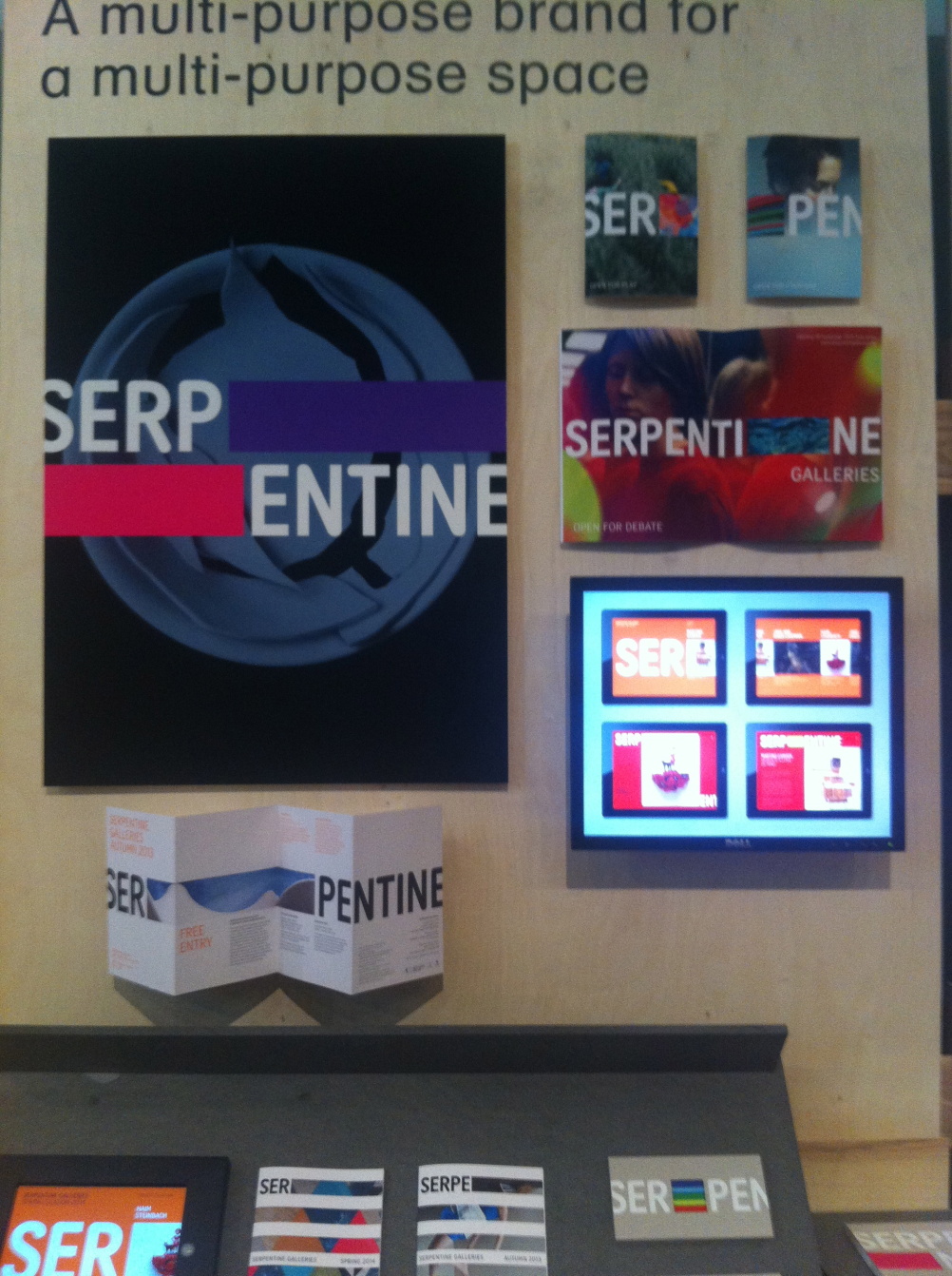
For instance, projects such as Experimental Jetset’s ‘responsive’ Whitney Museum identity and Marina Willer and Brian Boylan’s Serpentine Galleries identity – a gorgeous piece of work that comes alive with each one of its multiple applications – are displayed directly opposite projects like the Makoko Floating School in Nigeria. The school, designed by NLÉ and the Makoko Community Building Team is a floating structure prototype designed to address the specific needs of the lagoon area in Makoko, Lagos. Another such life-changing design in the Architecture category is Tezuka Architects’ Child Chemo House in Kobe, where children undergoing chemotherapy treatment can stay with their families, aiming to create as normal and serene an environment as possible under such circumstances.
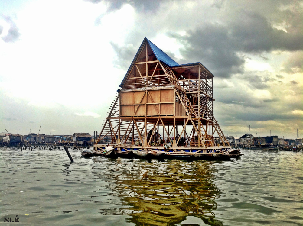
Source: Photo by NLÉ
Makoko Floating School – Designed by NLÉ, Makoko Community Building Team
Another nomination taking an innovative approach to children’s healthcare is Chair 4Life, created by a team including Bruce Renfrew, James Williamson, Shaun Philips and Michael Philips of the Leicester-based Renfrew Group. The chair was created for the NHS to be used with children aged four to 18, and uses a modular form that can be fully customised to suit the user. It grows as the child does, and takes into consideration a number of issued often overlooked in designing for disabled young adults.
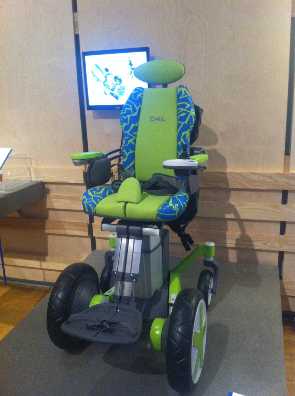
‘People don’t think about rites-of-passage like being served a drink in a pub’, Michael Philips says. As such, the seat can be adjusted to standing height, allowing direct eye contact with able-bodied adults. ‘One child said that having the chair was like all his Christmases had come at once’, Philips adds. That, surely, is testament to great design.
Source: Photography by Colin Streater
Iro by Jo Nagasaki for Established and Sons
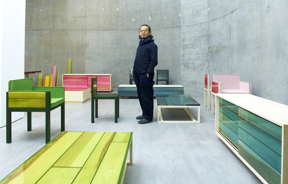
Moving on to a piece that is more about aesthetics and form, the Iro collection first caught our eye at Established & Sons during 2013’s London Design Festival. The pieces are designed by Jo Nagasaka, and take their name from the Japanese for colour. Brightly coloured resin is used over wood to create a beautiful translucent look for the sleek, minimalist range.
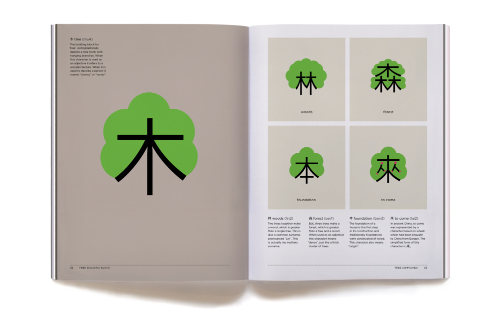
One project that explicitly looks to help people, and look beautiful, is Chineasy, which uses gorgeous, bold graphics created by illustrator Noma Bar and Chineasy founder ShaoLan Hsueh to help people learn Chinese. It’s a lovely project in its simplicity, showcasing Noma Bar’s brilliantly imaginative manipulation of text characters into cute, personified characters in their own right, and proving design’s capability to educate through beauty.
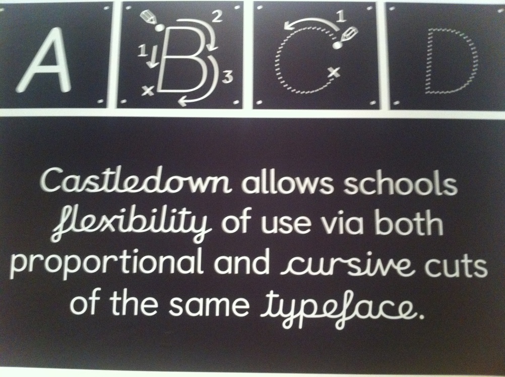
Among the other graphics projects we love is the Castledown Primary School Type Family, designed by Anthony Sheret, Edd Harrington and Rupert Dunk of Colophon Foundry. The typeface was initially created as a bespoke typeface for the Hastings-based school, but has since been developed into a system that aims to unify typography throughout UK primary schools, forming a system that’s easy for dyslexic children to use and creates a neat typographic system to be used in learning handwriting, school stationery and all other aspects of primary education.
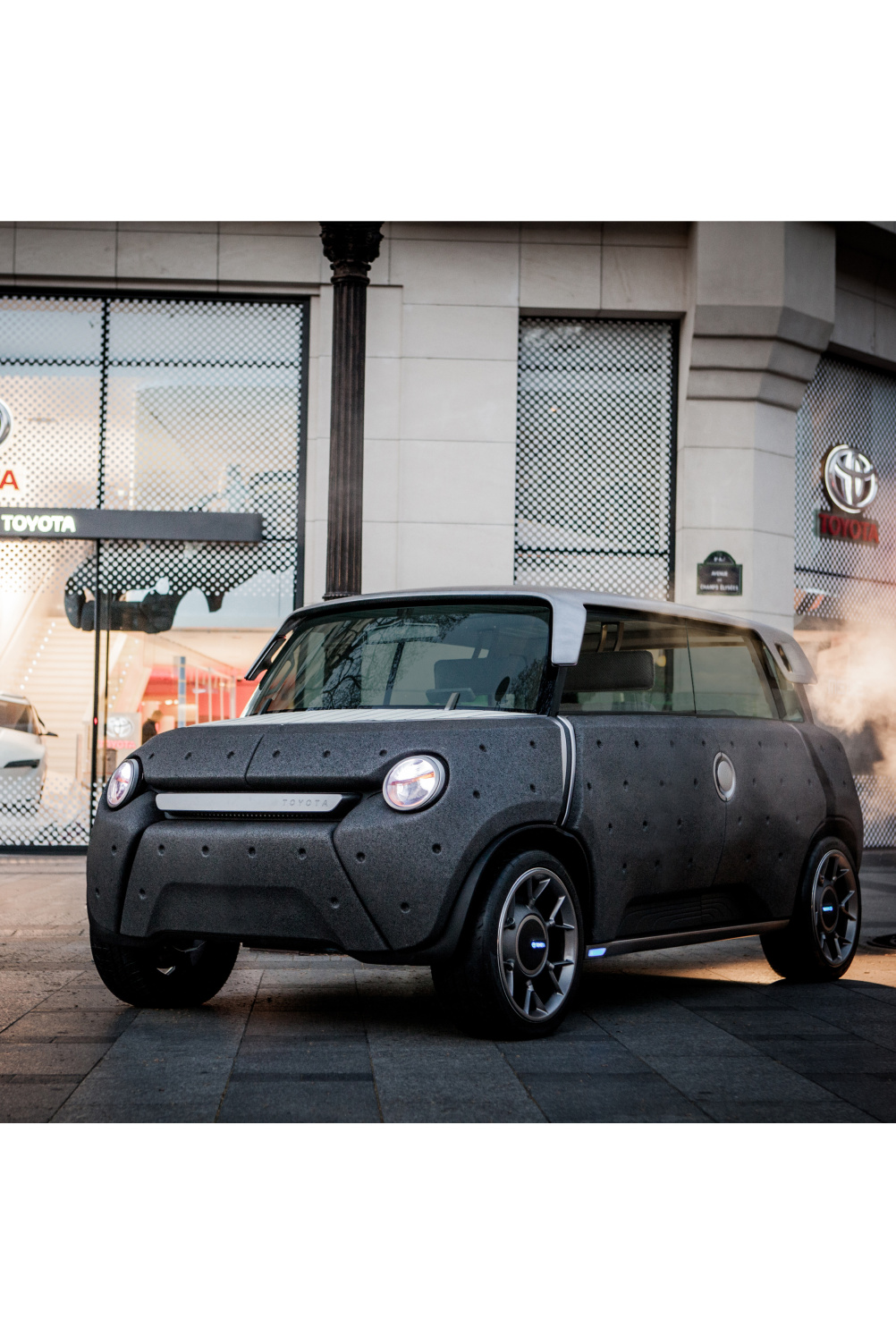
This is the event’s seventh year, and for the 2014 edition, things feel somewhat smaller. While aeroplanes fly overhead (e-Go’s Songle Seat Aircraft) and we’re surrounded by cars (Massaud & Toyota’s Me.We: Forward-Thinking Car, Volkswagen’s XL1) and bicycles (A2B’s Obree Electric Bike, Section Zero’s Ifmove Bicycle), compared to last year’s Designs of the Year, there’s a sense things have been scaled back. Indeed, there are 76 projects to last year’s 90, but that aside, there still seems to be a less busy feel to the show.
It’s disappointing to see how the various architectural projects have been displayed, for instance – and while this always seems to prove difficult, showcasing the impressive nature of projects such as John Pawson’s St Moritz Church interior renovation or David Chipperfield’s Museo Jumex musuem for Mexico City in a gallery setting, we feel that more could have been done to articulate them to the viewer.
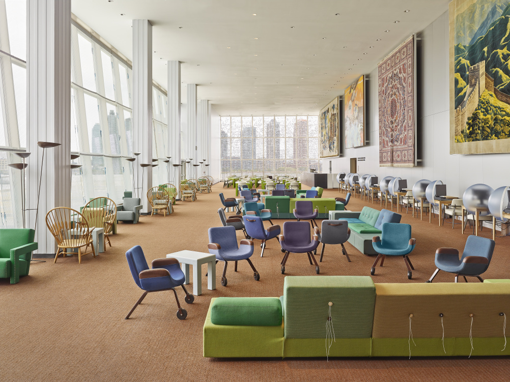
Source: photograph by Frank Oudeman
New Interior For United Nations North Delegates’ Lounge (New York) – Designed by Hella Jongerius, together with Rem Koolhaas, Irma Boom, Gabriel Lester and Louise Schouwenberg
And while it’s probably impossible in such a space to display an interiors project – such as the UN North Delegates Lounge, created by a Dutch team led by Hella Jongerius – its representation as a flat photograph is something of a letdown.
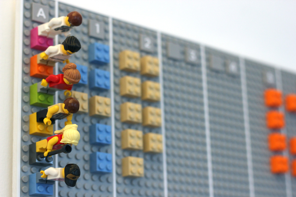
Source: Photographs By Adrian Westaway
Lego Calendar designed By Adrian Westaway, Clara Gaggero, Duncan Fitzsimons, Simon Emberton
Still, it’s always fascinating to see these wildly varied projects jostling together to compete to be named Design of the Year. Whether it’s a digital project such as the charming Lego calendar, the talking street furniture of Pan Studio’s Hello Lamp Post or One Life Remains’ never-ending Generations game – or a life-changing product such as the ABC syringe by Dr David Swann, designed to prevent users injecting with dirty needles – we daren’t guess.
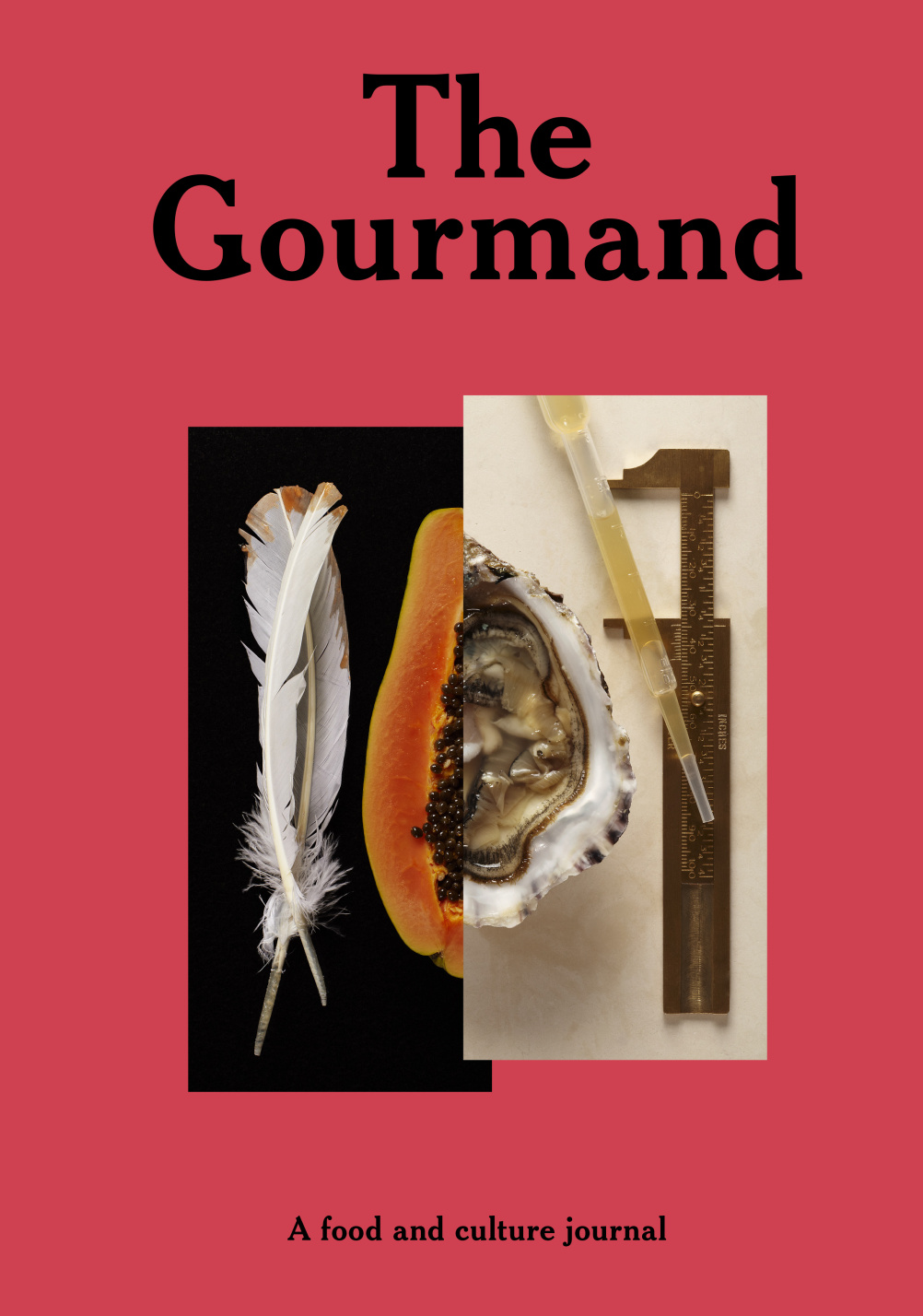
Source: photo The Gourmand
The Gourmand – A Food and Culture Journal – Created by David Lane (Creative Director), Marina Tweed and David Lane (Founders/Editors-in-chief)
Category winners and the overall winner will be announced later in the year.
Designs of the Year is on show from 26 March – 25 August at the Design Museum, 28 Shad Thames, London SE1.
Read this next

-
Post a comment


