John Spencer updates Survival International identity
John Spencer of Off the Top of My Head has updated the identity for Survival International, an organisation that promotes the rights of tribal people around the world.
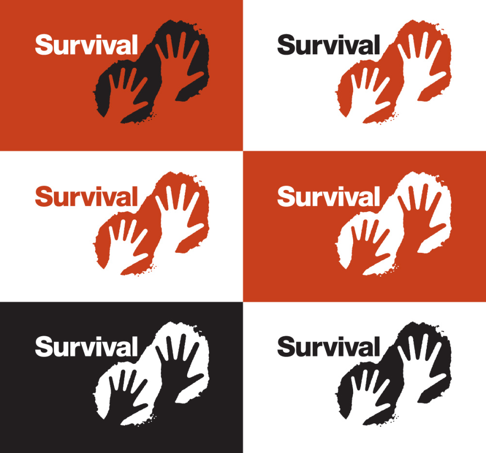
Spencer created Survival’s handprints logo in 1990. He says, ‘It speaks of people’s common ancestry. It says, “This is my mark, this is man”.’
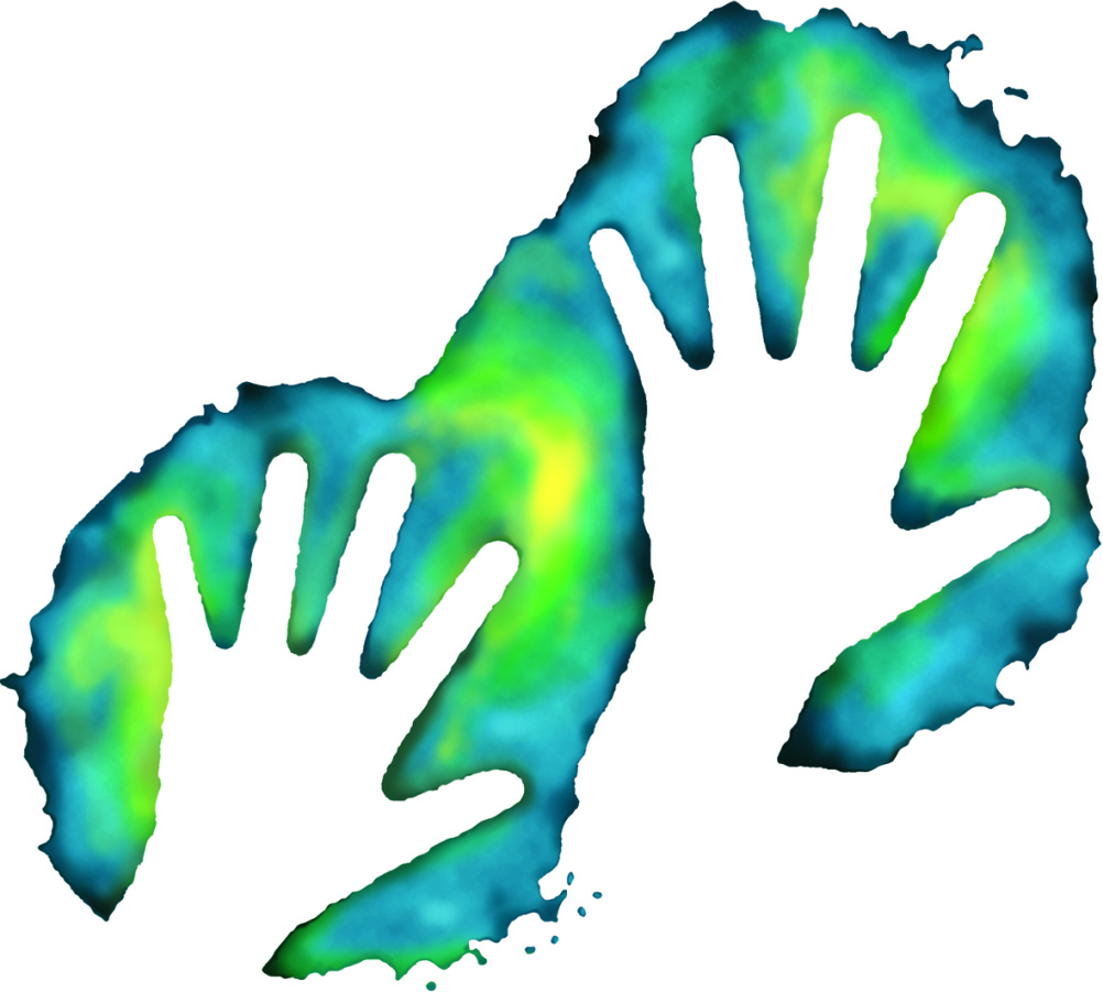
Working with fundraising and communications consultant Alice Devitt, Spencer has now refreshed the identity and developed a series of ‘supergraphic’ reinterpretations of the logo.
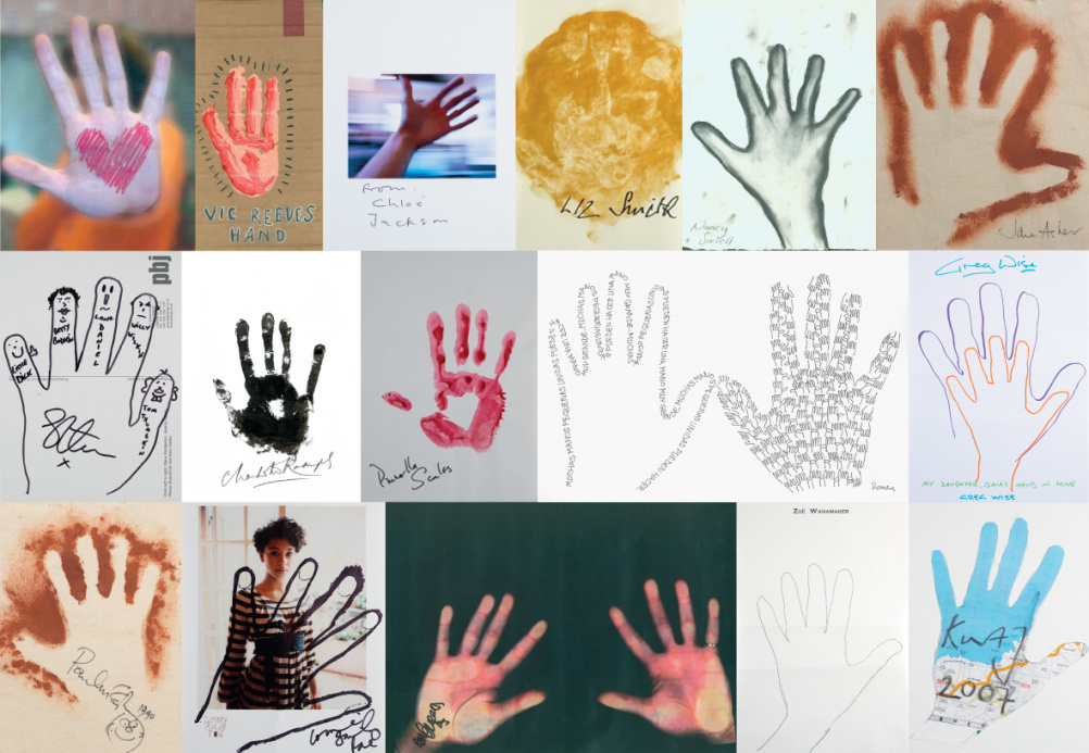
A host of celebrity Survival supporters, including Joanna Lumley, Paul McCartney and Vic Reeves, have donated their own handprints, which will be used in the organisation’s campaigning materials and merchandise.
Spencer says, ‘Survival is an amazing organisation. Their work is preventing the annihilation of tribal peoples.
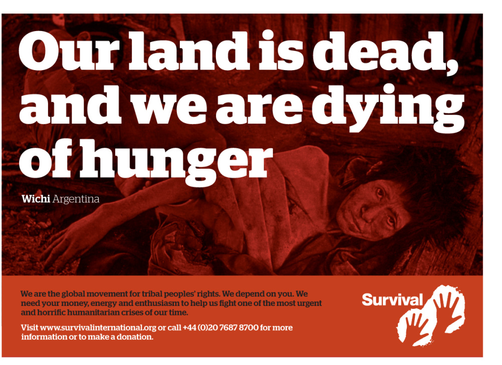
‘Survival’s new identity gives tribal peoples a platform to speak to the world. It gives “tribal voices” the opportunity to tell unforgettable stories of genocidal violence, slavery and racism, and the theft of their lands, resources and labour in the name of “progress” and “civilisation”.’
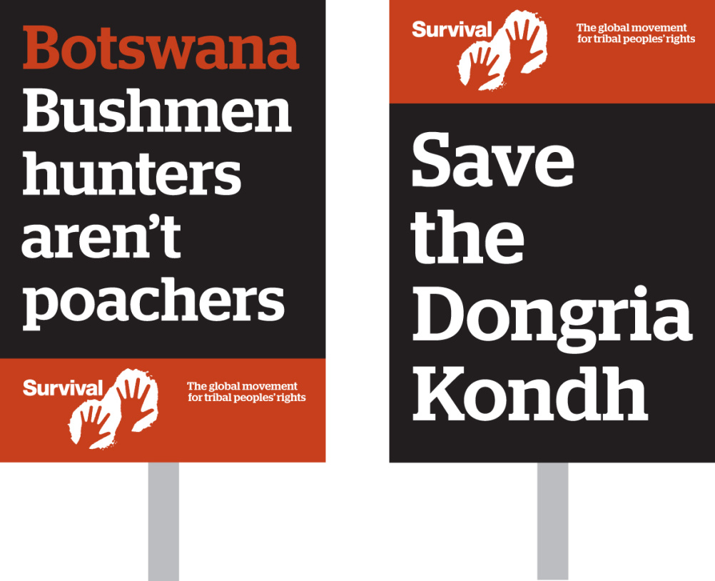
Spencer and Devitt are now working to update the Survival website, as part of an ongoing relationship with the organisation.


The use of ‘others’ handprints is nice for errr… global ‘reach’ the rest from Id to colour is just awful!
I like it a lot. A strong, simple concept that’s stood the test of time as the centrepiece of Survival’s message. The latest tweaks are excellent. From ID to colour it’s great.
The ID and colours of the tweaked identity and the supergraphic have a wonderful ‘earthiness’ that really brings home the core message of the organisation. The update has continued the identity’s lasting relevance.
Tom’s comments (both) Really!!?
What’s working, the dirty colour palette, use of different typefaces which don’t work together or the clumsy marque (which doesn’t sit well in any of the examples) or the supergraphic which now has a ‘psychedelic rave treatment’ applied?
I appreciate it’s a worthy cause but the design doesn’t promote this.
The ‘Charity Terracotta’ aside the logo could mean anything from abused kids to Bear Grylls – why two hands… why two left hands?
The overuse of the brand bar because of the lumpish logo – and the easy BIG statements.
The photo used says more to me than everything shown yet is used as a muddy background.
It really doesn’t look as though the left hand knows what the (left) right hand is doing!