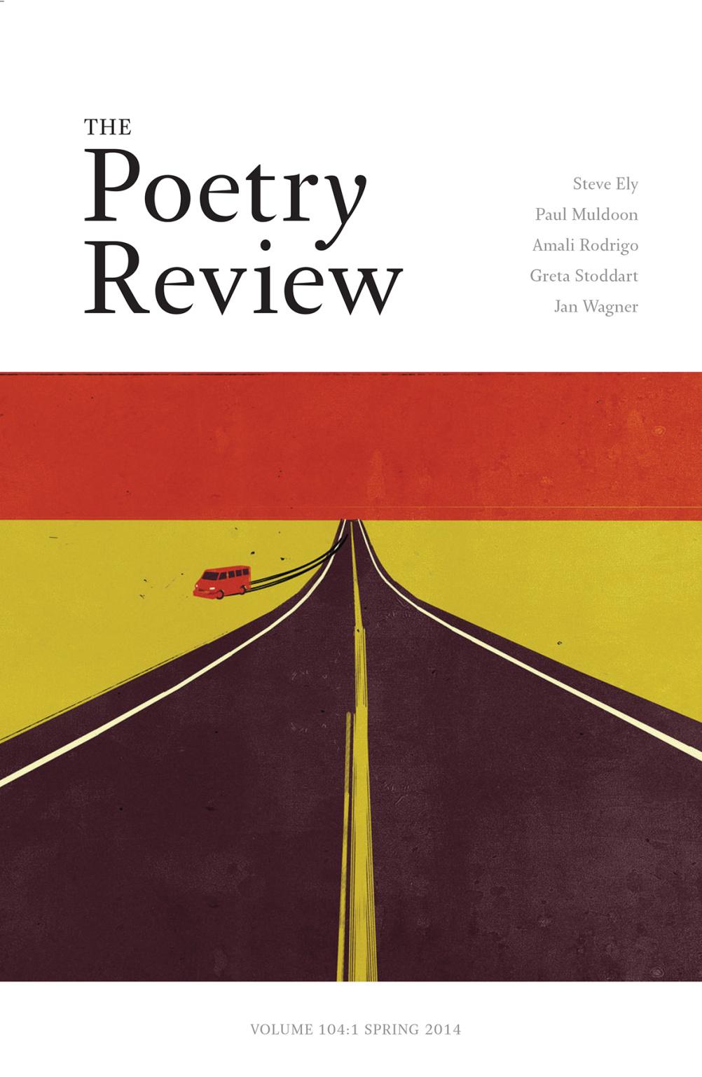
The Poetry Review redesigns – ‘a tad retro, very 21st century’
The Poetry Review – the magazine of the Poetry Society – has undergone a redesign which is described as ‘a tad retro and very 21st-century’.

The redesign has been led by designer Liam Relph and has brought in a new format, new typeface and reintroduced ‘The’ to the title for the first time since 1969.
The quarterly Poetry Review was first published in 1912 and this is its first redesign for more than ten years.
Relph says, ‘From the outset it was very clear that everyone involved shared the same passionately held belief that we needed to revitalise and modernise the look of the magazine whilst ensuring a direct link to its rich design history.’
The magazine is being relaunched in a new ‘pocket-sized’ format, while the Arnhem typeface is used. Arnhem was designed by Fred Smeijers in 2002 for foundry OurType.
The cover of the relaunch issue features an illustration by Dutch Uncle illustrator Shout.
Editor Maurice Riordan says, ‘Just a tad retro, and very 21st century, The Poetry Review now brings the reader the tactile familiar quality of a print magazine with an up-to-the-minute design’.
The new design will be launched with The Poetry Review’s Spring issue, which is published on 28 March.


I am a 7 Times Internationally Published Award winning Poet How do I get my work in your Publication and do you pay for the work?
Please send me a copy of ur latest poetry issue