Double trouble
With the unveiling of a new Olympics 2012 design element invariably comes a wave of instant feedback – armchair critics casting snap judgements on effectiveness and aesthetics.
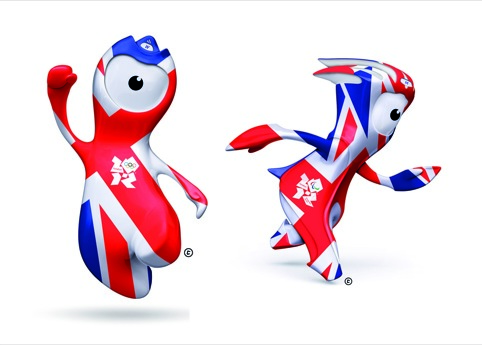
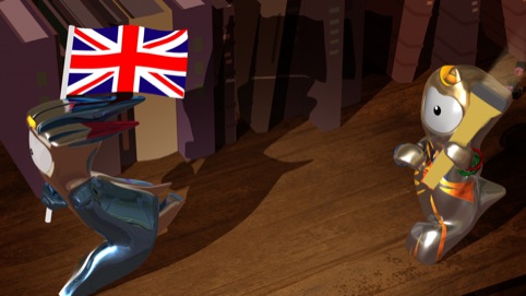
Thus the new Olympic and Paralympic mascots, designed by marketing and advertising agency Iris, were welcomed with a brouhaha of public opinion.
Online comments in response to national newspapers’ stories – from the Guardian to the Daily Mail – are predictably incredulous, and the Metro reports that the mascots are already facing a ‘Twitter backlash’.
However, some blogs in the creative sphere are more considered – even positive. On the Imagemakers blog creative consultant David Revel writes that mascots Wenlock and Mandeville ‘rank among the best examples of Olympic mascot design’ – although they still fall short of Cobi (designed by Javier Mariscal), he adds.
The Creative Review blog, concludes that ‘Iris’ monocular characters have just the right balance of digital zeitgeist and cheeky playfulness about them’, although the lively blog comments are somewhat split in their verdicts. James Jarvis, who was on the shortlist to design the mascots, reckons, ‘I feel these guys seem too clean, a bit lacking in warmth and character. Obviously, it’s not a patch on what I was working on…’
Meanwhile, Jim Prior, chief executive at The Partners says ‘they are not so bad’. ‘They look weird enough and fun enough to engage the attention of kids, and having Michael Morpurgo’s story to accompany them is an excellent idea,’ he adds. ‘Critics of these things should lighten up a bit. Like cats on the internet, it’s not like they’re going to do anybody any harm.’
What do you think?
Read this next


I love ’em. Everthything about them. I love the names, their back story, their look. Great stuff Iris. I think the world will love them too. For my full opinion, see my blog post http://crocodilejock.posterous.com/wenlock-and-mandeville-my-thoughts
for all the fun everyone has had revising them, the mascots are pretty fluid and quite appealing when animated – the thing that killed it for me was the cringe-worthy Morpurgo back story, not the design of the characters.