Brighten the Corners creates Anish Kapoor website
Brighten the Corners has created a new website for artist Anish Kapoor, which the consultancy describes as ‘plain but dense’.
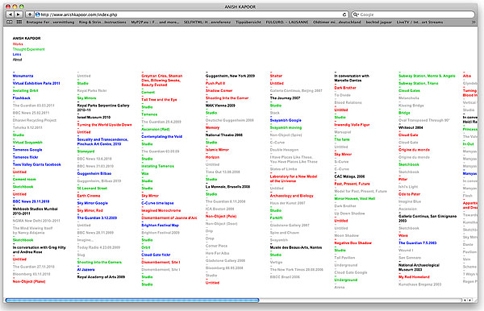
The site’s homepage features a purely typographical list of contents, which is updated chronologically. Clicking on one of the text links will take the visitor through to a range of content – a work, a text, an exhibition, a public link or a ‘thought experiment’.
Brighten the Corners designer Frank Philippin says, ‘We wanted a plain website that you could lose yourself in – plain but dense. It was also important to really under-design it, so that the emphasis was truly on the work.’
The consultancy’s Billy Kiosoglou says, ‘Anish doesn’t like the idea of using thumbnails of works as they can reduce the visual impact. Also, the titles of his works are quite playful, so they work quite well as links.’
Kiosoglou adds, ‘The content can speak for itself, so the design was focused on organising it in an appropriate way, rather than presenting it in a certain light.
‘We have always found site maps really interesting, as they are often better designed than the website itself, so I guess you could say that we’ve done both a website and a sitemap in this case.’
The links from the homepage are categorised with different colours, and individual pages link together, so that the user can form their own path through the site. Kiosoglou says, ‘Anish wanted people to be able to explore the site – you can get lost in it.’
Kiosoglou says Brighten the Corners has been working on the site for around eight months, having worked with Kapoor on other projects including catalogues. The site launches this week.
Read this next

-
Post a comment


