Aesop redesigns Ribena Light packaging
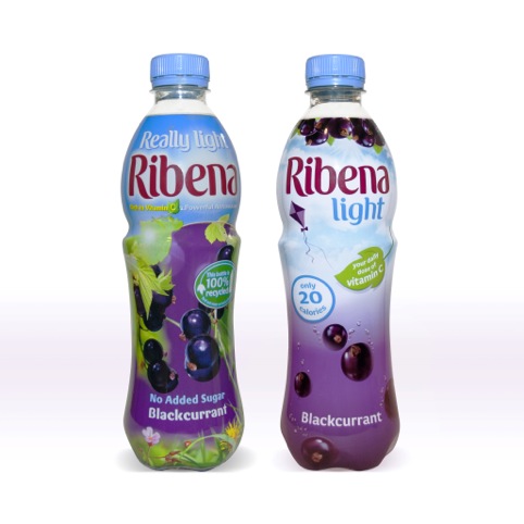
Aesop has created new packaging for Ribena Light, which replaces Ribena Really Light.
The consultancy has previously worked with the GlaxoSmithKline-owned Ribena brand on other projects including packaging for the new Ribena Plus products in February this year, and began work on Ribena Light this summer.
Martin Grimer, Aesop executive creative director, says, ‘We wanted to build on the equity and history of Ribena – it wasn’t about throwing the baby out with the bathwater, it was more about modernising it and making it feel light.’
The new packaging aims to appeal to the drink’s target audience of ‘busy professional young women’, according to Aesop. The blue-sky colour has been lightened to demonstrate the low-calorie quality of the product.
Grimer adds, ‘It needed to look light but still tasty, so we used the Ribena sunshine and fruit. The sky tells a story of lightness, with the berries floating up, which show the taste values.
‘It looks more relevant and contemporary in its execution with the less heavy colouring.’
The new packaging is rolling out from this week.
Read this next

-
Post a comment


