Alternative Olympic posters
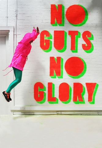
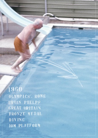
An all-star cast of graphic designers have created ‘alternative Olympics posters’ for a new show, Fit, opening this weekend.

Curated by Jonathan Barnbrook and Vaughan Oliver, designers including Neville Brody and Alan Kitching were tasked with creating posters inspired by London 2012 – or, more accurately, its well-documented design-related oversights.

It’s been no secret that some people have been somewhat disillusioned with the official Olympic logo, and the process by which the official London 2012 posters were commissioned, featuring, as they did, the work of artists rather than designers.

However, the show aims not to make a complaint about these various issues, but to highlight the huge amount design talent Britain has to offer – even if said talent was overlooked in creating the logo and poster designs.


Fit: London 2012-Inspired Posters by Contemporary British-Based Graphic Designers, is at Lethaby Gallery, Central Saint Martins, London WC1, from 2-9 July, and Window Gallery, Central Saint Martins, London WC1, from 2 July-30 August.


As a designer and Olympic enthusiast, think this looks great and definitely want to see. However, any info on where the exhibition is and dates? Not showing up on my screen.
Wow, hilariously bad.
Is this meant to highlight the huge amount of talent Brtain has to offer? It’s no wonder that said talent was overlooked!
You pulling my leg?!
We all have our own interpretations of what’s good / bad when it comes to design, but I’m struggling to answer what on earth these posters mean to anyone other than those that created them?
In the broader sense, how are these any different from the posters artists created not so long ago?
Perhaps we need alternative designers to create some alternative alternative Olympic poster designs. But, designs with a purpose this time.
There was quite a lot of grumbling by graphic designers when famous artists were chosen instead to provide the official 2012 posters.
Judging by these examples, it now looks like a pretty shrewd decision.
What miserable comments. I think we need to know in what sense “alternative” is meant here. If the show is “not making a complaint about these various issues”, then does that mean the posters are just those that could have been the ones chosen to promote the Games, or do they an alternative rhetoric on the Games? If so, then thats the criteria to judge them, but the brief is not clear in this piecel
Ummm… I’ll take most of the official posters over most of these any day.
‘Judging by these examples it now looks like a pretty shrewd decision’, judging by the comments so far, other graphic designers are as usual first to slag people from their own profession whenever anybody dares to be pro-active about a subject many people have had issue with. Well done ladies and gentlemen you are doing our profession proud.
I’m with Jessica on this one, sure they’re not ‘promotional’ but they are alternative and for that I like them. I think I’ve had about enough of the ‘WOO OLYMPICS!’ the Media are shoving down our throats at the moment, it’s good to see something inspirational for thems that preferred art to p.e. at school.
The critics here are clearly unaware that all the contributors have given their time for free and that all the money raised is going to support students? Bravo!
Miles: Critics are unaware because it hasn’t been reported. Where is that information from?
Unfocussed complaining is uncritical. I’m happy to see a constructive response to the London 2012 graphic design void.
even if it’s “alternative” it should still be clearer that there is a link beween the poster design and the ethos/actual olympic events etc.. otherwise there is no point as the brief was not answered. Constructive criticism is better than plain destructive criticism, but then that’s harder to do….I had a go. If the posters were communicating with the general public about the Olympics the message would not have been clear.
There still seems to be a widely held misunderstanding regarding the ‘official’ Olympic posters. Something that the design press has rather unhelpfully done little to resolve.
The work done by the selection of artists for the ‘official’ posters follows on a long standing tradition of using artists to produce prints as part of the cultural side of the Games. These are not posters in the traditional sense as they are not intended to communicate any information about the Games.
There was indeed much moaning by designers that they were overlooked in favour of artists. The design press should have been more accurate in their description of the purpose of these prints.
I do however think that there is a massively missed opportunity on behalf of the organisers to use designers, and the outstanding talent that UK designers have to offer for the actual 2012 posters.
As far as these alternative posters go, I would say that they are no different to the artists ones in terms of content/ideas. Perhaps with just a bit more type.
Justabittafun, it should be open to all to have a go.
“Fit” by Willer and Osborne is the stand out piece here for me. I like that it strikes a balance between the use of bold horizontal stripes (which seem to subtly reference the tube) while the word “FIT” makes an obvious connection to the Olympics itself. It had a lovely colour scheme to boot.
I’ve done a few posters for an Olympic related event myself, if anyone wants to have a look
http://cargocollective.com/supertara/Lightspeed
I have done one too. I would love you to see it. It is really retro-alt.