Book designer Jon Gray on creating The Yellow World
We’re all aware of the well-worn phrase, admonishing us not to judge a book by its cover. However, if the cover of the book features absolutely no text whatsoever – and the most simple of designs – how are we to judge it at all?
It was a gamble book designers Jon Gray (also known as Gray 318) took on his latest project, designing the cover for The Yellow World by Albert Espinosa.
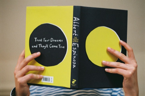
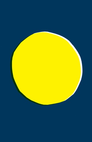
The cover is simply a yellow circle, centered in a screen-print –like style over a navy background.
Yet while it’s no ordinary cover, the pages within form no ordinary book, either.
Author Espinosa is a cancer survive, but rather than writing about the experience of overcoming his illness, he chose to write about his ‘yellow world’ – an imagined space that each individual can create for themselves, living in a world that makes them truly happy.
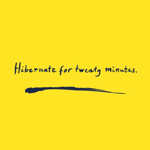
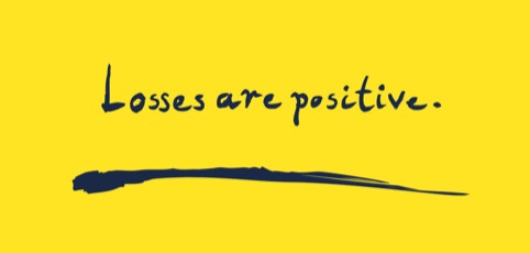
Divided into 23 chapters- or ‘discoveries’ – each section offers irreverent advice infused with an optimism and a sharp undertone of black humour. Discoveries include ‘hibernate for twenty minutes’, ‘listen to yourself when you’re angry’ and ‘positive wanking.’
We spoke to Gray about his career and the challenges of designing the cover for such an unusual book.

How did you first get into designing book covers?
I got a summer job at Little, Brown and then when I left college I was lucky enough to be offered a job there. Since then, apart form the odd commission it’s been all books.
What was the first cover you designed?
I can’t remember the exact book, but I do remember working on funny man Jim Davidson’s memorable biography The Full Monty. A truly memorable photoshoot with one of Britain’s best-loved comedians.
How would you describe your style?
Messy, eclectic, often type-driven.
What’s the best project you’ve ever worked on and why?
I have worked on many things that I’ve enjoyed. Jonathan Safran Foer’s books are always fun to work on because he is very enthusiastic to try new things and so are Penguin.
And the worst?
Did I mention I’ve worked with ‘one of Britain’s best-loved comedians’?
Are there any books you’d love to design the covers for that you haven’t? What would you do?
I have been really lucky in the jobs I have been given and I’ve been given the chance to design for a lot of my favourite authors. As to books that I haven’t worked on: anything by Don DeLillo or Thomas Pynchon. Catch-22? There are lots when I think about it. I’d also love a go at some classics or some poetry.
What piece of advice would you give to people who want to become book cover designers?
Just get stuck in. Work on some stuff at college, enter the various publishers’ competitions, write, email, harass, beg. Designers in publishing are often moving on to other publishers and vacancies do appear. Put yourself on their radar. Try for an internship.
What was the brief for The Yellow World?
The brief was: ‘read this amazing book and please give it an interesting cover’. I’m really lucky in that Jim Stoddart, the art director, gave me pretty much free-reign. I designed a few treatments with type on the front and Penguin were brave enough to pick the one without.
Why did you respond as you did?
I suppose I thought that there was something appealing in the big yellow ball. Rather like Olafur Eliasson’s giant sun at Tate Modern a few years back. It’s warming and comforting on the eye. I also thought it would stand out against other books and without type would make you want to pick it up and find out more.
What have other people’s reactions been like to the design?
I’ve been quite astonished to be honest. People have been very complimentary. It’s one of those designs that took so little time to execute but people have noticed and sent nice emails about. I spend a lot of my time doing quite detailed, fiddly things and so to strip something back to a very basic idea and have it appreciated is great.
What current trends do you see in book cover designs?
I don’t think there are any major trends at the moment, it’s all pretty disparate and desperate. The market is incredibly tough and publishers are scrambling around to make anything sell. There is a lot of copy-cat I suppose. When 50 Shades of Grey does well then suddenly there are 50 more just like it. People are nervous of appearing different and there is a lot of second guessing.
You can see more of Gray’s work at http://gray318.com/ and get more information on The Yellow World here
Publisher Penguin has also kindly offered Design Week readers a discount on the book for today only (7 December) . It’s available on the Penguin website with the discount code ‘PenguinAdvent’


[…] * Here’s a link to an article on the design of this book-cover: https://www.designweek.co.uk/issues/may-2012/book-designer-jon-gray-on-creating-the-yellow-world/ […]