BrandOpus creates new look for Lil-Lets
BrandOpus has rebranded Lil-Lets feminine hygiene brand, creating a new identity and 2D and 3D packaging.
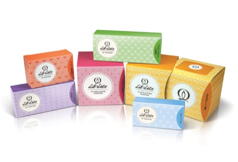
The consultancy was appointed to the project in November last year, and was tasked with creating a new identity and packaging designs to ‘match the shift in positioning to focus on discretion and femininity.’
BrandOpus created a new GEM icon, which will be used across all packaging. The symbol aims to representing femininity and is derived from ‘cross cultural symbols for the Goddess, the Earth and the Moon’, according to BrandOpus. This is informed by research into the lunar cycle, which is said to coincide with many women’s menstrual cycles.
The Lil-Lets lettering has been slightly tweaked, replacing the heart symbol above the ‘I’ with a dot, though it remains largely unchanged, To create discretion at point of sale, the new packaging is influenced by beauty products.
Kate Jones, designer at BrandOpus, says, ‘We wanted to create a symbol that referenced lifestyle brands such as Chanel and Gucci, that feature a strong identity that doesn’t require the word mark for the consumer to recognise which brand it is.The result is something really feminine and positive, which creates quite a lot of energy.’
The new packaging uses less material and can be made more discrete by removing the outer layer. The range now uses a consistent palette of six colours across the different products to denote absorbency to increase clarity for users.
Jones adds, ‘What [Lil-Lets] really liked about their previous packaging was the discretion and femininity. A lot of feminine hygiene brands are like doctors in white coats – it’s a solution to a problem – but we wanted to create something that didn’t scream “functionality”.’
The new packs will launch next month, when two new products, including teen liners, will also be introduced.
Read this next


The influence of Moxie http://moxie.com.au/moxie-me/ ? Their ‘boudoir’ packaging used to really stood out on the shelves.
Is it me or does the ‘GEM’ symbol look like a vagina?
To me it looks old fashioned and we’ve come a long way from women’s bodily functions being hidden and a shameful secret. I’d prefer a celebration of real woman not myth or ideal but woman unabashed
I find that their current branding fits the ‘discretion and femininity’ description better than this does – plus I also agree the symbol looks suggestive…
The Goddess, the Earth and the Moon?!..
Not sure about this – the last incarnation was beautiful, this one isn’t as playful with the nice tubs and bows, AND it has a not-very-discreet logo of a vagina on it in case anyone is any doubt about what these are for.
I think its really simple, feminine and sophisticated without being as fussy and girly as their current packs.
The previous redesign from last year was by far better than this, it had a sophisticated elegance and charm similar to Moxie, without looking stale and old fashioned as it now does – and who made the terrible decision to but vagina on the pack!? Oh dear.
What’s with the giant graphic fanny?!
Kotex will always be the one of the best fem packaging. period!
fannyliscious
Finally something I can actually leave out in my bathroom and not feel the need to hide.
whilst i think the colour palette is great, very feminine and fresh looking, i do think the previous design was more attractive. and to agree with another comment posted here, the symbol really is quite suggestive!!
Previous design was so much better and so much more discreet, this design shows so many features of the old one yet feels the need to add a suggestive image for impact. I don’t think that I would be comfortable having this on display in my bathroom at all. Bring back the previous design and ditch the fanny!
I don’t understand everyone’s issue with the suggestiveness of the symbol. If it is intentional I think it is a brave departure from the usual condesending visual imagery we have come to expect with feminine care products. I also think the new design will have a lot more impact for the brand on shelf, the previous design was discreet to the point of invisibility.
I for one am happy to embrace the fanny!
I think it’s great that a design has provoked so much debate – much better than being bland. Although treading a fine line between wanting to be a discreet product and getting good stand out on shelf. I personally liked the removable labels from the last design – surely one solution would have been to keep this idea and increase the brand standout.
I’ve been buying this brand for the past 7 years, even before the previous redesign, which, agreed, was much younger in it’s appeal, and more light-hearted than this incarnation. As long as the product is good, consumers will carry on using it, however the boxes are branded.
They’ve muffed that right up!