BrandOpus rebrands Butterkist popcorn
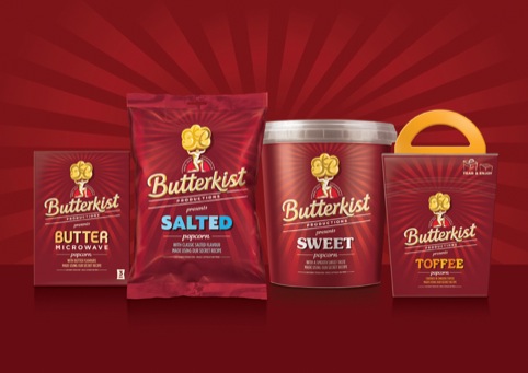
BrandOpus has rebranded Butterkist popcorn, creating new designs that align the brand with its cinema heritage.
The consultancy was appointed by confectionary producer Tangerine, Butterkist’s parent company, in February this year.
The brand was initially created in America in 1914 and first arrived in UK cinemas in 1938, and the new branding looks to this age of cinema for visual cues.
As such, the new branding positions Butterkist as a ‘popcorn production company’, with packaging inspired by ‘the visual language of the classic film production logo’, according to BrandOpus.
Different typographic styles are used across the different flavour variants to give individual, ‘film-like’ personality to each product and to add differentiation, according to BrandOpus.
Avril Tooley, BrandOpus client services director, says, ‘We were challenged to create a distinctive and ownable look and feel for the brand, and we have succeeded in setting it apart from the competition, by building on Butterkist’s iconic heritage.’
The new branding launches from this week.


It feels far away from the fun loving brand we all know!
‘The fun loving brand we all know!’? This was in total need of a re-fresh, it looked dated, and about as fun as stale popcorn. The new ‘Atlas’ icon is just brilliant. I love it. This makes me want to buy Butterkist.
what’s inside? them posh crisps that cut the roof of your mouth?….oh, if you look hard enough it says popcorn! It does capture a classic era of cinema which is nice. And it certainly removes it from the 10p crisp isle now!
I agree with Anonymous #1. Butterkist has completely lost that bold and fun loving look/feel that I remember through my childhood. The design needed to evolve not disconnect from everything it has achieved and became throughout its life. This design bores me. Surely kids and young couples don’t want to see a dull, muted retro design. It looks stale and obvious. Friday family film night will never be the same again!
think of the fun they could have had with different film genres – “thriller”, “Romance”, “Comedy” etc
As lovely and simple as it is there’s no strength behind it (not literally relating to the popcorn muscle man). I’m a lover of vintage/retro but I think I may just walk past this. For an FMCG brand it’s simply too simple. Besides, if all brands turn vintage/retro then what will we have left that’s different?
For all those against the new design.. What would you prefer to see for the Butterkist identity?