Designing the Rio 2016 Olympics
This weekend, as part of the London 2012 Olympic closing ceremony, the Olympics will be handed over from London to 2016 host Rio de Janeiro in Brazil.
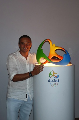
Fred Gelli, creative director of Tátil, the Brazilian consultancy that created the Rio 2016 Olympic and Paralympic branding, will be watching as his group’s identity officially comes into use. Design Week caught up with Gelli to discuss the 2016 branding and what he thinks of the London 2012 identity.
Design Week: What brief did the organising committee give you for the Rio 2016 Olympics identity?
Fred Gelli: The brief involved 12 different attributes that the organising committee said this logo should have – like that it should represent Rio in the future and that it should be for all 6 billion people in the world. The first time we saw these 12 attributes we said, ‘It’s impossible to get all of this into a single logo.’ We came to the conclusion that the identity had to focus on some single points that would really represent Rio’s soul.
DW: So how did you develop a focus for the identity?
FG: We defined four pillars that we call brand direction – like a kind of compass that guarantees that all of the expressions will be connected with the soul of the brand. These four pillars are: our exuberant nature; the captivating energy this logo should show; the multiplicity of our culture; and the Olympic spirit.
DW: And how did you create the logo from that?
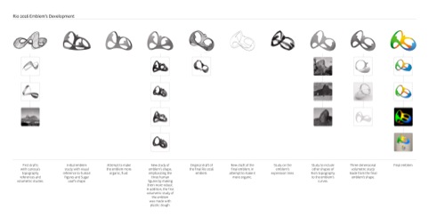
FG: We decided to do the project in a very particular way. We are a big company in Brazil – 130 people in two offices – and we decided everyone should work together on this. When I’m taking about everybody I’m not just talking about the designers but people like the receptionists as well. I remember one day I invited Josangela our receptionist to look at some models and said, “Can you see in this logo Rio in the Future?’ and she said, ‘Hmmm no Fred, I really can’t see this.’ It was important for us that this was a logo for everyone, not just for designers.
DW: How did you come up with the idea of a 3D logo?
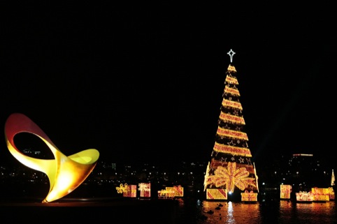
FG: One day I was at the Lagoa Rodrigo de Freitas – a small lake in the centre of Rio with many mountains around it. And I realised that Rio is a kind of sculptural city – I’m in the middle of this big sculpture. I understood then that it would be a very interesting approach to design a sculptural logo for a sculptural city. As well as this we also considered that the logo had to work well until 2016, across different devices. And also for products it’s very interesting to have a 3D logo. We also wanted a new way to represent the Sugarloaf mountain [whose shape is referenced in the logo] in a new way. So many Brazilian brands use this image, and we wanted to use the same icon but in a new way.
DW: Some people have mentioned that they can see the word Rio in the logo, is that something you intended?
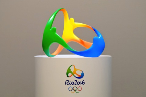
FG: No! This was another amazing thing – after we presented the logo people started to see things in it – like the mayor of Rio at the launch he said, ‘I can see Rio there,’ I was like, ‘Really, where?!’ There is a concrete meaning and a subjective meaning. So the green is our tropical forest and also represents our hope, the yellow is the sun, and also our warm and welcoming nature and the blue is the ocean, but at the same time representing the fluidity of life.
DW: How does your work on the Paralympic logo relate to the Olympic logo?
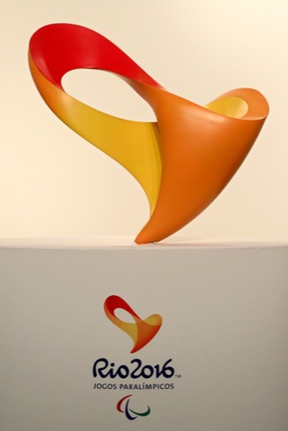
FG: The brief from the Paralympic Organising Committee was that the Paralympic and Olympic logos had to be in the same family. They also specifically requested a 3D logo. We had a lot of stereotypes in our mind about the Paralympics, but when you engage with Paralympians you lose all your preconceptions – you see the energy they have to have to go from the depths of experience, for example being in a crash and losing the ability to walk, to being at the top of the sport. We understood our logo should represent this journey, this infinite energy it must take. Another very important thing was not to use any sort of icon that represents Paralympics, like in Barcelona when they used the wheelchair.
DW: How did you develop this into an identity?
FG: We decided to express in this logo not the thing that represents our difference, but exactly the opposite – what we have in common. We decided to use two icons. One is the heart, and the other is the infinity symbol, to represent the infinite energy of the athletes. When you put this together you have a heart that beats with infinite energy. We also decided that this logo should be multisensory – for everybody. First of all it’s a 3D logo, so it already incorporates touch. To that we added a sound – a heartbeat. Connected to the sculpture is a subwoofer with vibrations, so deaf people can feel it and there is also a rhythmic light in it. We’re working on creating a smell too…
DW: Wow!
FG: There was a very emotional moment on the launch day. Ádria Santos – she’s a Brazilian Paralympic runner who has been blind since birth – when she arrived at the logo she started to touch it and felt the vibrations and she started to cry, and sure I cried too, and she said that was the first time in her career that she could feel the symbol of her life, she has been running in the Paralympics for 20 years. She said when she listened to the heartbeat she felt like it was for her heartbeat. We couldn’t have imagined that sort of response.
DW: What do you think of Wolff Olins’ London 2012 Olympics logo and how do you think it compares to yours?
FG: I’m a very close friend of [Brazilian designer] Marina Willer [formerly of Wolff Olins and now a Pentagram partner]. We were together in Rio at a lecture and she criticised our logo, saying that we didn’t use the opportunity to create something that could be a breakthrough. My answer was that I think the briefings were completely different for Rio and London, the cities are completely different and the culture is completely different.
DW: What do you think of the London 2012 logo?
FG: We like the logo – it’s very cutting edge and bold, but I do I think it has some technical problems, for example when it’s reduced the London type is lost. In our briefing the International Olympics Committee showed us many of the things that the London logo had done as things not do to. For example we couldn’t have any type within the logo – it had to be completely clean. We almost had a script on how to create a logo, based on the experience of London. The Rio organisers had obviously learned from that experience.
AM Do you think the 2012 logo represents London well?
FG: I think so – I think it represents a new London, with all the youth and all the energy and in this way it works really well. I think you as a country historically have brought for humanity many cutting-edge concepts. I feel you are a cutting-edge country and in this perspective the logo makes sense. But perhaps when you have an icon that is representing a cutting-edge and breakthrough culture then the rationale and explanation is more important and necessary than when you have an icon that is representing a culture that is very open and warm.


Really great article, it’s good to see something quite fresh in the aftermath of the 2012 disaster.
I know that W.O got a lot of jip for their 2012 logo but it’s done it’s job really well. It should everyone up and created a really visually interesting Olympics.
However, it is great to see a really beautiful and well executed identity in the making, in lien for 2016.
Can’t wait to see these two sexy little beasts in action.
I hope the Brazilian public don’t get their knickers in a twist over this Olympic logo.
I like these logos a little more now due to this article, but i still think they are both standard olympic logos. Sure the 3D aspect is a nice touch (and probably essential in a modern branding world) and the paralymic logo has a lovely story, but there’s nothing new here and nothing that doesn’t really move away from what Barcelona or Sydney created.
As for London 2012, i’ve not necessarily fallen in love with the branding at any point, but i admire its bold and unique approach and overall think it’s been a massive success.
I instantly love the Rio logo. I can’t see that it is generic at all. It’s beautiful. Being 3D is marvellous. Fred Gelli is being very polite about London 2012. Can’t believe WO had the audacity to criticise his logo. As much as I try I can’t like the London logo. If it ticks all the right boxes, and is cutting edge and different, but still not beautiful then does it work?
I think Marina Willer’s comments about this logo are patronising and elitist. As Fred Gelli points out there are basic errors in the London logo – such as including type that does’t read when it goes too small. Maybe WO think they are above this sort of detail but for your average designer these are the sort of details we get right. For all the rationalisation about the London 2012 logo it doesn’t look good which means it hasn’t worked. Design has to be a marriage of functionality and aesthetics. Get both right and you’re there.
its better than the shitty London 2012 logo by far!
I am in love with the Brazil logo! Just looking at it without reading the article (sorry) evokes emotions of what the games should be about, unity and one force. Great job Fred and can’t wait to see how this plays out in their opening ceremony
I think the Rio work is elegant and does a good job of nicely balancing the Olympic values and Brazilian spirit but I agree with Marina at WO. Why not take the opportunity to create something with standout and impact?! Whatever anyone thinks about the London 2012 logo it most definitely stands out. It’s etched in everyone’s mind for life. Previous designs are forgetful bar a few (namely Mexico). What I think is most important is how the creative concept comes to life beyond the static/3D logo. And even more so, what kind of legacy will Rio 2016 leave behind? Creatively? Culturally? Economically?
Looks like my daughters dummy. The london mark has attitude, this is web 2.0 bland.
I love the Rio logo especially when it is in 3D but then I do love the london logo to, it’s on almost everything I wear!
Pretty much better than the last one, I like the generative 3D design concept, although I’m not sure if parametricism needed to be mainstream like that. btw it could be easily printed on a cheap desktop 3d printer:)