Dressing the London 2012 Olympics
With the London 2012 Olympics now just over a week away, we’re starting to see how the Olympics identity is being applied to venues, the Olympic Park, transport routes, and the wider capital.
The identity, as you all will doubtless remember, was created by Wolff Olins and unveiled in 2007 to a rather dubious reception. Since then, the branding has been taken up by Futurebrand and Locog’s design team.
We’ve already seen Futurebrand’s work on touchpoints including the tickets and the official Olympics shops, and now we’re able to see how the branding is being applied to the Olympic venues themselves.
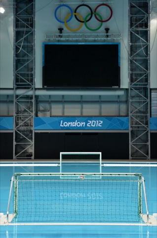
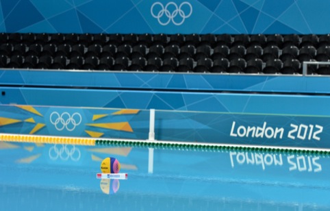
Patrick on Creative Review was last week taken on a tour of the Olympic Park to see how the branding work is bedding in, and now Locog has also unveiled images of the first fully dressed venue – the Water Arena, designed by David Morley Architects.
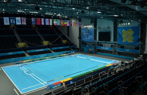
Locog says this demonstrates how the ‘look of the Games’ will be rolled out across the 32 sporting venues and 61 non-competition venues.
Further impressive stats include the boast that the designs have been applied to more than 250 000 individual designs – from medals to tickets to 70 000 individual buttons on the uniforms for the ‘Games makers’.
The Water Arena dressing shots demonstrate Locog’s colour-coding approach to venue dressing, also seen on the tickets. So blues are used for the water-sports arenas (as seen here) while purple is used at the Olympic Stadium, and oranges and magenta for indoor and contact sports including cycling, weightlifting and boxing.
Locog says it has worked with broadcasters and photographers for the last three years to create the best backdrop for the sporting action.
The venue dressing is just one part of a wider branding scheme that, according to Locog, ‘extends across every aspect of the Games, from spectator arrival into Heathrow all the way through to the colours and designs of seats in the venues’.
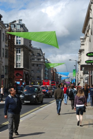
Those of you in London will have seen banners and flags appearing on London streets – like the ones hanging on Oxford Street outside the Design Week office – and stickers and wayfinding popping up on the Tube and public transport.
In fact, local authorities around the UK have been given a range of material and guidelines, from banners and bunting to instructions on how to develop floral displays, to allow them to create their own Olympic dressing.
When the initial Olympics identity was first unveiled, its reception was, it’s fair to say, far from enthusiastic. This is due, in part, to the classic dilemma of having to critique a ‘brand’ without seeing anything of that ‘brand’ beyond an isolated logo.
Whatever you think of the aesthetics, you have to respect Futurebrand and Locog’s work to apply the Olympics branding as a triumph of logistics – across innumerable touchpoints and with innumerable partners.
Next week Design Week will be taking another look at the Olympics identity – as part of a pre-Games series on Olympic designs – and asking whether or not people’s opinion of the identity has changed since 2007. We’d love to hear from you. What do you think of it now?
Read this next


Following the draconian policing of Olympic symbols, language and displays, I would be interested to know how many local authorities in the regions bother with the available materials, especially if they have to pay for installation. There is certainly nothing in evidence yet on the East coast of Scotland, which merely reinforces this as an exclusively London centric event.
Still not a fan I’m afraid! Too many disparate elements for me and it was a while before I worked out what the main logo actually was! 🙁 #logofail
Now that the 2012 identity is being applied to areas of the city I’ve been marveling at the illegibility of that ugly font when spelling out the name of the unfortunate local authority that has stumped up considerable sums to ‘buy into the brand’. In Camden, they just get the borough’s name arranged vertically on a black background, a few meters on there is an insignificant olympic symbol on a blue ground. Groundbreaking!
I agree with Lisa. We have had 4 years or so to acclimatise ourselves to the identity, but ubiquity and huge exposure and application does still not make for a great identity. I have personally never come across anybody who has spontaneously said they love it….and I mean anyone not just design folk. It would have been lovely if it had engendered a ‘love it’ and ‘proud of it’ response from the the British public.
The banners and flags I’ve seen around town look so tacky. There’s just about every colour in the rainbow involved in the Olympic branding and even the event pictograms look really shoddy. I think there was a real opportunity missed here. London has a fantastic design culture and we had the chance to show it to the world. Is this really the best we could do?
The original work is powerful and progressive. I think it’s reflective of the UK and particularly London with its edgy energy. I’ve loved it from day one, a mark and font that feel born and bred in Hackney. Thank goodness the team had the confidence to make something that has created this much interest and not merely another bland brand. Moving onto the wider application I’d have to say some of the venue dressing and city banners are more successful than others.
of Creative Review
Still as poor as the day it was launched, I’m afraid.
Take a look at the new Shrewsbury branding elsewhere on this site and the chasm between the two is huge.
The Shrewsbury brand is elegant, well thought through and rounded.
The 2012 brand is still an unfinished mess, most off which looks like an after-thought thrown together as the deadline approached.
Well done Shrewsbury.
I’ll have to disagree with you Kenneth. I think the lack of confidence in the 2012’s identity – if we can call it so, is reflected in every single piece I’ve seen. A memphis-like logo, streamlined pictograms, dancing type, Illustrator’s gradients all over…seriously this is not identity is just a series of narrow solutions. Although I wasn’t keen on Wolff Ollins’ logo at least it was a clear and bold idea. What a missed opportunity London…
I like the flexibility of the logo. It’s nice to see it in conjunction with other brands and campaigns, which helps offer the look and feel of a united event.
Also the logo is memorable. I couldn’t recall the logo from any previous Olympics, can you?
Agree with you T, the flexibility of the logo works okay within corporate Sponsor branding guidelines and their individual colour pallets.
I can remember the Inukshuk from the Winter Olympics in Vancouver… but I think it helped that particular logo had a story/meaning behind it and was based on a stone landmark used in the 86 expo. I guess you could relate too it more…
I think the London 2012 logo and branding is brilliant. I’m not much one for the Olympics, but I imagine this branding will be recalled for generations.
I can remember Moscow 1980 being particularly elegant, Atlanta 96 being particularly stupid, and Sydney 2000 (my home Olympics) being ‘Disney-fied’. I think London 2012 represents a confidence and an exploration of contemporary design that has ‘cut-through’ as they say in advertising. I love it!
It is still as ugly as ugly can be……and no amount of explanation, justification, diversification or provocation can change that fact!