Form rebrands Reading and Leeds Festivals
Form has created a new identity for Reading and Leeds music festivals, which debuted at the events held over the weekend.
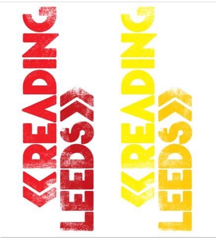
The consultancy was appointed by Melvin Benn, head of Festival Republic, which runs the events, in May this year. It was brought in to create a new logo to reflect a ‘slightly new direction’ for the festivals.
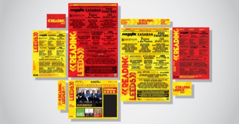
Form says the overall identity aims to ‘give a youthful, rejuvenated yet focused personality – to be highly recognisable and symbolic of what the festivals stand for.’
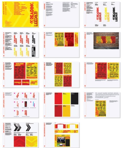
While the festivals’ heritage is in rock music, the new identity had to reflect their move towards incorporating other music genres, and appeal to younger festival-goers without patronising them, according to Form.
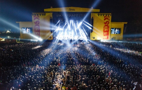
Source: photo by Giles Smith
Leeds stage scrim
The brand colours used on the previous logo, yellow and red, have been retained. Form created a bespoke distressed typeface for the logo, and a chevron device pointing ‘south’ for the Reading identity and ‘north’ for Leeds; with letters arranged vertically.
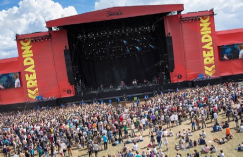
Source: photo by Mark Sethi
Reading stage scrim
The new identity was used at the weekend’s festival on touch points including stage scrim, and will be rolled out in forthcoming months on promotional materials for next year’s events and merchandise.


I was at Reading this year and was incredibly dissapointed to see the stage had been re-designed to this. Such a shame they decided to change the logos as the old one was so iconic for the festival. The new one just looks generic and far to simple. The red for the reading just about works (albeit horribly bland for a rock festival) but leeds lucked out with that awful yellow! Shame they are trying to move the festival away from rock…in a few years it will seemingly just be another v-festival clone. Dissapointing.
I like it! While the old branding was iconic, I think it was well overdue an update & I like this clean, yet rough around the edges look.
I think the branding is very simple – the red/yellow combo, although associated with the festival, has too much of a generic feel to it. The “urban” text styling is also very disappointing – it feels like the organisers went to a website that automatically generates design schemes.
I think the brand works. I think simplicity is often underestimated and under used. Works for me.