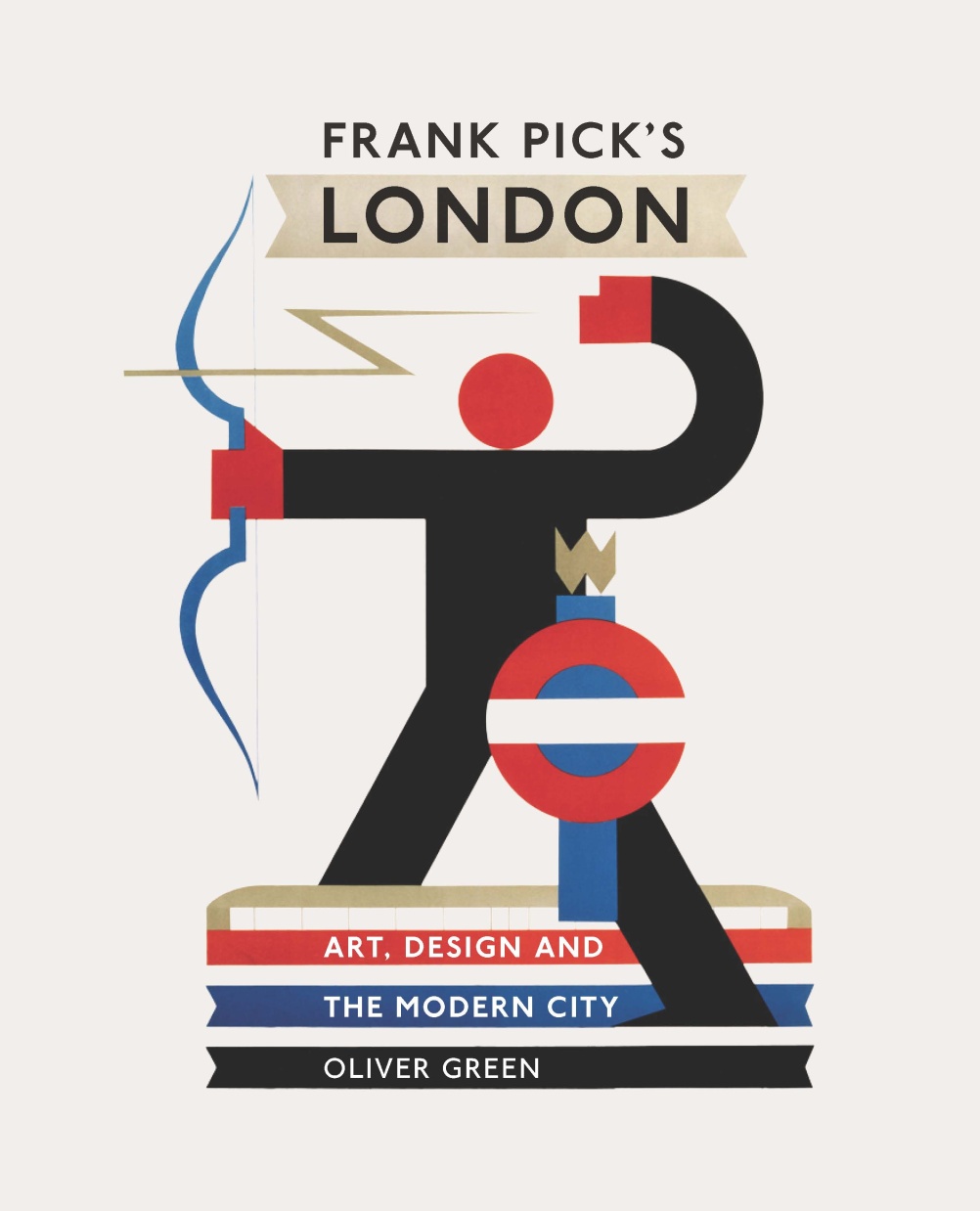
Frank Pick’s London
Much of London Transport’s history, and particularly that of the London Underground, is imbued with a palpable design language.
Source: London Transport Museum
Frank Pick’s London
As the Underground revels in its sesquicentennial (150th) year we’ve seen some of its greatest design icons celebrated – see related stories.
Now a new book reveals how this design philosophy can be attributed to the stewardship of London transport’s first chief executive Frank Pick, who recognised the social and civic value of art and design and how it could improve Londoners’ lives.
Source: London Transport Museum
Pick commissioned publicity posters by Paul Nash, Edward Bawden, Graham Sutherland, and Edward McKnight Kauffer, upholstered fabrics by Marion Dorn and the Piccadilly line extension by architect Charles Holden.
Source: London Transport Museum
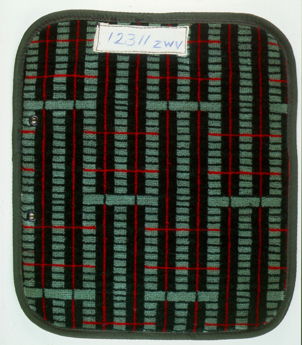
Marion Dorn-designed fabric 1936-38
It’s worth noting that moquette fabrics designed by the likes of Dorn have become so desirable that the London Transport Museum now sells them as soft furnishings for the home.
Source: London Transport Museum
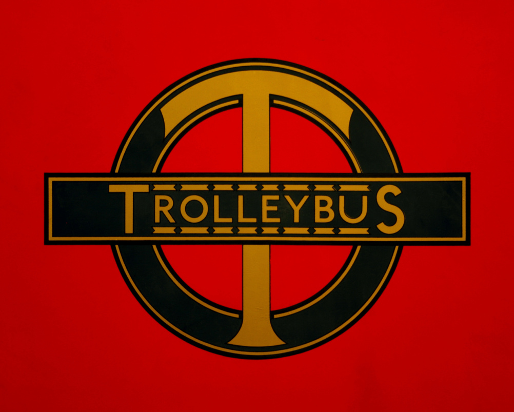
The Underground logo was adapted to take the trading name of the London Passenger Transport Board in 1933 and variations were designed for each department
Perhaps Pick’s greatest achievement was to steer and build a recognisable brand, commissioning calligrapher Edward Johnston to create a typeface for the London Underground, and principally to re-draw the roundel symbol that we know and recognise today.

Source: London Transport Museum
The first pocket version of Becks Underground map, 1933
The much-lauded Tube Map, designed by Harry Beck in 1931 came to be under Pick’s tenure, and is explained in all its glory.
The book makes a case for influence of Pick’s legacy on the likes of the look of the Jubilee Line, the Crossrail project and the Heatherwick Studio designed New Bus for London.
Source: London Transport Museum
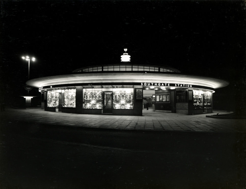
Charles Holden creaated a house style which became instantly recognisable on the Picadilly line stations of 1931-34
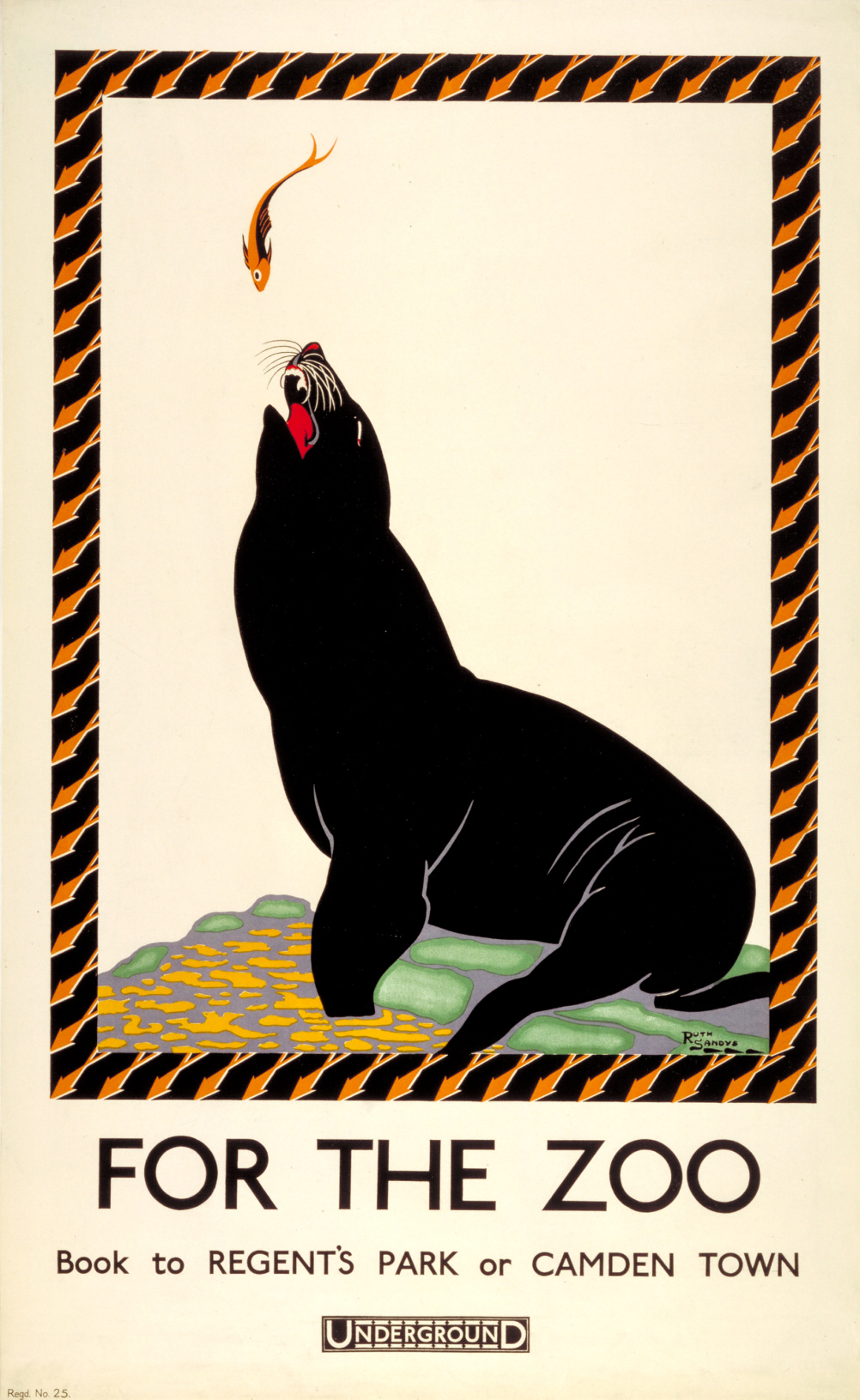
There are plenty of stunning photographs of identity development, Becks map sketches, Holden’s Deco towers, and hundreds of posters reflecting the illustration styles of the day.
It is published by the V&A, written by Oliver Green, former head curator of the London Transport Museum, and designed by Webb & Webb.
Source: London Transport Museum
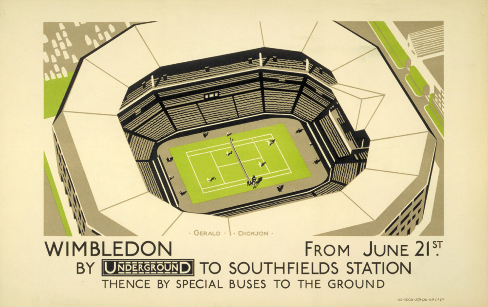
Sporting events were often promoted on small panel posters inside tube cars
The stunning cover has been adapted from Alan Rogers poster, Speed Underground, 1930.
Source: London Transport Museum
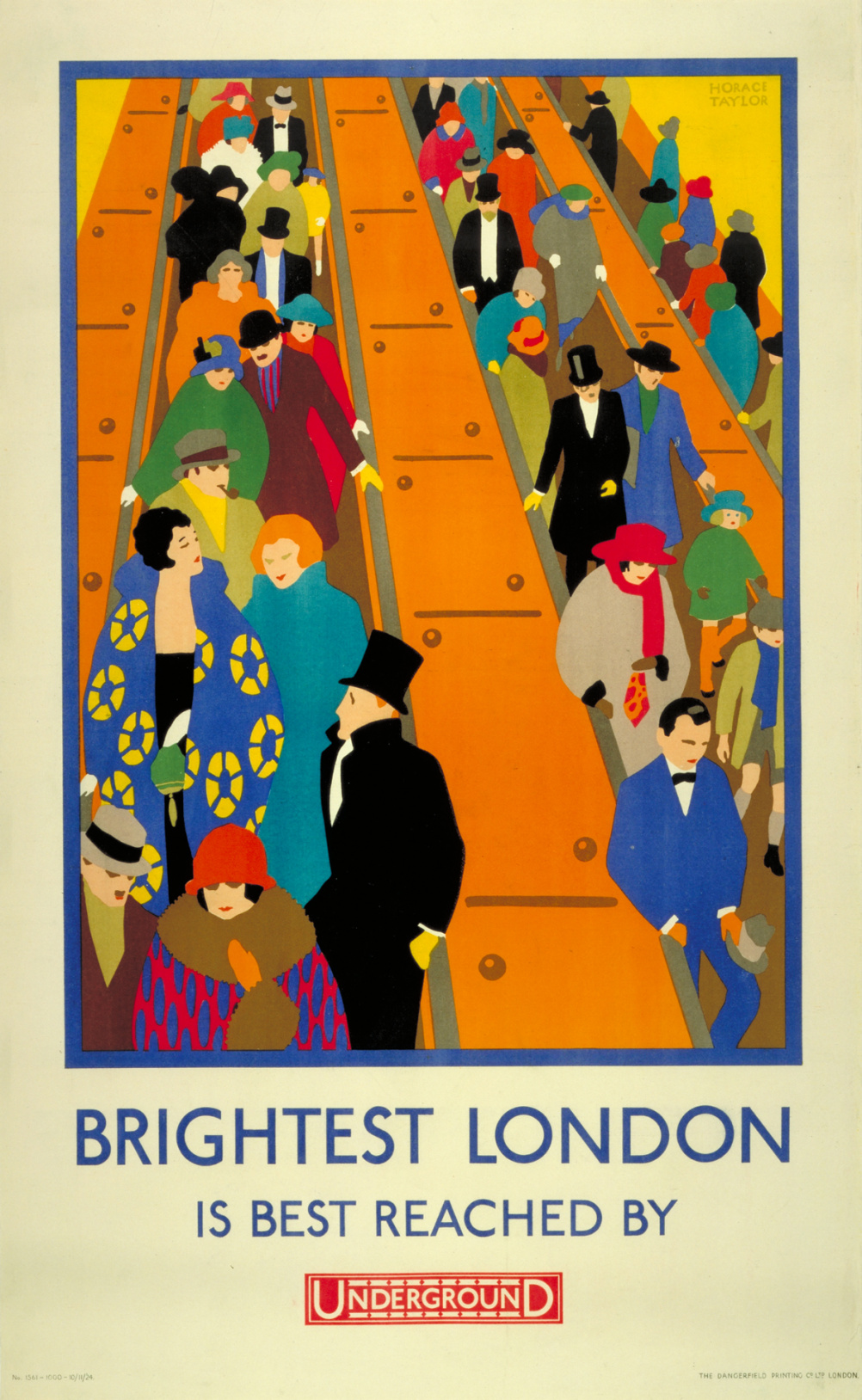
1924 poster by Horace Taylor
Frank Pick’s London: Art, Design and the Modern City is published in 4 November by V&A Publishing, priced £25
Read this next

-
Post a comment


