New Government department branding set to launch
A new colour-coded identity system will be adopted by Government departments which uses the Royal Crest ‘as a singular corporate identity’ alongside individual department names.
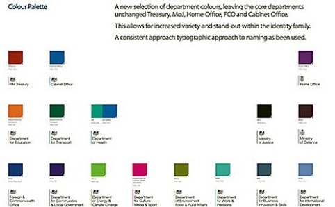
Each government department will use the Royal Crest logo but in their own brand colour.
The Cabinet Office confirms that the system has been designed in house, and a spokesman says, ‘We have developed a new consistent approach to our identity which comprises the Royal Crest alongside the relevant organisation name.’
This follows reports based on a leaked version of the branding, (pictured) which the Cabinet Office spokesman says is an ‘early version’ but not the signed off work which will launch ‘within a few weeks.’
‘We are effectively moving toward a singular corporate identity across government and a single domain for government websites,’ he adds.
The single domain website is gov.uk which is already in beta testing and follows a call from Government appointed digital champion Martha Lane Fox to ‘revolutionise online government services.’
The gov.uk project has been led by Government Digital Service head of design Ben Terrett.
It seems that the branding project will be brought into line with the new website – and the decision to design the new brand in-house may be a cost saving exercise.
‘For years taxpayers’ money was thrown at expensive government department branding exercises. We are now doing this work in-house so it does not cost the tax payer a single penny,’ says the spokesman.
On the new website, the Royal Crest will form the primary identity, which is displayed in different colours on the pages of other departments, with the exception of the Ministry of Defence and the Home Office, which will keep their current identities.
Founding partner of Someone, Simon Manchipp believes that as long as the new ‘single marque’ system is ‘elegantly presented’ it is a good idea.
‘It’s way more useful then having meaningless marques – logocentric branding carries less meaning,’ says Manchipp.
‘To create a single marque and then segregate each one with a specific colour makes enormous sense,’ he adds.
If any emphasis was placed on an identity being the focus of this project, rather then the enormous clarification of government departments and their online homes, the point of the undertaking might have been lost.
‘When the logo is the centre of the attention on a project like this, it’s completely at odds with the narrative of the rebrand,’ says Manchipp.
Read this next


“We are now doing this work in-house so it does not cost the tax payer a single penny,’ says the spokesman.”
…apart from the cost of the Civil Servants themselves and the attendant overheads that are all being ignored.