Planning Unit rebrands Salomon mountain sports brand
Planning Unit has rebranded mountain sports brand Salomon.
The French brand, which was founded in 1947, appointed Planning Unit in 2011 through a pitch, which it entered due to an existing relationship with Salomon sub-brand Bonfire Snowboarding.
Branding consultancy Fresh Britain worked with Planning Unit on the final logo mark following a three-way pitch. Planning Unit went on to complete the final logo, as well as the associated Salomon Snowboarding logo, while Fresh Britain worked on tone-of-voice and ‘brand experience’ for the internal logo announcement presentation, according to Planning Unit.

Planning Unit was brought in to clarify the branding, creating a single logo to be used across all strands apart from snowboarding, which will retain its own logo. These include alpine and Nordic skiing, trail running, hiking and the mountain life apparel range.
Nick Hard, Planning Unit co founder, says, ‘It had got a bit messy – each discipline was using their own version, so we needed a new umbrella brand.’
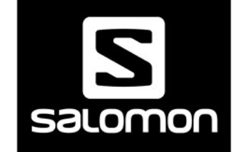
The new logo is based on the incumbent Salomon logo in order to retain the brand’s recognisability and equity.

It can be used in either black or white, with the ‘S’ character forming a clear window when applied to other images. The ‘S’ marque appears above the Salomon name, which uses a bespoke typeface.
According to Planning Unit, it had to ensure that the new branding was gender neutral, and equally relevant for all the sports that Salomon works with. Other considerations were that it was ‘inclusive, forward thinking, performance driven’ and ‘no nonsense’, according to the consultancy.

The logo will come into use gradually from now, and will be used for company presentations as of this summer. It will appear across all Salomon products, as well as online, on marketing materials, exhibition stands, shop signage, point of sale materials and other collateral.
Read this next


I’m a skiing lover so was excited to see this. The symbol and the text work individually but put together there’s a lack of synergy and they seem miles apart.
“S” in a shield?? What were they thinking, Superman?? I hate it!
I am a fan of Salomon, but I hate the new logo a lot. I’m trying to only buy the older shoes and boots because frankly the new logo looks stupid.