The Allotment rebrands The Donkey Sanctuary
The Allotment has created a new identity for international charity The Donkey Sanctuary.
The consultancy was appointed to the work around 12 months ago and tasked with developing an identity based on the charity’s core purpose of ‘care and devotion’.
Paul Middlebrook, managing director at The Allotment, says, ‘They had quite an inconsistent identity with a lot of different logos, we’ve created a much more monolithic brand.’
The new, heart-shaped identity, which was developed with Chris Mitchell of Epicicons, features images of two donkeys.
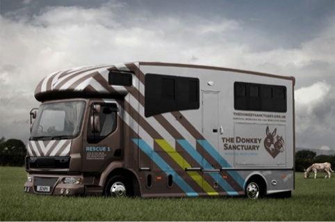
The Allotment has also created supporting graphics for destinations run by the Donkey Sanctuary, which continue the heart theme.
It has worked on touchpoints including livery, signage, gifts and print collateral, and is also working on the website, which is set to launch next year.
James Backhurst, creative partner at The Allotment, says, ‘Because The Donkey Sanctuary is an international charity we wanted to reflect the palpable “care and devotion” of its supporters in a way that would be instantly understood regardless of language.’
Mark Cross, brand and design manager for The Donkey Sanctuary, says, ‘Our new, more emotive-based brand will help us to raise the consciousness of potential new supporters and allow us to communicate more effectively with existing donors.’


This is really nice. Well done chaps!
Lovely identity. Great work.
Really lovely – especially like the big furry ear for the comments leaflet – well done!
Great thinking – love this!
Love it!
Each piece looks nice but altogether they dont seem joined up, each piece has a very different style
To celebrate a lovely new identity a lovely poem.
The Donkey by GK Chesterton
When fishes flew and forests walked
And figs grew upon thorn,
Some moment when the moon was blood
Then surely I was born.
With monstrous head and sickening cry
And ears like errant wings,
The devil’s walking parody
On all four-footed things.
The tattered outlaw of the earth,
Of ancient crooked will;
Starve, scourge, deride me: I am dumb,
I keep my secret still.
Fools! For I also had my hour;
One far fierce hour and sweet:
There was a shout about my ears,
And palms before my feet.
Well done on the Donkey Sanctuary new branding particularly liked the donkeys’ ear on the ‘tell us what you think’ leaflet but disappointed you missed out on using a donkey’s ass on another cover! Just kidding well done Mark!
Great use of typography, G-Type’s Houschka Pro font works really well in this identity.
What an absolutely magnificent farm. I truly adore what these guys are doing for these donkeys. I’ve had a rather odd infatuation with donkeys welfare since I was a small child, after going on holiday and having the unfortunate sighting of a working donkey being beaten.
I think it was when I turned 20 that I really started to do my part. Whether it be donating to my local donkey charity or educating people on the abuse that donkeys face everyday. Keep up the good work over there guys, you’re doing a great thing.