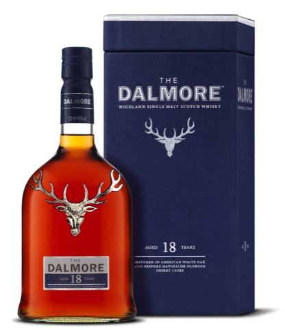
The Dalmore whisky launches new packaging
French consultancy Mazarine has designed new look packaging for whisky brand The Dalmore, by making its silver stag more prominent.

A solid silver stag will now feature on every bottle of The Dalmore. The symbol indicates the distillery’s links with the Mackenzie clan, which was awarded the 12-point royal stag emblem for saving the life of King Alexander III in 1263, according to Dalmore brand owner Whyte and Mackay.

Cartons now have a textured finish to add a ‘sensory experience’ and the King Alxander III whisky has a ‘front reveal’ style carton to display the bottle on shelf says Whyte and Mackay.

The colour palette comprises rich colours inspired by the history of the brand, including those found in the Benjamin West painting Fury of The Stag, which depicts Alexander III’s rescue.

Whyte and Mackay says, ‘Clean and contemporary lines, labels and communication feature heavily in the new range which increases clarity and brand stand-out, meaning consumers can easily identify with the brand, the expression and its maturisation content.’


I like it. It appears almost as if the antlers are supporting the bottle.
?????? ???????? ???? ????? ??????????????, ????????? ?????? ? ?????? ? ???????. ??? ?? ?? ??????? ???????? ????? ?????? ?????, ??? ???????? ? ????????? ???????????? ?????? ???????? . . .
? ??? ?? ??????????? ???????, ?????? ?????? ????? ???????? ???????!!!