The Partners rebrands claims management firm
The Partners has created a new identity for EMCAS, a financial claims-management company that helps customer reclaim funds from mis-sold financial products.
The rebrand is part of a drive to communicate Devon-based EMCAS’s ‘ethics’ to customers, and keep it separate from the ‘cowboy’ reputation of many claims firms in the market.
The Partners was appointed to the project in December 2011, without a pitch.

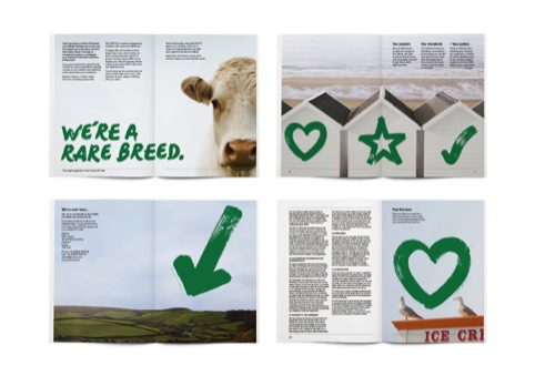
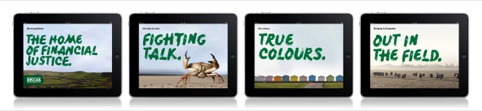
The consultancy has introduced a new logo which uses a hand-written typeface against the backdrop of a swoosh of green paint. The consultancy says this is designed to look like ‘a social crusade – a conscious nod towards the brush strokes of student placards’.
Brush-stroke lettering is used on communications material, while photography reflects EMCAS’s Devon origins, featuring light-houses, beaches and a pincer crab.
Paul Twivy, strategic consultant to The Partners, says, ‘We wanted to provide them with a typeface that echoed their down-to-earth, human approach. In contrast to the slick and corporate fonts used by competitors, we wanted a typeface that could communicate with passion and personality.
‘In addition, the environment of Devon led us to this area, with its abundance of hand-painted signs found in the vast rural areas and also along coastal parts, such as harbour signs and markings.’
The Partners has also introduced a new strapline: ‘Reclaiming your money. Restoring financial justice.’
Twivy says, ‘The “re” of “reclaiming” is particularly important. EMCAS are not claiming money, they are returning to their customers what is rightfully theirs.’
The new branding is set to fully roll out next year.
Read this next


Isn’t Drake our most famous Elizabethan buccaneer? More theft than reclamation surely.
@Thomas Hall-Spencer
When you say theft were you thinking of Macmillan Nurses identity?