Typography vs Illustration
Illustrator Yekinni’s new show Typography vs Illustration documents her experiments with type, graphic design and illustration.
‘I have a strange obsession with typography and letterforms,’ she tells us. ‘I never really know what box to put myself in – if it’s illustration or graphic design. I totally love typography so the point of the exhibition was to explore where typography and illustration can meet.’
Yekinni graduated in illustration from Kingston a couple of years ago, and has since indulged her passion for letters. ‘I took a typography course and originally my love of type was about letterforms. Typesetting is very pernickety though, so I wanted to look at working with letterpress and traditional methods.’
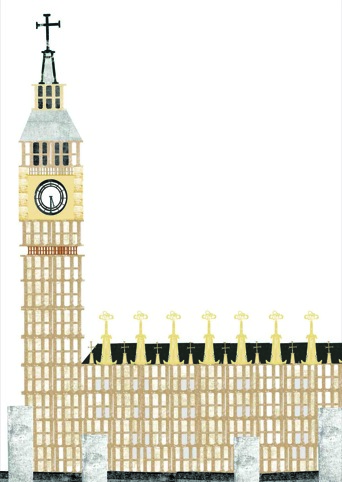
The Big Ben image is Yekinni’s way of experimenting with producing a recognisable image using letterforms. The iconic Big Ben, she says, was chosen as it’s a symbol people would instantly understand.
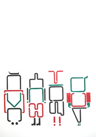
Indian Time is inspired by the Yekinni’s three months working at a design agency in India. ‘I wanted to produce an image that mirrored the craziness of the place’, she says.

Typography vs Illustration runs until 29 July at Woolfson & Tay Gallery, 13 Bermondsey Square, London SE1
Read this next

-
Post a comment


