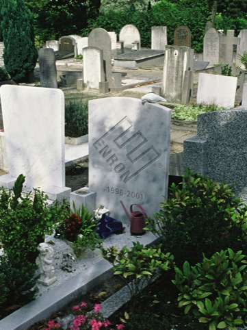
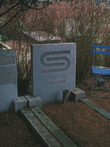
Where logos go to die
Netherlands-based creative duo the Stone Twins have updated their 2003 classic Logo RIP, a collection of defunct, outdated and scrapped logos.
The latest edition, which is published this month, features a host of new additions, with the Abbey National, AT&T, DSM, Lucent, Rover and Xerox marks all going to the logo graveyard – victims of rebrands, company administrations, and the inexorable march of time.
They join defunct logos from the past century such as Pan Am, British Steel, Nasa, even the Nazi swastika.
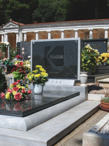
Each is accompanied by a short design and cultural history so, the publishers say, ‘although these logos may be gone, they are not forgotten.
The new edition also features an introduction from Gert Dumbar and is reissued in a gold, gilt-edged edition.
It also includes an apposite quote from UPS chairman Mike Eskew, on the departure of Paul Rand’s UPS logo in 2003, ‘It’s time for this old friend to retire with the grace and dignity it deserves. So today we’re saying goodbye.’
Logo RIP, by The Stone Twins, is published by BIS Publishers, priced at 17 euros.
Read this next

-
Post a comment


