‘Beyond stuttering’ – Purpose rebrands The McGuire Programme
Purpose has created a new identity for the McGuire Programme, which provides coaching to help people with stammers.
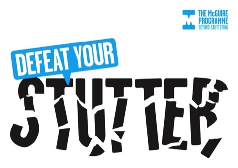
The identity uses two speech bubbles, which come together at the top and bottom of the logo to create an ‘M’ in the negative space.
This is placed alongside the programme name the strapline – ‘beyond stuttering’.
Purpose says it chose ‘bold and distinctive but friendly and approachable’ Garage Gothic as the typeface, while cyan was selected as the main colour to be ‘bold and pure’ while also easy to reproduce.
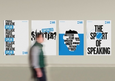
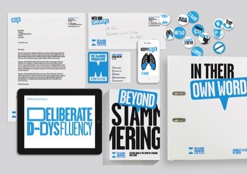
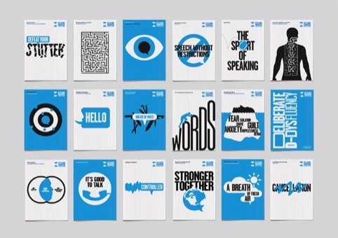
The speech bubble in the identity can also be adapted to incorporate text or graphic images, in campaigns and posters.
The McGuire Programme was founded in 1994 and helps transform people who stutter into eloquent and articulate speakers.
Purpose took on the rebranding project as part of an internal initiative to identify and invest in companies that can be helped through design.
Purpose designer Sean Rees, who is working on the identity programme with Nathan Webb, is a McGuire Programme coach.
After completing the programme, Rees took on challenges which included speaking at London’s Speakers Corner and presenting the McGuire rebrand at the recent Point conference in London.
Rees says, it would be no exaggeration to say that The McGuire Programme has changed my life for the better.
‘I am hugely grateful to Purpose for investing our time and expertise, allowing me the opportunity to give back to the organisation in a professional capacity.’
Read this next

-
Post a comment


