Bulletproof creates new branding for Amira rice
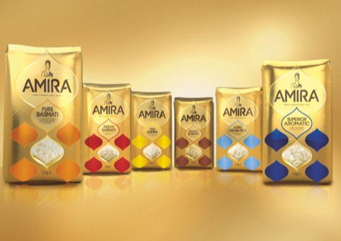
Bulletproof has created new branding and packaging for Indian rice brand Amira, which is set to launch in the UK, with an icon based on the brand name’s ‘princess’ meaning.
The consultancy was appointed to the project in November 2011 following a three-way credentials pitch.
It was briefed to create a new brand for Amira, with a modern look and feel that conveyed the ‘authenticity and quality of the product’, according to Bulletproof.
Amira was founded in 1915, and Bulletproof’s designs aim to reference this heritage, alongside the product’s ‘superiority’ to other rice, it says.
Nick Rees, global creative director at Bulletproof, says, ‘The name Amira (meaning princess) was a great tool to leverage for the brand icon, so we created a simple and elegant icon supported by a hand-crafted proprietary font.’
The designs use a gold colour palette, with variant’s distinguished with individual secondary colours.
Amira will initially launch with five products, including Superior Aromatic and Pure Basmati rice.
Read this next

-
Post a comment


