Everton’s branding own-goal
Everton’s U-turn over its plans to introduce a new club crest caps off a sorry few days for the Premiership team.
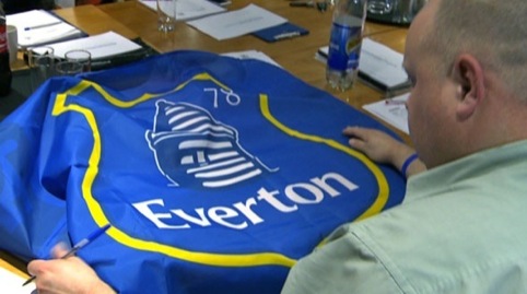
The new logo, developed in-house, met with vituperative online protest, including an online petition that dubbed the new logo ‘embarrassing’ and notched up more than 23 000 protests.
Everton has apologised to fans and announced that although it will use the new crest next season (all the club’s replica shirts have been printed apparently), it will launch a new logo for the 2014/15 season, which it will develop with supporters.
Although, as many commentators have pointed out, rebranding a football club, with its loyal, vocal and passionate fans, brings its own set of challenges, there are several lessons that can be learned from Everton’s experience.

• Don’t launch a ‘logo’. In fairness, a lot of this seemed to be out of Everton’s hands, with the new identity apparently leaking on fan sites several weeks ago and being met with derision.
But the actual launch of the ‘club crest’ at the weekend could have been better handled. Eight pages on the Everton website, going into great detail about the visual elements of the logo is great for design journalists, but will it ever really engage the fans (most of whom have already made up their minds)?
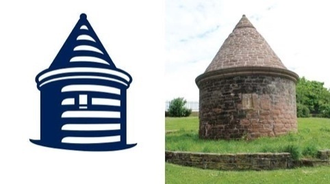
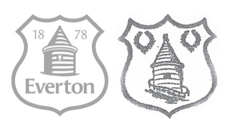
By dwelling on logo design details such as the representation of Prince Rupert’s Tower and the fact that the previous identity didn’t reproduced well digitally, Everton seemingly failed to answer the wider branding questions that the fans really wanted to know – what does this brand mean for me? And why should I buy into it?
• Consult with the right people. Again, Everton seem to have done a lot right here, apparently developing the new identity in consultation with the fans forum (which represents ‘a wide spectrum of Evertonians, including season ticket holders, Supporters’ Club officials, corporate members, shareholders and fans from the Everton Disabled Supporters Association’).
Strange then, that practically none of the thousands of fans who took to message boards to slam the identity admit to having been involved in this process.
Of course, the club has to draw a line in its consultation somewhere, but it would have made sense to have identified some of the more vocal fan organisations initially and tried to get them on-board early in the consultation process, rather than giving them the chance to slate the identity when it launched.
Everton’s admission that commercial sponsors such as Kitbag and Nike were involved in the process, while admirably honest and hardly unexpected, only served to fan the flames under the circumstances.
• Don’t backtrack. In apologising unreservedly to fans and saying they will drop the new identity in 2014, Everton are now in the worst position possible.
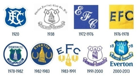
They have set out a lengthy rationale for the rebrand, and now effectively admitted that it was misguided.
They’ve resigned themselves for the 2013/14 season to using a club crest that large elements of the support have said they don’t want – and that the club itself admits it will drop.
And there’s the obvious question of what the club will end up with in 2014? Everton has promised to pull together elements of all its fan-base to review the club’s crests, before developing ideas and putting them to supporters for a final decision.
Crystal Palace went through a similar process with its recent rebrand, but this wasn’t against the context of a ‘failed’ rebrand and an upset fan-base.
Everton’s new identity has its many haters – who have probably overshadowed those who actually like the new branding – and it will be interesting to see whether it can actually be improved on in a year’s time.
Read this next


Don’t like new badge the present badge is best badge in football league I was going to get tattoo but not now I will wait till 2014-2015 season
We redesigned the Cheltenham Town FC logo a couple of seasons back and the initial response on the supporters’ forums was, on the whole, negative for the first few days. However, this changed within about ten days to recognition that it was a good move, that the logo was more relevant to the club, was visually strong and worked very well in all sorts of media; not just shirts but in print and, importantly, in the digital arena.