Lewis Moberly’s Divino dessert branding
Lewis Moberly has created the branding and visual identity for start-up dessert brand Divino, which sees ice-cream served in a fruit shell.
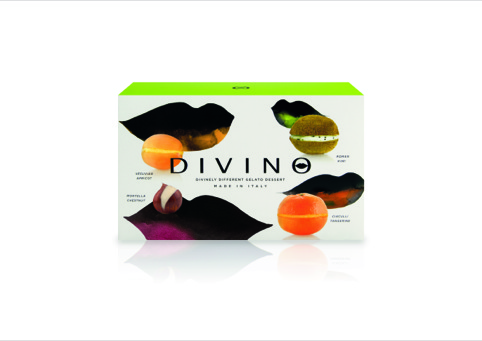
The branding uses a lips icon to reflect the product’s ‘oral sensation’, according to Lewis Moberly.
The consultancy was appointed to the project in September last year without a pitch, and was appointed to create an identity that brought ‘some theatre into the freezer cabinets’.
Mary Lewis, Lewis Moberly creative director, says, ‘The freezer cabinet in stores is a bit of a grim, forgotten place, so we had the opportunity to create a brand that would have a real distinction.
‘The pack is really the poster.’
Lewis Moberly created the brand name, the ‘divinely different’ strapline and the packaging designs, which use watercolour illustrations by Lucilla Lavender and product photography taken by the client.
‘We set the dramatic darkness of the lips against the brilliant, dramatic colours of the fruit’, says Lewis. ‘The idea of having the lips on the pack with the fruit is a very instant, surprising and evocative link to the product – you immediately want to try it.’
Divino will initially be available online and in selected retailers including Harrods and London food store Partridges. Flavours include Vesuvian Apricot and Montella Chestnut.
Read this next

-
Post a comment


