Mark Porter works on Dutch news channel relaunch
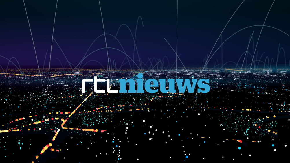
Mark Porter Associates has collaborated with Dutch consultancy Smörgåsbord Studio on the rebranding of Dutch news channel RTL Nieuws, which has been based around a rectangular ‘framing’ metaphor.
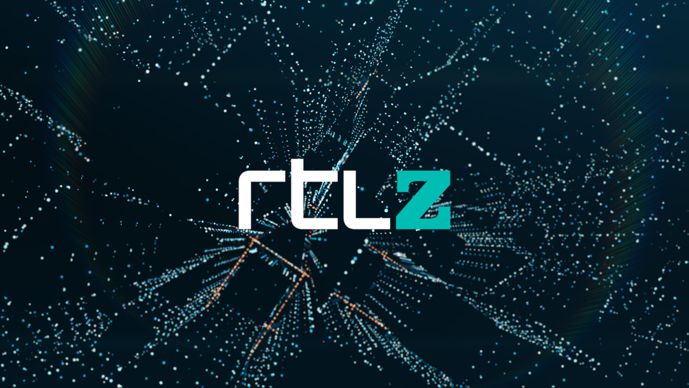
RTL Nieuws comprises six channels producing all news content for the RTL network.
The 18-month project was led by Mark Porter, former creative director of the Guardian, and Smörgåsbord Creative Director Dylan Griffith, who is the former creative consultant to the MTV World Design Studio, and S4C — the Welsh-language division of Channel 4.
Caroline Schnellen, marketing and communications manager at RTL Nieuws believes that the old identity, which was introduced in 2007, had become outmoded.
She says, ‘Everything has changed… The world of news, the way we consume news and RTL Nieuws itself. With all this in mind it became the right time to rethink the brand’s visual identity. We needed to show one brand, one look-and-feel, on TV, web and app.’
Porter says the solution was to recognise that ‘Broadcasters no longer have a monopoly on the distribution of news. In the age of Twitter and YouTube, people can find out for themselves what’s going on in the world. The broadcaster’s role has changed.’
Most news design is ‘stuck in the 1980s’ says Porter, who was keen to avoid ‘pulsating globes and glossy 3D objects’.
His team’s solution was to introduce a rectangular framing deivce, which could be used to show that ‘RTL is at home in the connected world’ and can offer ‘a direct conversation with the audience across all platforms’.
Porter says, ‘Whether news comes from TV, web, or mobile apps, we tend to view the world through a rectangular frame. This form can also represent the editorial process in which RTL Nieuws takes a torrent of raw information and frames the essentials, adding context and meaning.
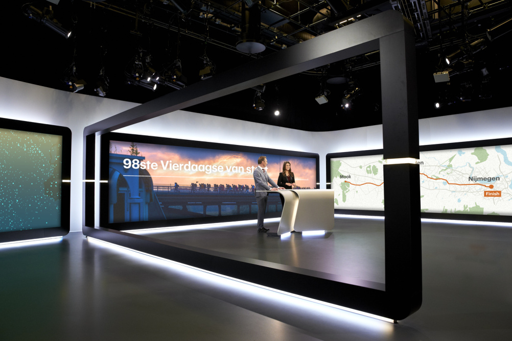
The frame became the key visual metaphor of the project, influencing the visual expression of the brand at every level, from the set design to the new logo.’
The frame can also be broken down so that it forms the component part of the typographic identity and you can see this transition in the moving ident sequences.
Porter hopes the new brand will provide an environment for editors and presenters to communicate ‘with directness and clarity.’
The typography used is a customised version of a Graphik typeface from New York font foundry Commercial Type.
‘Typography, colour and image all play a role in the storytelling process,’ says Porter.
Universal Everything has worked on animation for title sequences, stings and bumpers, which have been designed to reflect global and individual perspectives as well as digital conversations.
Depending on the time of day they are aired the sequences are influenced by a different mood – a warm sunrise for a breakfast bulletin, or a night scene for late news.
Other design partners include Dutch motion graphics specialist John Beckers, sound designer Martijn Schimmer and set designers and builders Pièce Montée.
Read this next

-
Post a comment


