Jammie Dodgers range gets splat appeal by Robot Food
Harrogate-based consultancy Robot Food has created new branding and packaging for Jammie Dodgers, for brand-owner Burton’s Foods.
The consultancy was approached by Burton’s to work on the Jammie Dodgers project while working on a licensed branded snack bar in July, according to Robot Food creative director Simon Forster.
Robot Food has created a new logo and pack designs and also developed a brand framework for further products to roll out under the ’Dodgers’ brand next year.
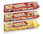
The consultancy says the rebrand’s aim has been to make Jammie Dodgers ’appear more Jammie Dodger-like’. The logo holding device has been given more of a jam ’splat’ shape, while the new hand-drawn typeface features more rounded ’Jammie’ lettering.
The 1950s Dodgers font, derived from The Beano’s Roger the Dodger strip, has been retained, with a heart shape added to the centre of the O, to reference the heart in the biscuit.
The pack features a full-sized product shot, with the backdrop featuring a sunburst, while marker-pen graffiti is used throughout. Robot Food says that the new design has impacted on the biscuit’s recipe, which now features added fruit.
Robot Food design director Mike Shaw says, ’Jammie Dodgers has been a much-loved biscuit for years and we’re excited to have been given so much freedom with such an iconic brand.’
The core range of jam biscuits is set to hit shelves in January 2011, followed by two entirely new products under the Dodgers brand.
Read this next

-
Post a comment


