Neville Brody creates D&AD’s 50th anniversary identity
Neville Brody has created the 50th anniversary identity for D&AD, which is celebrating its half-century next year.
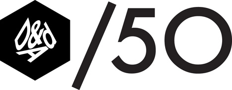
The identity, named Forward 50 is designed to work as a ‘modular’ addition to the existing D&AD identity.
The brief for the identity was to create a mark that could be used as D&AD celebrates ‘50 years of looking forward’. It will be used on campaigns and other applications.
The design uses the Futura font, which Brody says he chose for its ‘timeless and yet simoultaneously contempory’ look.
Brody, who takes over as D&AD president next year, says, ‘When it came to the creation of the identity, we wanted to create something that could be used alongside all the other materials and compliment everything that D&AD does this year.
‘Hence, this modular system allows a clear way of writing the story as D&AD/50 without the addition of another logo.’
He adds, ‘We like the way it comes off the page and can be used in any piece of text, as well as in web addresses – conveying the message that everything this year has special significance, without labouring the point.’
Read this next


Seriously?
joke………….
LOL lazy!!!
I’d be interested to hear the justification for this
D&AD is meant to recognise and encourage creative excellence. What would the Jury make of this? Its frustrating to see this this kind of mediocrity from the very body we strive to be recognised by.
I must be missing something really clever…surely
Is this a VERY late April fools? I agree with Eve.
It has been designed to be modular, so it supplements D&AD’s existing logo and artwork without overcomplicating them. The /50 identity also works equally well when written as text for print and on the web.
He’s seriously lost it.
Ive been a fan of Neville’s for years and his older work was great. But this just shows the guy has lost his passion for design.
Ive looked at this logo many times and I still cant change my opinion.
This is teh result of a burnt out creative, Neville needs to re-connect with his muse!