To The Point brands private equity product Pevara
To The Point has named and branded a new private equity financial product Pevara and also designed the look of its interface.
A credentials pitch in September 2010 led to the consultancy first working on naming and branding Pevara so holding company Efront ‘could confidentially market it to financial professionals,’ according to To The Point managing director Simon Hutton.
Pevara is a conflation of ‘pe’ for private equity and ‘vara’ which is a Spanish term for measurement. To The Point also secured the company a .com domain.
This then led to development of a look for the Pevara programme, which is an online system for financial experts to provide performance and benchmarking solutions supporting limited partners investing in private equity. The The Point has also designed the website which this sits within.
The product needs to offer appeal through its ‘operational efficiency’, says Hutton, so the structure of the design needed to support this, with ‘simple intuitive navigation’.
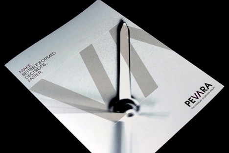
The look of the brand stems from the highlights of ‘VA’ in the identity which Hutton says represent market fluctuations as ‘up and down arrows’.
Extrapolating these VA symbols, more imagery showing ‘performance measurement, speed, time and accuracy’ have been depicted as graphics, including a clock and a compass.
The brand launches today, is present online and To The Point is now looking at Pevara print materials.
Read this next
-
Post a comment


