Eat your words
Four imaginative creatives have taken the rather complex Monomyth concept, and simplified it through the unusual media of edible pasta typography.
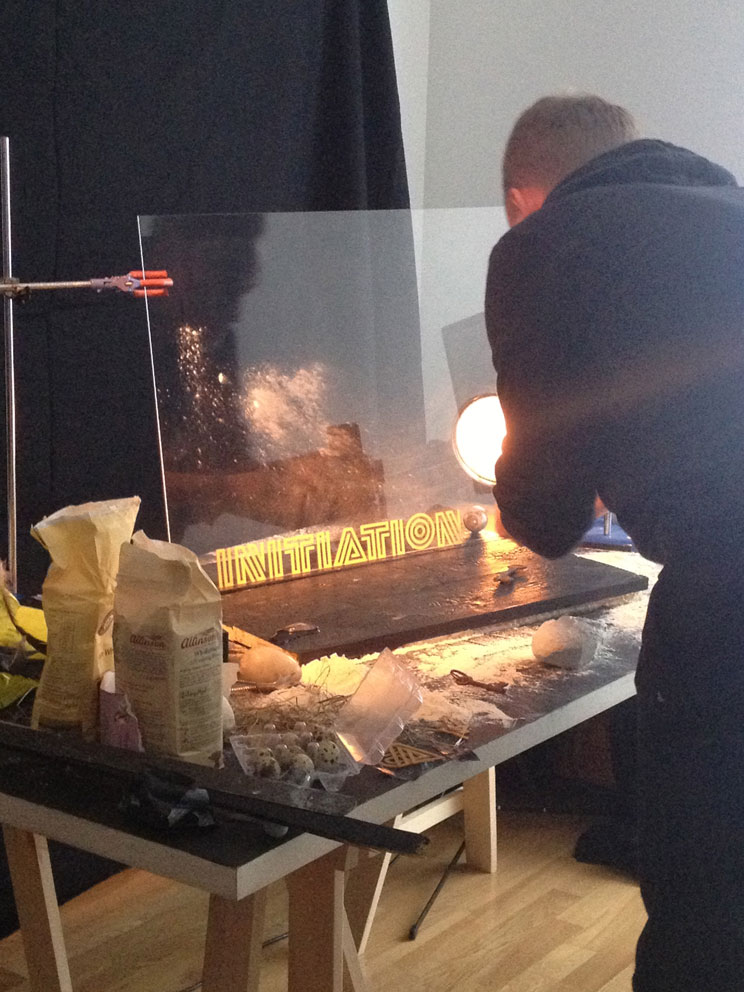
Art director Andrew Stellitano, design duo Sawdust (Rob Gonzalez and Jonathan Quainton) and photographer Dominic Davies have been busy working on the Monomyth Typographic Pasta project, resulting in a rather high-brow take on Alphabetti Spaghetti.
The project looks to typographically depict the ideas of Joseph Campbell¹s Monomyth, or The Hero’s Journey.
Campbell, an American writer who was a fan of the notoriously tricky books of James Joyce, proposed that the monomyth pattern (a term taken from Joyce’s Finnegan’s Wake) that follows a hero’s venture from ‘the world of common day into a region of supernatural wonder’ is echoed in numerous religious and mythical narratives around the world.
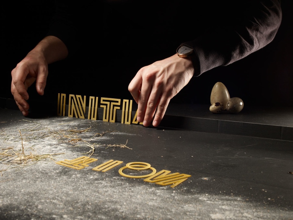
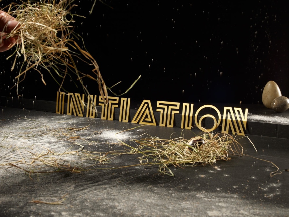
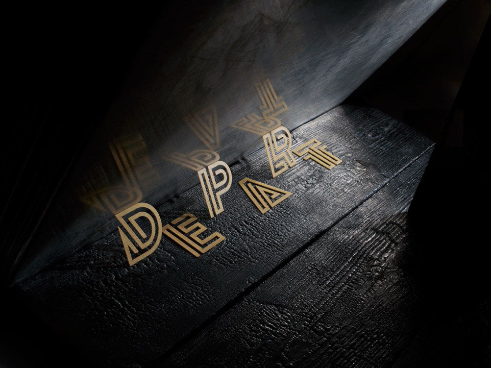
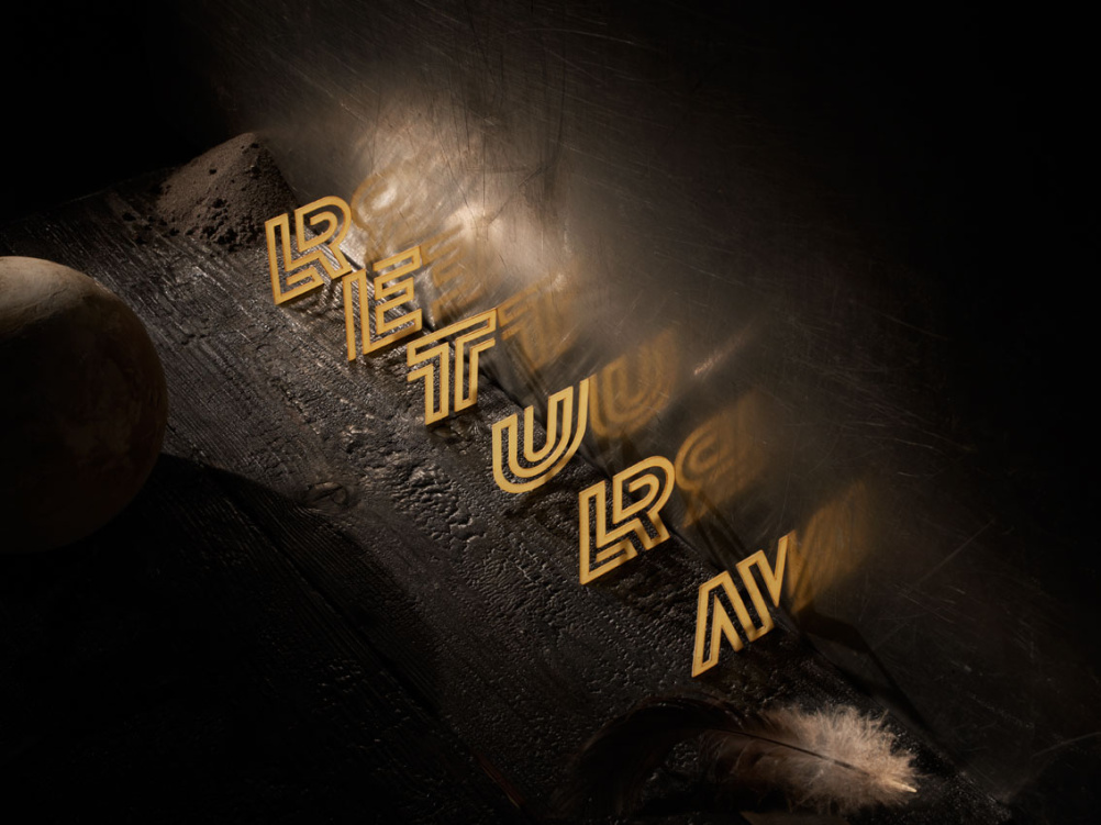
Down to its most basic level, the pattern can be split into three main sections – Departure, Initiation and Return.
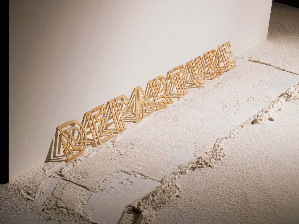
As such, Sawdust set about forming these three words typographically, creating pasta shapes in the new Lunetta typeface that were then laser cut and photographed by Davies.
Sawdust co-founder Jonathan Quainton says, ‘The typeface’s angular structure is defined by (but not limited to) a continuous and sometimes curvaceous geometric line, which allows the letterforms to be freestanding once laser cut from pasta’.
Sawdust’s previous projects include typographic illustrations for Shoreditch’s Ace Hotel in east London.

-
Post a comment


