How brands can best use colour
Who wants 50 shades of grey when you’ve got the choice of the rainbow? asks SomeOne’s Laura Hussey.
It’s drizzly, it’s grey, everyone is wearing black and I’m a Celebrity is back on the telly tempting me with the lush green Australian rainforest. I’m sick of the dullness of winter. I need some colour.
My desire for colour isn’t just at this time of year either, I crave it all year round — in fact I’d go so far as to say I draw energy from it.
Brands can benefit from our desire for colour too. It can help keep conversations intriguing, energetic and rewarding. A study of the world’s top 100 brands (defined by brand value) saw 95 per cent use only one or two colours. Then 33 per cent of those top brands would like to think they own the colour blue, and 29 per cent think red is THEIR colour. When this happens colour becomes irrelevant, it’s what you do with it that counts. Why be limited?
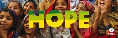
Take a look at how Oxfam have rebranded with an reinvigorated palette of colours and the mantra ‘provocative optimism’. The charity has to deal with famine and world disasters and yet still has to attract people to be inspired to give money. The most immediate way to do this is through their brand colours. The vibrant colours help to reinforce Oxfam’s positive attitude towards fund-raising and boost their rallying cry, making people feel positive about taking part and able to help affect change.
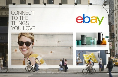
Another brand that recognises the power of colour is The Guardian, which uses of a spectrum of colours to illustrate it’s all-encompassing news. Multiple colours speak of choice, variety and diversity. Think Google, NBC, Ebay, or the many other brands that use more than two colours to express their breadth.
When we worked on the branding for Halcyon we used colourse derived from, and acting as a subtle nod towards, the diverse colour palette used during Britain’s great creative periods of the past – our Halcyon days, mixed with those we see around us today.

Colours can reflect the emotional outlook of a culture and so it’s no coincidence that as we emerge from the UK’s longest, deepest postwar recession we see a change in colour trends.
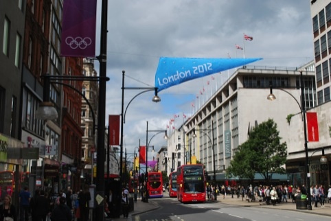
We want to feel happy and secure, and that’s why we gravitate towards colours that bring about more positive emotions. Think of the striking pink London 2012 Olympic signage that directed people around London and how happy and talkative people in the city suddenly seemed to be. The colour got a good showing on many volunteers too. Why? it stands out, it’s appealing. The result? A world city and thousands of people wearing an unusually bright and appealing shade.
The Dutch artists Haas & Hahn saw this potential when they lived and worked in some of the world’s most violent places. It’s not every day you have to ask permission of a drug lord before you can start painting, but in one of Rio’s most dangerous favelas – this is exactly what they had to do. Not just to beautify, but also to create a conversation with their surroundings.
After many successful projects, the image of a square painted in a design of radiating colors drew worldwide fame and transformed Rio into ‘one of the world’s 10 most colorful places’. It stands out.
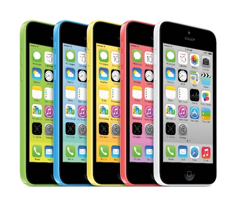
Colour doesn’t just benefit worthy causes though – you only need to look at Jonathan Ive’s colour choices for the new iOS 7, or the sweet-shop choice of iPhone 5C. More than any iPhone in history, the iPhone 5c is all about colour and personality.
Some say Ive was inspired by graphic designer Mitsuo Katsui whose work is known for bold uses of colour in motion, often placed within vast flat colour backgrounds. Katsui also uses transparent layers in his abstract forms to highlight contrast effects between colours.
Similarly, for the launch of Tesco’s first tablet – the Hudl, we brought in multiple warm colours and customised options help to soften what can often be stark and technologically-led communications.

‘Be more Colourful’ doesn’t have to simply mean ‘use lots of bright colours’ either. A brand can behave more colourfully through its actions, its tone of voice or its inventions.
Innocent Drinks has grown from a three-person outfit to a multimillion pound business, a large part of the company’s success must be attributed to the brand’s tone of voice. It has managed to stand out in a saturated drinks market by being friendly and engaging, sometimes even cheeky but always distinctive. It has managed to elevate the brand way above it’s competitors.
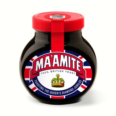
Then you have Marmite — a yeast-based spread. Nothing very sexy or colourful about that – and yet by being brave enough to recognise their product is hated as much as it is loved it has elevated it to much more than a savoury spread. Its ‘Love/Hate’ campaign has earned the brand many fans and its uniqueness means it’s now used to mean anything which strongly divides opinion. The strength of the brand means it can now expand into other areas, even fashion – ‘Love Marmite, Hate Jams’ as seen on many a trendy fixie rider weaving through traffic.
Brands want fame and monopoly and to do that they must stand out and appeal to human beings, so they need to be more optimistic – more colourful. Who wants 50 shades of grey when you’ve got the choice of the rainbow?
Laura Hussey is partner and creative director at SomeOne.
Read this next

-
Post a comment


