Music makes east meet west with new Centre for Chinese Contemporary Art branding
Music has created new branding for Manchester’s Centre for Chinese Contemporary Art, designing a look ‘born out of the notion of east meeting west’.
The centre, which was previously known as the Chinese Arts Centre, celebrates its tenth anniversary this year, and was looking for new branding to help dispel ‘misconceptions’ about the brand, according to Music.
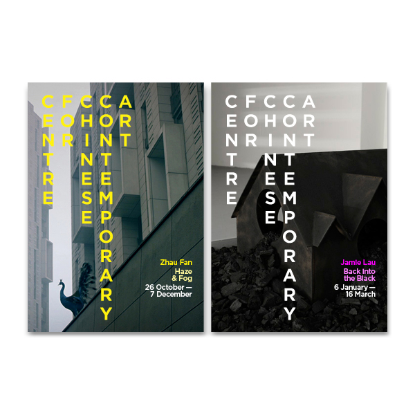
Music’s concept uses the Chinese way of lining text vertically, though the words are arranged in the western manner, to read from left to right. A geometric typeface is used to reference traditional Chinese letters, which are drawn within a square-shaped space.

The consultancy was appointed in spring this year following a creative pitch, and initially carried out research with staff, visitors and non-visitors to identify misconceptions about the centre and barriers to entry.
Dan Lancaster, lead creative at Music, says, ‘We wanted something that reflected their outlook as a bold and contemporary gallery but one that still provided interesting Chinese or Chinese-related art.
‘When we first started working together people thought it was more about the historical stuff, rather than art for the present or the future.’
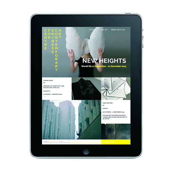
A colour palette of black, white and yellow was chosen; with ‘slick’ monochrome to appeal to a traditional art audience, and the yellow to stand out and reinforce the idea of the gallery’s Chinese background.
Lancaster says, ‘We needed something that can stay consistent. We created guidelines that will allow [the centre] to come up with interesting, creative ideas themselves.’
Read this next


Stupidly naive or genius… I can’t decide!
This is great! Big hand to Dan and the team!