Tangerine and DWHD collaborate on Sindoh identity
Tangerine and DWHD have collaborated on the rebranding of Korean printer company Sindoh.

Tangerine, which has worked with Sindoh since 2009 has designed a family of printers for Sindoh as well as the company’s website and marketing collateral. It is currently designing a second generation of the printers.
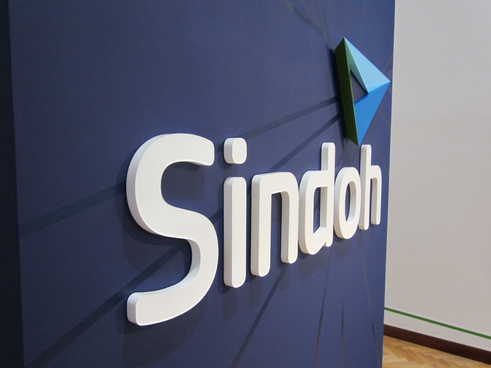
The form of the new identity has been inspired by a Sindoh product which can scan and print A3 and A4 from an A4-sized scan bed.
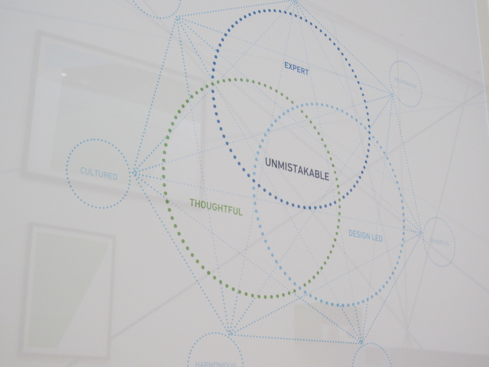
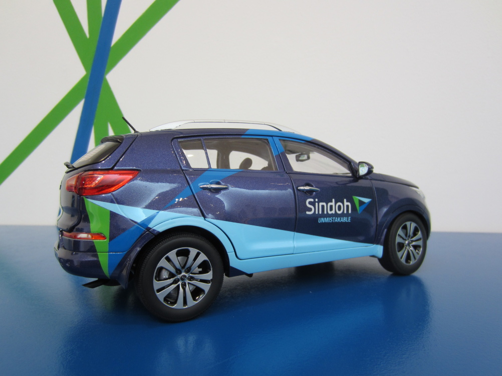
Tangerine says, ‘Three core brand attributes, have been identified and incorporated into the new logo – dark blue represents expertise, green represents thoughtfulness, the lighter blue means design-led, and collectively the white centre point means unmistakable, which is the new company strapline.
Working in partnership with DWHD over a nine-month project, Tangerine first conducted an audit of the brand, talking to staff at every level of the business.
Chief executive of Tangerine, Martin Darbyshire says, ‘From this information we were able to map out the brand values and hit upon “Unmistakable” as the Sindoh brand proposition.’

DWHD partner Will Pocknell says, ‘The clincher for us was that there was a very real intention and desire within the business to change.’
Read this next

-
Post a comment


