The PR of rebranding
Philips’ decision to reveal its new company crest piece-by-piece on social media provides another interesting case study of how big organisations tackle rebrands.
There seems to be an increasing drive from brands to actively use an identity change as an opportunity to engage with consumers or get PR.
While this is a step up from just putting a statement on the company website talking about how a redrawn lion or heart represents ‘innovation’ or ‘community’, these efforts are still on a relatively basic level.
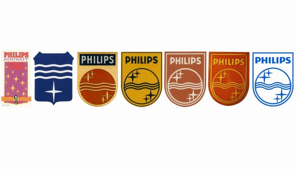
With Philips, for example, you have a company that has been through a massive structural and organisational change recently – its ‘Accelerate!’ transformation process has seen it restructure its portfolio and earlier this year it dropped the word ‘Electronics’ from its name, becoming just Royal Philips.
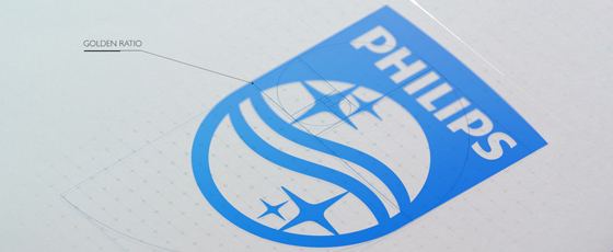
However, stories around these deep and impactful changes being tricky to communicate to consumers, the company chose to engage them through a more tangible touchpoint – its crest.
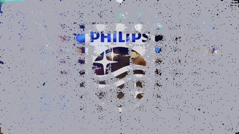
Philips launched the #UncoverPhilips website, inviting people to ‘uncover’ one of 50 000 pixels making up an image of its new crest, and share the #UncoverPhilips hashtag on Twitter and Facebook.
There’s obvious logic to this of course, but the downside is that attempts to engage the general public through logo design generally meet with an apathetic response. In the run-up to the Philips logo reveal for example, there was only enough engagement from visitors to uncover around 30 per cent of the crest.
And then the design-savvy audience who would be interested in a logo-led PR campaign are often also the ones ready to pick apart any identity update in a methodical and often unforgiving fashion.
Philips should, to an extent, be congratulated on quite a canny initiative. The project was certainly a huge step up from similar recent logo-led engagement campaigns, such as Yahoo’s 30 logos in 30 days stunt.
The company had clearly taken what they saw as the most tangible aspect of a massive organisation change and tried to present it in an engaging, accessible and quirky way.
But huge questions remain around this sort of stunt. Does it really represent what a ‘rebrand’ is? Does it open a brand up to unneccessary criticism? And ultimately, do the consumers really care?
Read this next


I wrote something about poor launches in our Review of the Year 2013 – enjoy this example of how not to do it:
vimeo.com/68999045
Feel free to shoot me down but the only time I’ve ever seen this logo is on the packaging of a phillips product. Its normally very small and would never get noticed by the vast majority of people who are too busy ripping the box open to pull out their shiny new gizmo. I’ve always know Phillips as a text based logo brand and even on its website it uses the text based version. I would question was this logo even needed in the first place. I personally am getting a little bit bored or watching companies take the simplify it, give it a bland colour palette, and add a gradient approach to design. WHERES THE PERSONALITY, I want the Naff but fun ebay logo back I want variety.