Colgate rolls out new identity
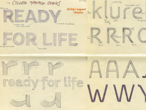
Colgate is launching a new identity developed by The Partners, which features a new typeface created by Fontsmith.

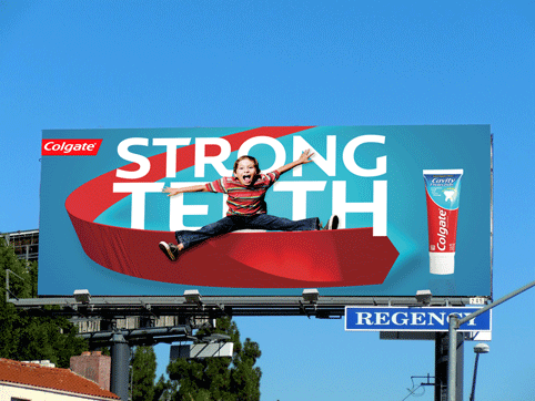
The new Colgate identity is rolling out internationally and was created by The Partners’ New York office. The branding features a redrawn logo and a chevron ribbon device.

Jason Smith, founder and creative director at Fontsmith, says: “Colgate has so many different products with different identities and shelf presences. Colgate the brand was never really overarching – we’ve used the typeface and the chevron ribbon device to realign that relationship between products and company, and bring Colgate a bit more to the forefront.”

The branding uses the new typeface Colgate Ready, which will be used internationally and has versions created in languages including Cyrillic, Eastern European, Devanagari and Thai.
“Our purpose was to create global unity,” says Smith. “Making a consistent brand across all those different regions was a challenge. The typeface was key to that – our inspiration was in trying to find something that was both humanist and clinical.”

Smith adds: “The red colour that Colgate uses is so ownable. We had to design a typeface that had the same emotive feeling as that white on red.”
Colgate Ready is designed as a Roman/Latin character and comes in three weights, Light, Regular and Bold, each with its own italic.


Smith says that the three weights were chosen to suit Colgate’s different markets. “The thin style was designed to work for cosmetics and beauty,” Smith says. “The heavier weights are more clinical – for regular morning use of dental products, and for dentists and medical use.”
The Colgate branding has started to roll out and will eventually be available on all point-of-sale product packaging, in print and TV advertising and on the brand’s website and mobile communications.


Is this what Constitutes a new identity these days? A new font? And some banner system?
I’d love to see if the customer does either of these two things.
1) notices.
2) thinks it in any way better describes the benefits of this brand over say, Aquafresh. Or indeed any other paste.
It’s bland. Vanilla. Minty tosh that probably paid well to the designers but is unlikely to help the brand in the slightest.
Where’s the idea? The plan? The strategy?
This tweaky pond skating does nothing to help. It simply spends budgets.