The Partners creates hidden pattern branding for Tusk Conservation Awards
The Partners has created a new identity for the Tusk Conservation Awards, based on a geometric pattern that contains the letters T, U, S and K.


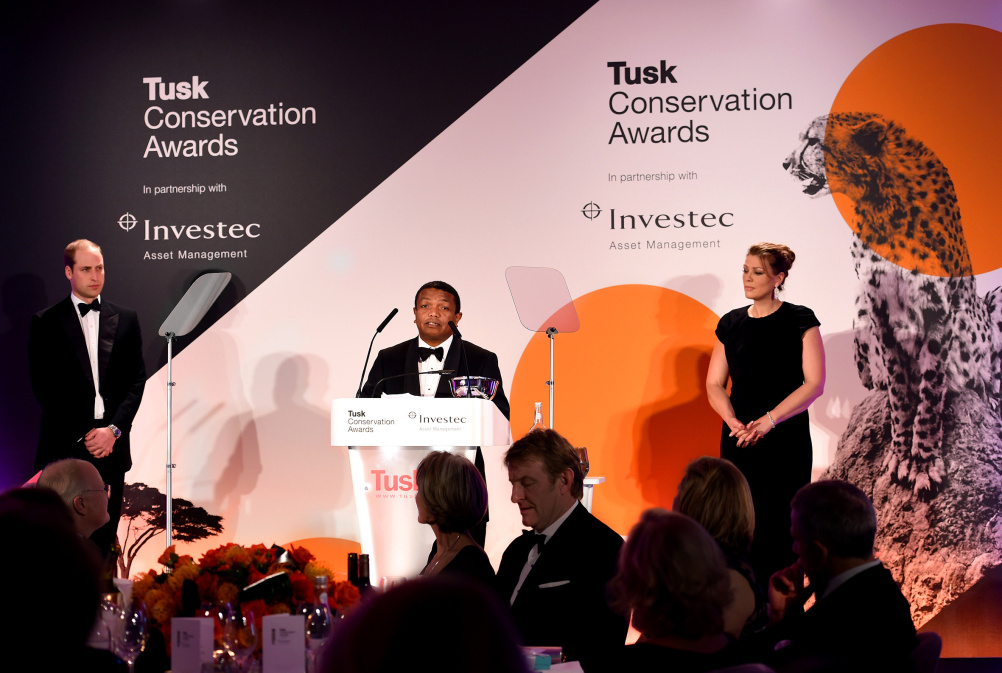
The awards are run by charity the Tusk Trust and aim to recognise achievements in African conservation.
The Partners says the pattern used in the identity is inspired by traditional African designs. The branding aims to focus on “the emotional connection between the Tusk Trust and the communities and individuals dedicating their lives to the preservation of African heritage”.
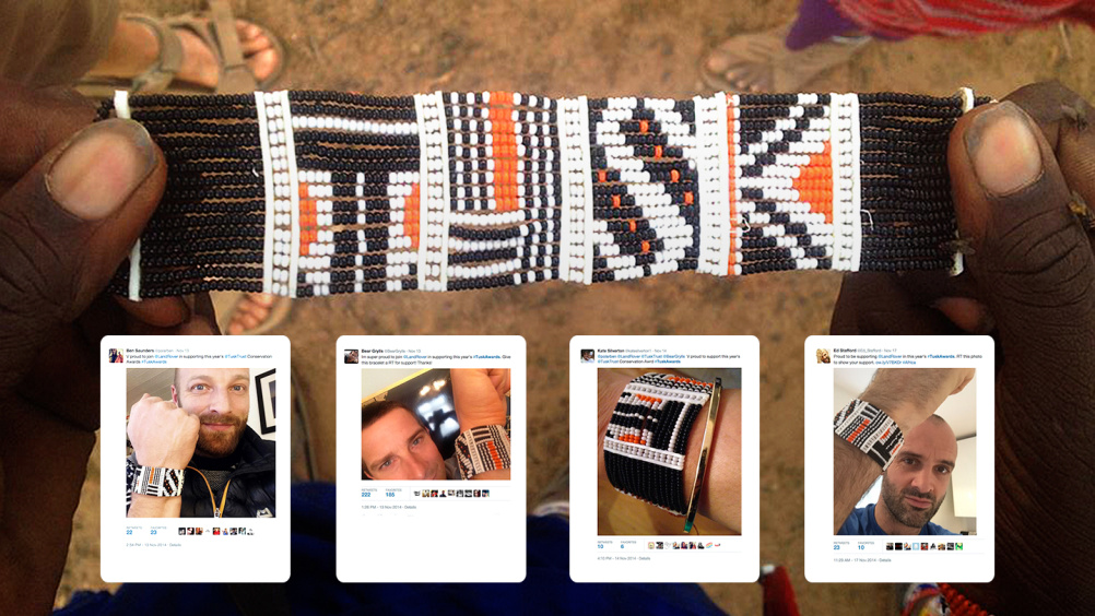
The pattern looks like an abstract series of orange, black and white shapes, but can be cropped into to reveal the Tusk name.
Graphics can be used in applications such as website design, event design and vehicle wraps.

A series of patterned wristbands were created by the “Mamas” of Enkiito village in Kenya, to be by nominees and celebrities, including Bear Grylls and Katherine Jenkins, to raise awareness of the cause.
The Partners creative director Stuart Radford says “It’s great to to see the new identity being rolled out, particularly the applications which employ traditional African techniques. It has been a rewarding process both in terms of what we’ve achieved from a design perspective and ultimately working for such a good cause.”
The branding was created over a six-month period as a pro-bono project by The Partners.

-
Post a comment


