FLB brands Kenwood kitchen range
Kenwood is launching new branding and packaging for its range of kitchen products, designed by FLB.
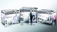
The new packaging design features a silver background and on-pack product photography. It no longer divides the Kenwood range into two groups, as the previous system did. Instead, the packaging will present all products as part of a single, unified range.
FLB has also created a new logo for Kenwood that is intended to create a stronger impression than the previous identity, through the use of a heavier-weight typeface.
The packaging also features ‘exploded’ views of each product, aiming to ‘create greater emotional appeal’ and ‘inspire confidence and understanding’, according to FLB creative director Colin Mechan.
The revamped packaging, which launches globally this month, carries information in ten languages to allow a single design to be used in all of Kenwood’s markets.
-
Post a comment


