Beijing Design Week
Back in August, we spoke to Sir John Sorrell about the inuagural Beijing Design Week , which ended yesterday, and took London as its partner city.
Up Creative’s Jamie Balliu reports back from Beijing with his experiences of the festival.
Beijingers are an open and sociable lot, and it’s perhaps this enthusiasm or curiosity of the new that is forging the city into an international centre for the arts, design and culture.
During Beijing Design Week, we witness the combination of a long heritage in art and design with an enthusiasm for the new; including influences from Europe and London.
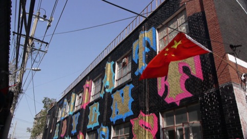
Established figures such as Neville Brody present work alongside Ben Eine and Dutch self-titled ‘califgraffiti-est’ Niels (Shoe) Muelman as part of the Converse Off Canvas street-level type-based design project.
brightcove.createExperiences();
Against the stark grey, brutal backdrop of a converted post-industrial facility, Neville Brody’s giant vector based mural, the Vortext, born out of his Antimatter font, casts a striking image.
Vortext carries a feeling of movement, and even with its aggressive shapes and hard edges, might, if only by chance, appear to want to relate to the somewhat abrasive, aggressive non-organic forms and environment which houses it.
Brody’s objective here is to express themes of urban regeneration, disorder and optimism; a form of renaissance through the cracks of urban decay.
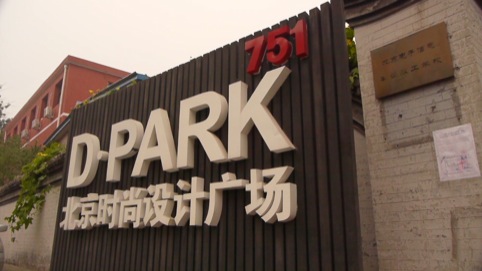
Students from Tsinghua University & Ecole Plytechnique Federale de Lausanne have worked together to create Urban Body, an installation in the 751 D Park area which uses shipping crates as the primary elements on which to build a platform for dialogue.
brightcove.createExperiences();
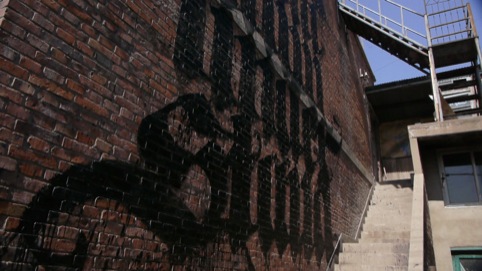
Muelman created three pieces for the festival. He says, ‘Like most calligraphers, I prefer to do my Calligraffiti-art on a paper or canvas that lies flat. Lately, my paintings are getting bigger and bigger.’
Drawing inspiration from a video he saw of retired Chinese people ‘doing calligraphy with a stick-brush and water on the sidewalk’, Muelman worked across a black roof for his festival piece, using a bucket of white paint and a large broom.
He explains, ‘The big difference between Chinese/Japanese and Western/Arabic calligraphy is the shape of the brush. With both scripts it’s all about the place where the strokes get thinner or thicker.
‘It’s just that with the Chinese round brush this is obtained by pressing or lifting the brush and with my flat brushes it’s the angle and the direction that make the lines change thickness’.
Many from east London will be very familiar with Ben Eine’s bold, typographic work on shop front shutters, but seeing his work in the context of Beijing has an altogether different effect.
The festival’s Converse Off Canvas project has seen him create an artwork entitled Happiness, in the Xicheng Shopping District. Despite its size, the piece could easily become lost or part of the bright, pop language of advertising around it, but for its simple one word message: ‘HAPPINESS’.
The font is formed by the ubiquitous and international circular smiley face motif; back home perhaps associated with rave culture but here worn by many, often teenagers, as a pop image or badge.
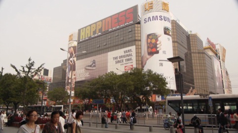
Happiness: is he suggesting that consumerism is bliss? Or that the underlying objective of shopping is a temporal happiness? Perhaps it’s an ironic gesture or a call to advertise something simple and free: to promote the brand of happiness? One is left to assume that its open to whatever you want to make of it.
brightcove.createExperiences();
Read this next

-
Post a comment


