Echo works up new Cobra look
Echo design consultancy has updated the brand identity and redesigned the packaging for Cobra beer, aiming to emphasise its premium qualities while retaining its Indian heritage.
The consultancy was appointed in January 2011 following a two-way pitch. It has previously created branding for Carling [https://www.designweek.co.uk/echo’s-new-carling-branding-set-to-launch/3028532.article], which is also owned by Cobra parent company Molson Coors.
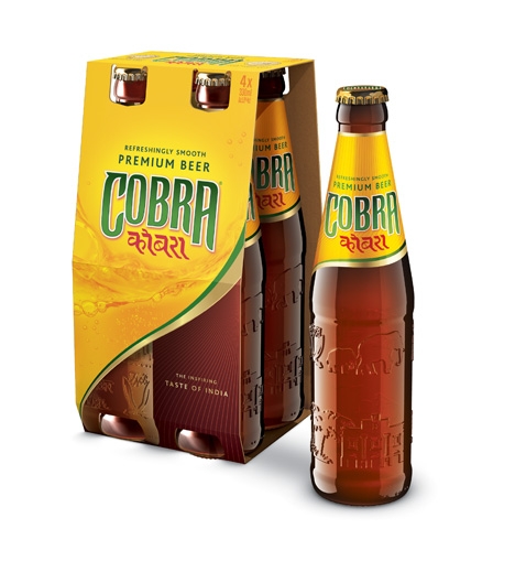
Echo tweaked the brand marque, retaining the green and gold palette but enriching the colours. The redesigned neck label now features added texture and contour lines in the background.
The secondary packaging also brings the contour line to the fore, aiming to reference the smooth taste of the beer and clearly divide the pack.
The main gold background on the upper half features a flowing liquid graphic to heighten the ‘refreshing qualities’ of the product, with the darker lower half reflecting its ‘fuller flavoured characteristics’, according to Echo.
Nigel Ritchie, Echo creative director, says, ‘Cobra is such a well-known brand but is almost exclusively associated with Indian restaurants. Cobra is now on a journey to make its presence felt in both the on and off- trade and the new design will contribute significantly to this.
‘As befits a world beer from India it looks dramatically different to everything else that’s out there.’
The new packaging is rolling out from this month.
Read this next

-
Post a comment


