Typo London – Michael Bierut
Philip Larkin’s This Be The Verse (yes, the one about your parents ‘fucking you up’) may seem an odd opener for a talk on typography by one of the world’s most respected graphic designers, but it works for Pentagram partner Michael Bierut.
Speaking at the inaugural Typo London event last night, Bierut’s talk, The Only Important Decision, focussed on how, while architects and fashion designers get to choose from colours and materials, graphic designers are often left agonising over the typeface.
In a very lively and engaging presentation, we learn that no, his surname is not like the capital of Lebanon (‘“ie”, like sexier’, according to his wife, apparently); that he once sported ‘Wim Crouwel hair’; and in his youth, had a penchant for drawing the Titanic- thwarting icebergs in ballpoint pen.

Returning to the more serious business of typography, Bierut guides the audience through a series of high-profile Pentagram projects and the processes behind finding the perfect typeface.
A major case study in the presentation is the wayfinding system for Celebration, a community in Florida originally developed by the Walt Disney Company, and featuring buildings from an arsenal of architects including Michael Graves, Philip Johnson and Robert Stern.
Pentagram’s lettering system was based on typography from ads in 1920s directory books, and features on everything within the community including street signs, sewer caps and Celebration-branded products, such as golf clubs. Pentagram was also asked to design the Celebration Preview Centre to showcase properties to potential buyers, for which it created a graphic ‘simulation’ of the houses, comprising full-scale prints of the facades affixed to trucks.
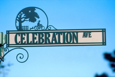
Bierut admits a ‘nostalgia’ element to the typeface – its arcane starting point; the cutesy ‘tree girl’ logo that accompanies it – but is unapologetic, suggesting that, ‘at [his] age, you get nostalgia anywhere you can.’
Another case-story highlight was the work for Brooklyn Academy of Music in 1995. The logo uses the simple device of lettering that appears too large for its space; meaning only partial letterforms are shown.
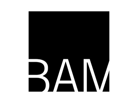
Bierut cites King Kong as exemplary of what makes it successful: when the girl in the film sees an enormous gorilla’s face outside the window, her terror stems from the implication that he is 30-feet tall.
Therefore, in using letters that are half-formed, the illusion of scale is created, and more words and pictures can be crammed onto the page. This is even carried though to the toilet sings for the Academy: while it is legally required to show ‘men’ or ‘women’ in full; the little person icon has a bit of leg or head partially spliced off.
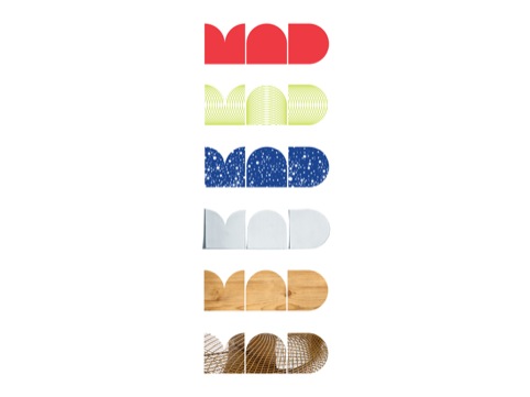
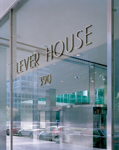
Other case studies include the wayfinding system for downtown Manhattan, a bold step away from colourful signage in favour of simplicity and place photography; the Lever House typeface, which still visibly exites Bierut; the ‘savage, brutal typeface’ for the Jets American football team; the imposing letterforms for Harley Davidson, and the iconic MAD letting for New York’s Museum of Arts and Design.
Typo runs until Saturday 22 October at University of London Institute of Education, Logan and Jeffrey Hall, 20 Bedford Way, London WC1H. For more information visit www.typolondon.com
Read this next


ditto is… hyped about type
This last week, we’ve been hyped about Type…
Starting with Typo London, a three-day conference with broad range of speakers, covering visual communication, film, emerging media, design, education, technology, information and typography…
http://www.ditto.tv/blog/2011/10/ditto-is…-hyped-about-type/