Airline Iberia takes off with new identity
Spanish airline Iberia is launching a new identity as part of a rebrand project led by Interbrand Madrid.
The rebrand comes as the airline promises a ‘new, more dynamic Iberia, focusing as never before on satisfying the customer’.
Iberia chief executive Luis Gallego says, ‘It’s not just a matter of changing the company’s logo, but of bringing the new image to every corner of Iberia, so the change will be perceived in all our products and the service we provide to our customers.’
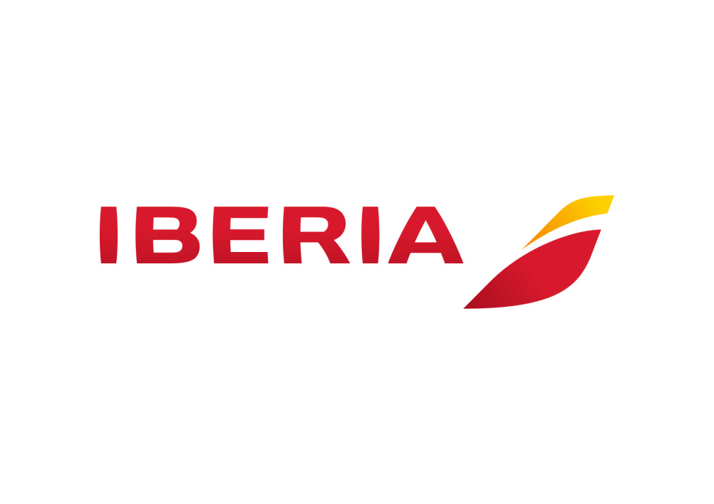
The new designs retain the red and yellow of the Spanish flag ‘with a starring role for red as a symbol of Spain’s vitality, expressiveness, and art, and of the Spanish character’.
Iberia says the new identity was developed after a design process involving interviews with 9000 people.
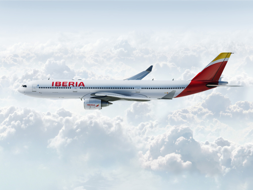
The airline started to roll out its new look earlier this year, with new A330 business class interiors designed by Your Studio.
The new identity will now roll out across all the airline’s touchpoints over the coming months.
Read this next


I like it! A really strong and modern update that not only helps strengthen the airlines image to their customers – but in my opinion, helps in giving the Spanish brand as a country, an extra boost…
If you have to talk to 9000 people you’re bound to end up with mediocrity. And sadly that is what you have. There are some great Designers in Spain. It’s tragic that you’ve ended up with such banality.
I hope that it didn’t cost as fortune and that you still have time to reconsider this feeble and trite work
Possibly the dullest new brand/identity ever and certainly does not represent the Spain that I know an love. All the marketing hype in the world will not hide this….
“with a staring role for red…”
understandable I guess as red is sometimes seen as an aggressive colour
In the second quarter of 2012, the airline lost $125.5 million, While this year’s second quarter earnings saw a $47.6 million loss.
So it’s become a slightly less dreadful business.
I suspect this rebrand is heralded as a signal for change. Yet it would be hard to imagine a more charmless and mean approach. Doing any less of a change would actually render it changeless.
Its a barely there rebrand.
I was desperately looking at the vile brand launch film hoping to see some smidgeon of an idea. Something other than the meaningless tailfin colour shambles. But no. Nothing.
InterBland continue to romp along charging meaty sums for hefty values, missions and visions. Yet fail time and again at putting those lofty aspirations on the surfaces owned by the lemmings they have leaned on.
Mr Wolff is right here. Spain is an amazing place for design. One only has to look at the flair of Madrid the inspiration of Barcelona to find 100 influences that could have actually put some lift in these limp wings.
A disgrace and a disservice.
Is it a bird? Is it a plane? Whatever the icon is supposed to represent, appears that 9,000 people didn’t help the decision-making process. Mediocre it definitely is.
I agree with Mr Wolff. The identity has no story and does not reflect the standard here in Spain.
In Spain, especially Barcelona, there are many studios doing great work. If they were looking for an international company, like Interbrand, but with roots in Spain they should have gone to Mucho, who are based in Barcelona, with offices in the States and the UK.
Many are calling them the ‘new Pentagram’ and looking at their set up and the standard of work across all offices, I can see why.
We need to celebrate design in Spain and sadly the Iberia identity does not reflect the quality or passion we have to offer as an industry.
@Michael Wolff …you’re so right.
Too much democracy in corporate design…
I remember when designing designers, not agencies
I agree with Mr Wolff. The identity has no story and does not reflect the standard here in Spain.
In Spain, especially Barcelona, there are many studios doing great work. If they were looking for an international company, like Interbrand, but with roots in Spain they should have gone to Mucho, who are based in Barcelona, with offices in the States and the UK.
Many are calling them the ‘new Pentagram’ and looking at their set up and the standard of work across all offices, I can see why.
We need to celebrate design in Spain and sadly the Iberia identity does not reflect the quality or passion we have to offer as an industry.
Mediocre perhaps, hardly ‘tragic’ or a ‘disgrace’.
I can think of situations or events to which these words would be more suited – but this isn’t one of them.
Mediocre perhaps, hardly ‘tragic’ or a ‘disgrace’.
I can think of situations or events where these words would be more suited – but this isn’t one of them.