Anxiety Arts Festival designs aim to ‘convey the tension and distorted reality’ of anxiety
Praline has created the branding for the Anxiety Arts Festival, an event organised by the Mental Health Foundation.
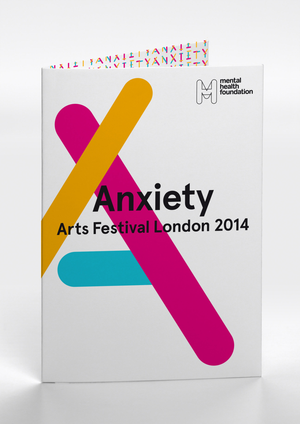
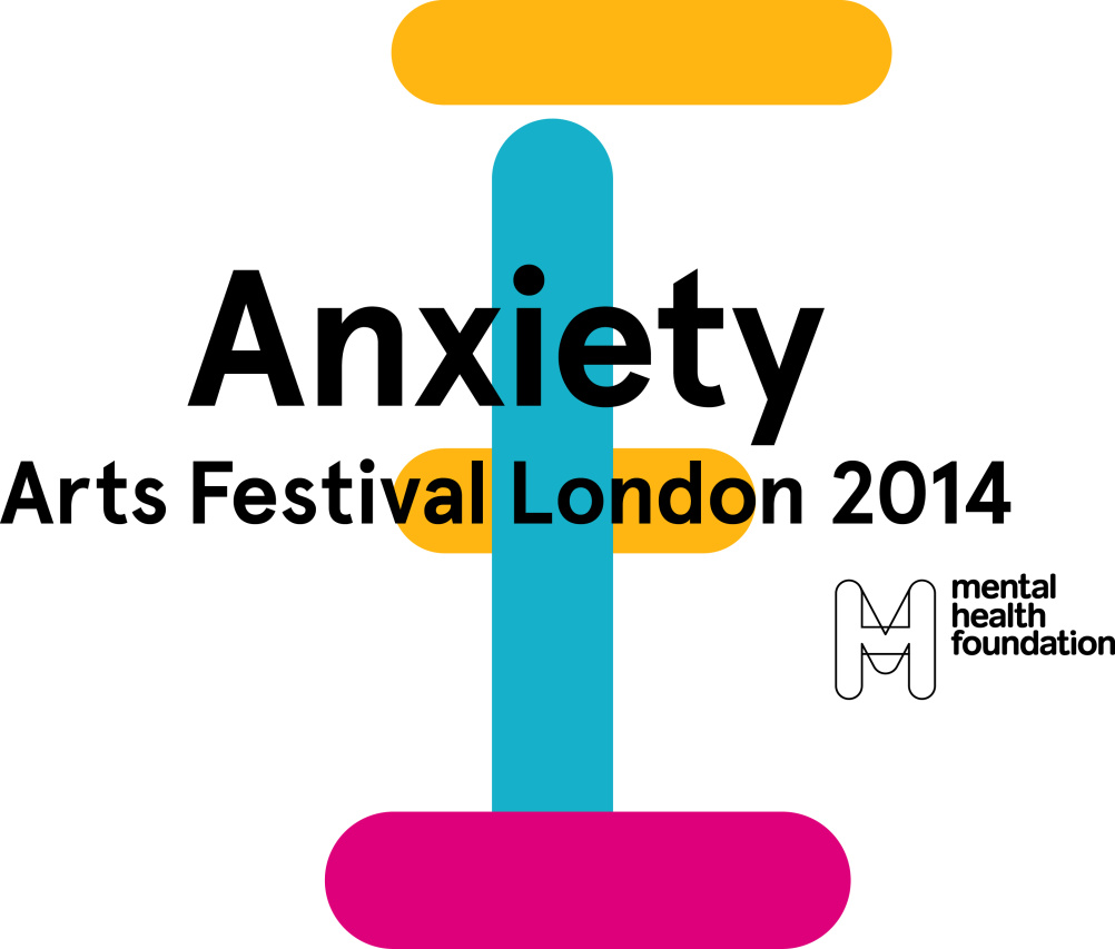
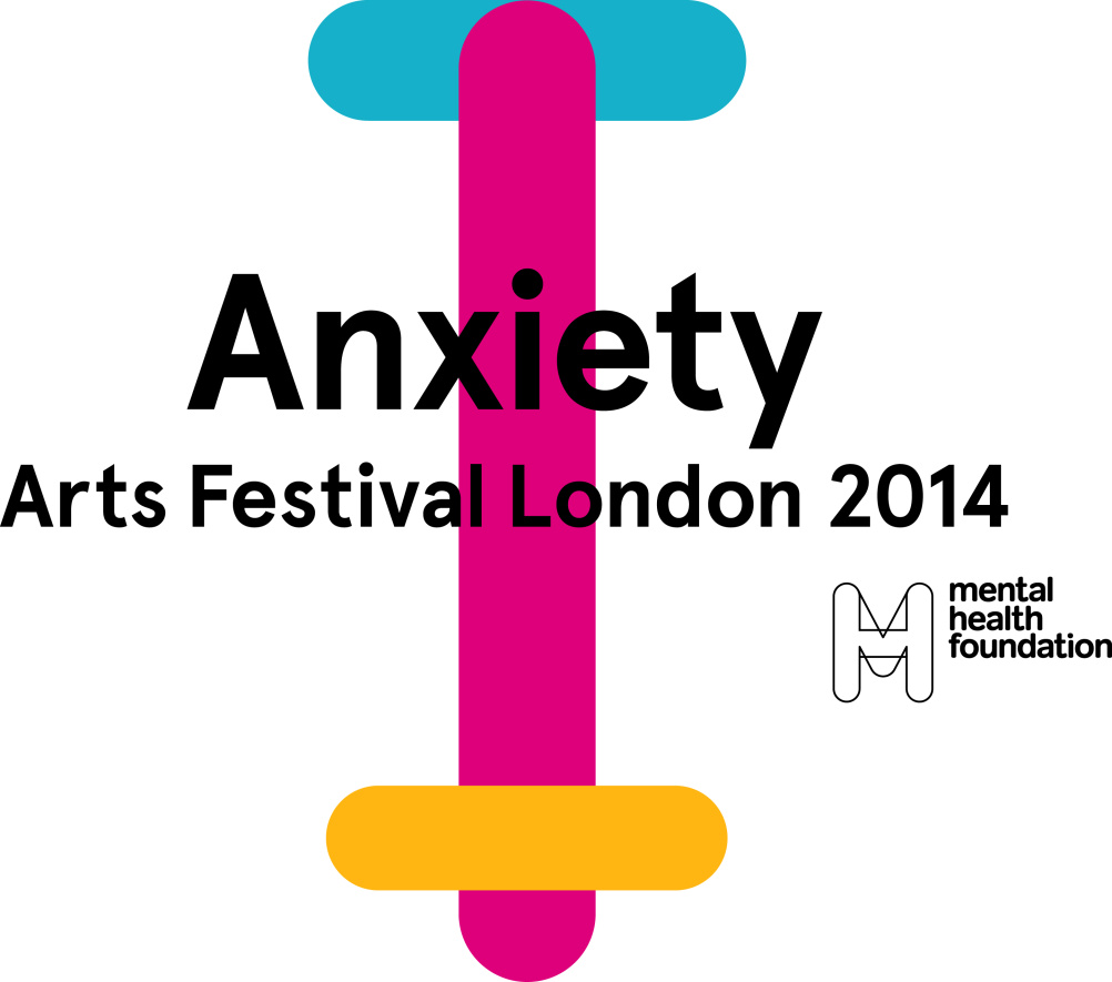
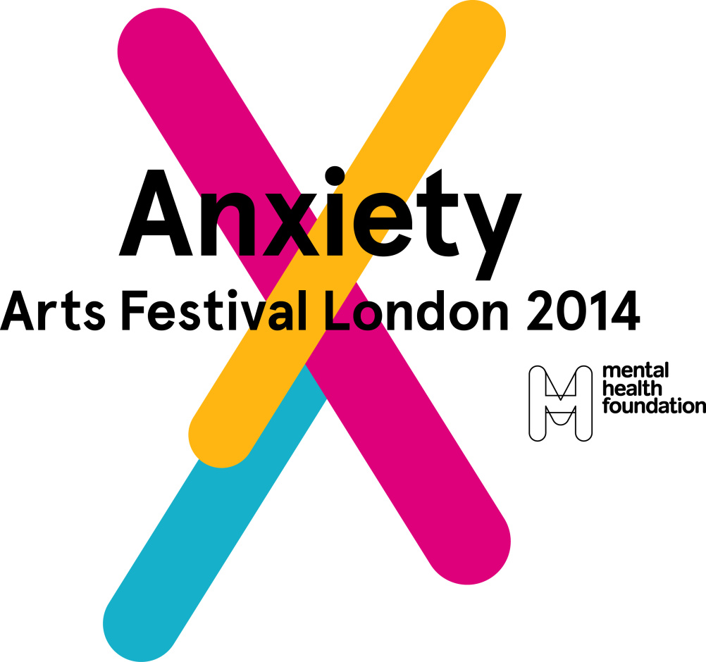
The Anxiety Arts Festival identity stems from the logo for the Mental Health Foundation.
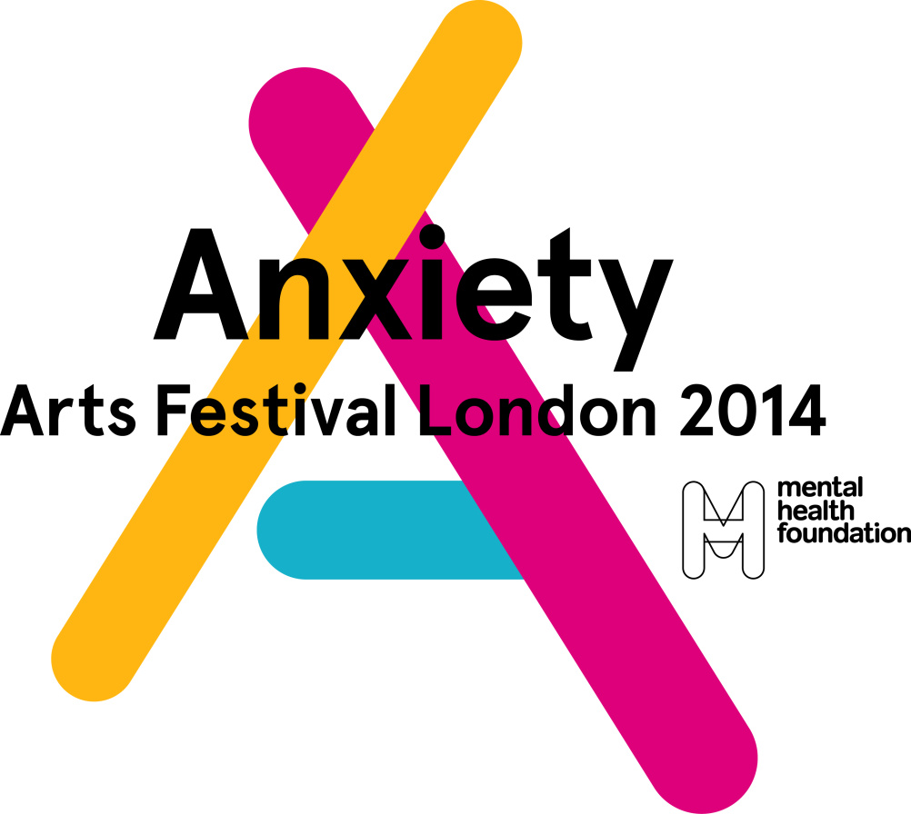
The letterforms from the word ‘Anxiety’ were ‘exploded’ to create broken, rounded forms, which were put back together to form the Anxiety Arts Festival logo.
The branding uses three bright colours – magenta, yellow and blue.
The three components of the logo can be split into different forms for its various applications across the festival’s touchpoints, aiming to reflect the ‘many different forms’ of ‘anxiety, the condition as well as the festival’, says Praline.There are seven variations of the logo – one for each letter of the word ’Anxiety’ – which can be used for different applications.
David Tanguy, creative director at Praline, says, ‘With the name of the festival being so charged with meaning, the identity design had to be bright and positive.’
He adds, ‘The aim was to convey the tension and distorted reality which the state of Anxiety can lead to.’
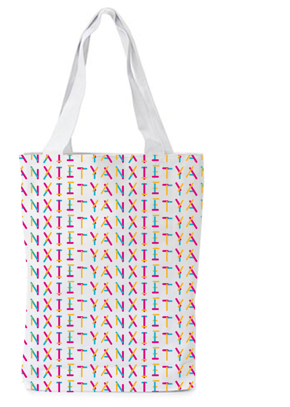
A pattern made up of all the characters can be used for applications such as bags, folders or endpapers.
You can view an animation of the logo below.
The festival will take place in June next year. You can view the holding page at http://anxiety2014.org/
Read this next

-
Post a comment


