Interabang’s Darcha teahouse identity that ‘fuses two cultures’
Interabang has created the identity for Darcha teahouse in Bahrain, creating a look that aims to represent the fusion of two cultures.
The consultancy was approached to work on the project by Darcha founders Weena Clarke, from Hong Kong, and Latifa Ebrahim from Bahrain, and was tasked with creating an identity that showed the coming together of their two cultures.
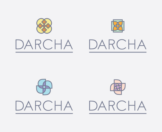
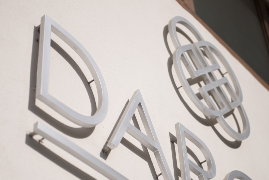
Four logos were created, each using two intertwined capital ‘D’ letters from the Darcha name – taken from blending ‘dar’, meaning house, and ‘chai’, meaning tea.
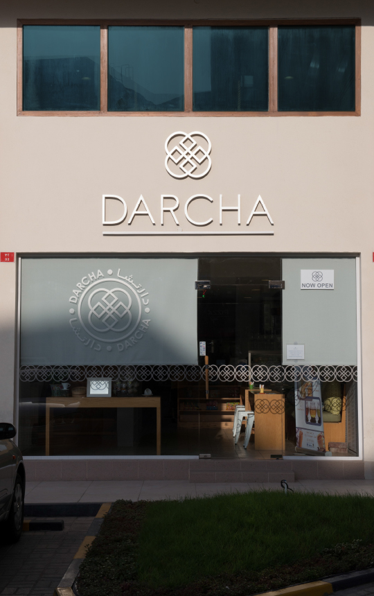
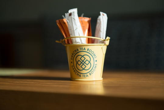
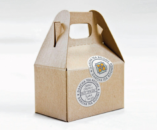
From these logos, four patterns were created, which are used across the interiors of the store. The identity is also shown across all packaging, signage, uniforms, stationery and digital projections.
‘We wanted to keep it very contemporary, fresh and simple’, says Ian Mclean, Interabang joint creative director. ‘The colours are representative of the two cultures, but they had to look modern and classic to enhance the geometric shapes of the marque’.
The D of the logo is the same size and typeface as the word mark, which uses a tweaked Century Gothic typeface that Interabang redrew to make it ‘perfectly symmetrical’.
Read this next


This may be the sweetest identity design i’ve seen in years. Refreshing to see a simple, thoughtful concept well executed. I’m guessing there were no committees involved. Great work!