Johnson Banks’ anamorphic type promotes London universities in China
Johnson Banks has designed a typographic exhibition in China promoting London as the best place in the world to study.

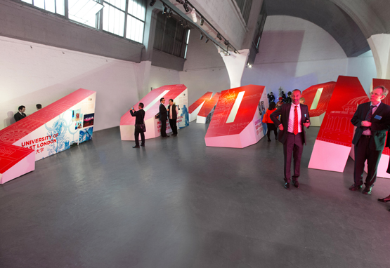
The client, London Universities International, is a consortium of 15 London universities which are promoting themselves in the Yang Gallery, Beijing.
Senior politicians including London Mayor Boris Johnson and Chancellor George Osborne have been in China this week promoting London as a University study destination.
Creative director Michael Johnson says that Johnson Banks was briefed to create a temporary exhibition that could show ‘a curated sample of the universities projects.’
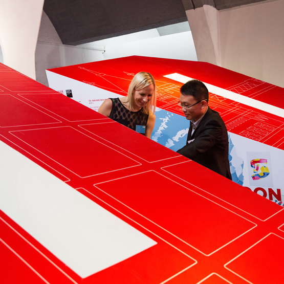
Finding a typographic solution, spelling out #London# stretched anamorphic letters have been installed, featuring London landmarks on the front and university projects on the sides.
Michael Johnson says, ‘To add to the visual effect, the letters themselves twist and turn, creating an unusual typographic landscape.’
The double hashtag has been introduced so that users of Weibo, a Chinese equivalent of Twitter, can communicate information about the show, which is bilingual.
Read this next


This looks dreadful. Both as an exhibition and as a design idea.
Beyond impractical and ugly.
Looks like an egomaniac graphic designer has been let loose on a space.
Oh. Hang on. They have.
I wish to study more on my course.
I have Diplomal in Theology so I want to study more possibly in London and its environment.