Movember’s new branding for 2013 event
The Movember men’s health initiative has launched new branding for this year’s event.
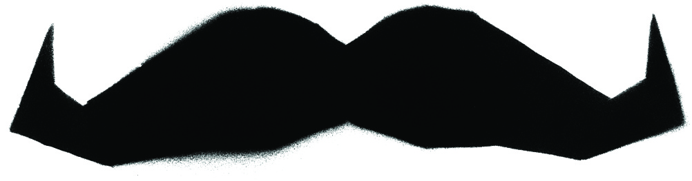
Movember encourages men to grow moustaches during November to raise awareness of, and funds for, prostate and testicular cancer.
The branding, which is refreshed each year, is created by Melbourne-based consultancy Urchin Associates.
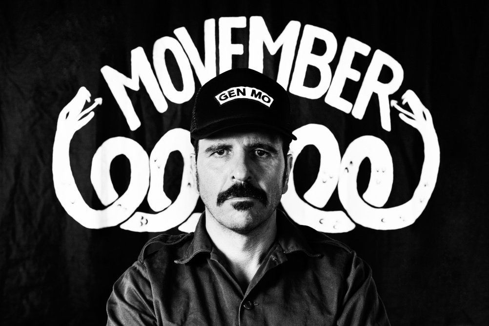
Last year’s look was based on the idea of a traditional father-and-son run business; while this year’s branding has a monochrome palette, with a rebellious aesthetic based on a campaign message ‘if you don’t like our moustaches we don’t like your laws’.
The main Movember word-mark has a hand-drawn brushstroke look, and is always capitalised; while secondary text uses capitalised stencil-like typography.
Snake and wolf graphics are used across the branding, with a two-headed snake forming a line above the logo on a number of applications and a howling wolf seen with lightening flashes.


a wolf…? looks like a rat!