Children’s charity the NSPCC rolls out new identity
Children’s charity the NSPCC has launched a new identity, which replaces its previous “Full Stop” positioning and aims to highlight the work carried out the by the organisation.

The “Full Stop” branding was developed more than a decade ago, and according to NSPCC creative director Mark Tobin “put child abuse firmly on the agenda and raised over £250 million”.
Tobin adds: “[Full Stop] was developed more than a decade ago, and the landscape has changed. We’ve raised awareness of child abuse, but our research shows that people are less clear about the work we’re doing to prevent it. We need to address that to drive up support.”
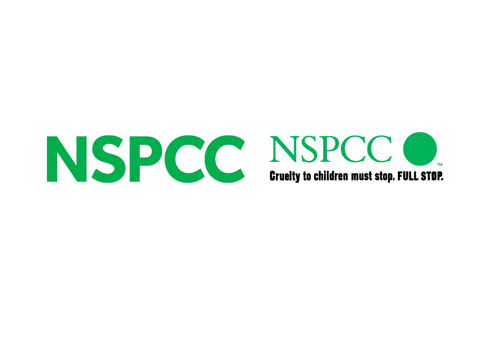
The new look has been developed by the NSPCC’s in-house creative team, which won the project following a pitch against external consultancies.
Tobin says: “The previous brand was heavily reliant on black and white photography; a limited colour palette, and a strapline that focused on cruelty.
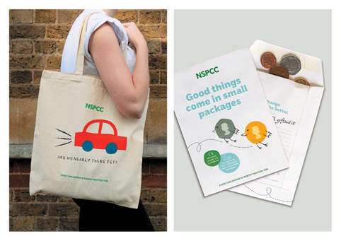
“Our new brand allows us to move the conversation on, and talk about the solutions we offer rather than just the problem.”
The NSPCC says the rebrand is part of a strategic shift at the organisation, that sees it placing greater emphasis on preventing abuse before it starts.

Research showed that many people were unaware of the work carried out by the NSPCC in, for example, supporting families struggling with drug addictions and helping children recover from domestic abuse, Tobin says.
He adds: “The people who the NSPCC wanted to help were reluctant to use services from what they perceived to be the ‘cruelty charity’. This is what the new brand addresses.”
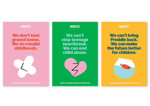
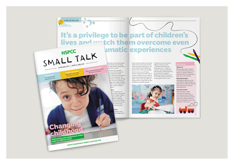
The NSPCC says the new identity is based on the idea of “childhood”. It features a “bright” colour palette, moving away from the previous black, white and green look, and a “crayon” illustration style. The charity also has a new strapline – Every childhood is worth fighting for.
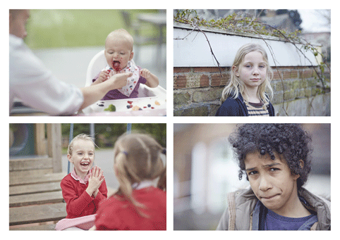
The NSPCC also worked with photographer Tom Hull to produce imagery that “offers a glimpse into childhood”. NSPCC art director Sue Hornsby says: “Even when we portray children who’ve been abused, we follow this principle. Abuse doesn’t just happen to a certain ‘type’ of child – it could happen to any child, from any background. Our brand needs to convey that in order to make our cause feel more relevant.”
The brand is undergoing a phased roll out, with a new website, developed with digital consultancy Amaze, launching this month.
The new NSPCC identity follows a rebrand of fellow charity The Children’s Society, which launched last month.
The rebrand, by SomeOne, saw the previous purple identity replaced with a black-and-white look and the concept of telling “hard truths”.


[…] (2014). New NSPCC Visual Identity. [online] Available at: https://www.designweek.co.uk/issues/october-2014/childrens-charity-the-nspcc-rolls-out-new-identity/ [Accessed 14 October […]