Ideas Factory helps Aspire shape-up with triangular identity
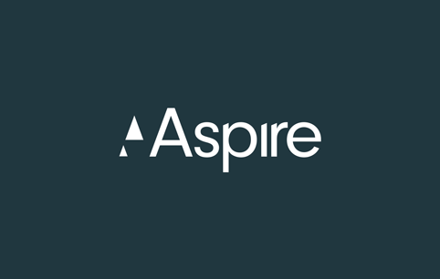
Ideas Factory has rebranded London estate agent Aspire using triangular symbols, which are borrowed from the A of Aspire.
The consultancy says it has looked to communicate a message “which builds on Aspire’s name” and reflects the level of service Aspire offers its customers.
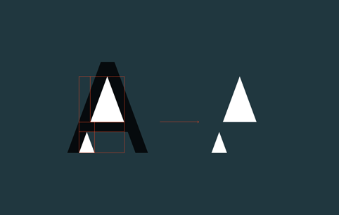
Ideas factory says: “The triangular symbols are used as a device to communicate this aspirational theme while making a subtle reference to the A in the word-mark.”
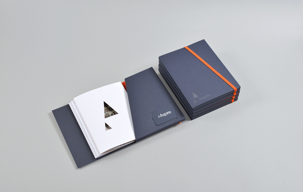
The triangles, which can be a stand-alone mark, have been designed with flexibility in mind and can be used as a cut-out window to reveal property photography. They’re also scalable and feature across print collateral.
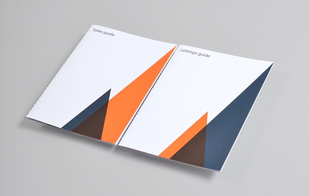
The typographic style across communications and the colour palette of muted blue, grey and white with orange accents have been chosen for the “timeless quality” they give the brand, according to Ideas Factory.

Aspire director Matthew Dabell says: “Our original brand grew organically and has served us well, but as we look to expand further into new markets, we need to ensure that we are fit for purpose and ready to go. Our rebrand does just that.”
Read this next

-
Post a comment


